Laboratory Investigation in Hematology
How to decide what a number is worth — the five stations between the patient and the result, then the tests themselves.
These slides are an outline only. Read the accompanying material with them: the notes under each slide below, and the Hematology Handbook. Then work through the Internal Medicine Casebook and the Hematology Question Bank.
Before you believe a number

What this lecture is about
These slides are an outline only. Read the accompanying material with them: the notes under each slide on this page, and the Hematology Handbook. Then work through the Internal Medicine Casebook and the Hematology Question Bank.
This is the first lecture of the clinical hematology series, and the one the others depend on. It is not a catalogue of tests. Its subject is the sentence under the title: how to decide what a number is worth. Every result you will ever act on was produced by a machine that never met your patient, and between the patient and the number there are five places where the result can go wrong without ever looking wrong. Learning to ask which of those five failed is the skill this lecture teaches.
It comes in two parts. Part I builds the framework, the five stations, and shows each one failing on a real result. Part II walks the everyday tests of hematology through the same stations: the blood count, the film, the reticulocytes, the panels, the coagulation screen, the blood bank and the molecular tools. Read Part I first even if you came for Part II; the second half assumes the habit the first half installs.

The outline, and one sentence to notice
Two parts, one framework. Part I is about reasoning: why a test is ordered, how the specimen and the instrument can betray it, what a reference interval actually is, and how a result should change what you believe. Part II is the catalogue, but every entry in it is read through the same five stations, so that by the end you can interrogate a test you have never met.
The last bullet is unusual for a lecture and worth noticing. The reference intervals quoted here are the ones measured in this population, at this altitude, and much of the evidence comes from studies done in this department on patients like yours. That is not local pride. It is the point of station 4, which you will reach on slide 25: a normal range belongs to the population it was measured in, and Abha's is not Jeddah's.
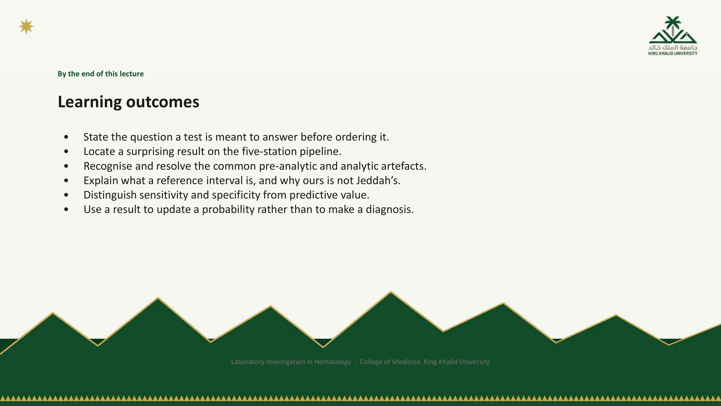
Six things you should be able to do afterwards
Read these as a checklist to return to when you have finished. Each maps onto one station of the pipeline. The first is station 1, the question. The second is the framework itself. The third covers stations 2 and 3, the tube and the instrument. The fourth is station 4, the number. The last two are station 5, the meaning.
Notice the verbs. None of them is "list" or "recall". They are state, locate, recognise, explain, distinguish and use, because this lecture is about a way of thinking rather than a body of facts. The facts in Part II are there to give the thinking something to work on.

Part I
The first half of the lecture contains no test you have not heard of. It is about what happens to any result between the moment you decide to order it and the moment you act on it, told through five stations and a handful of cases in which a perfectly reported number was wrong. By the end of Part I you should find it impossible to read a laboratory result without asking which station it might have failed at.
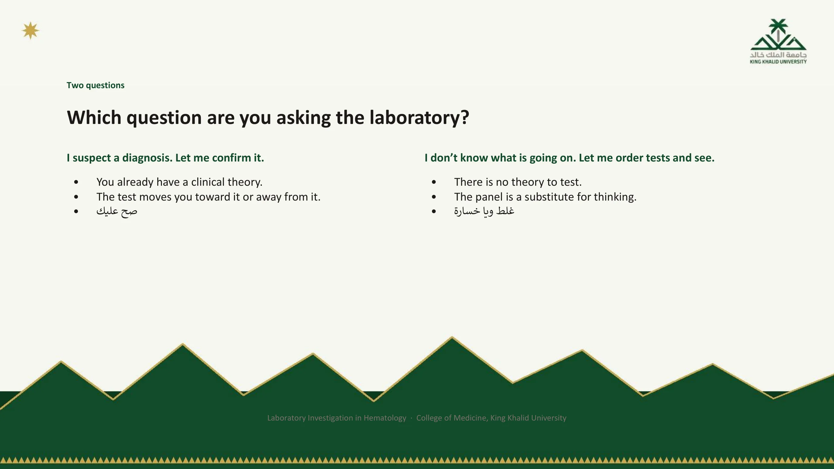
There are only two reasons to order a test, and only one of them is good
The first speaker has a clinical theory. The history and examination have produced a suspicion, and the test exists to move that suspicion up or down. Whatever the result, it means something, because there was a belief for it to act on. The Arabic verdict on the slide is approval.
The second speaker has no theory. The panel is ordered in the hope that the answer will appear among the numbers, and it is a substitute for the thinking that should have come first. The Arabic verdict is that this is wrong, and a loss. The loss is not rhetorical. By slide 26 you will be able to calculate it: the fewer the reasons you had for ordering a test, the more likely it is that an abnormal result is noise, and a test ordered without a question does not merely fail to help. It generates work, repeat tests, imaging, referrals, and occasionally a diagnosis the patient never had.
This habit has been measured here. Audits in this institution of serum vitamin B12 and serum folate requests both ended with the same recommendation, explicit ordering guidance, and neither found clinicians ordering out of carelessness. They found tests ordered instead of a question.
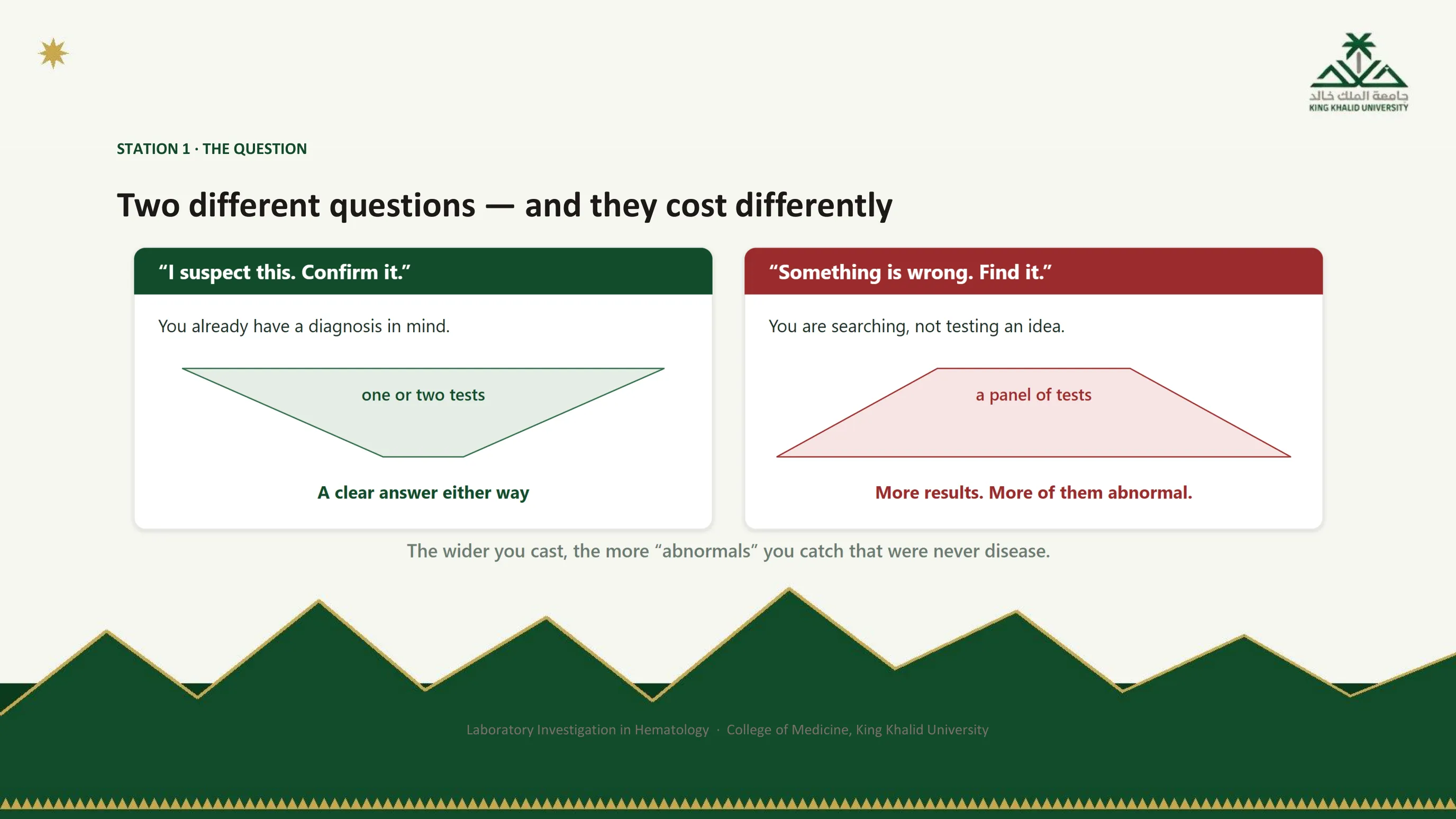
The same two questions, drawn as shapes
The figure turns the previous slide into geometry. The confirming question is a funnel: it starts from a diagnosis in mind and narrows to one or two tests, each of which gives a clear answer whichever way it falls. The searching question is the funnel inverted: it starts from nothing and fans out into a panel, and the wider the panel, the more results come back, and the more of those results are abnormal.
The footer is the arithmetic in one line. Every extra test on a well person is another chance of an "abnormal" that was never disease, and each of those must then be explained. Keep the two shapes in mind: when you find yourself about to order a panel, ask whether you are at the narrow end of a funnel or the wide end.
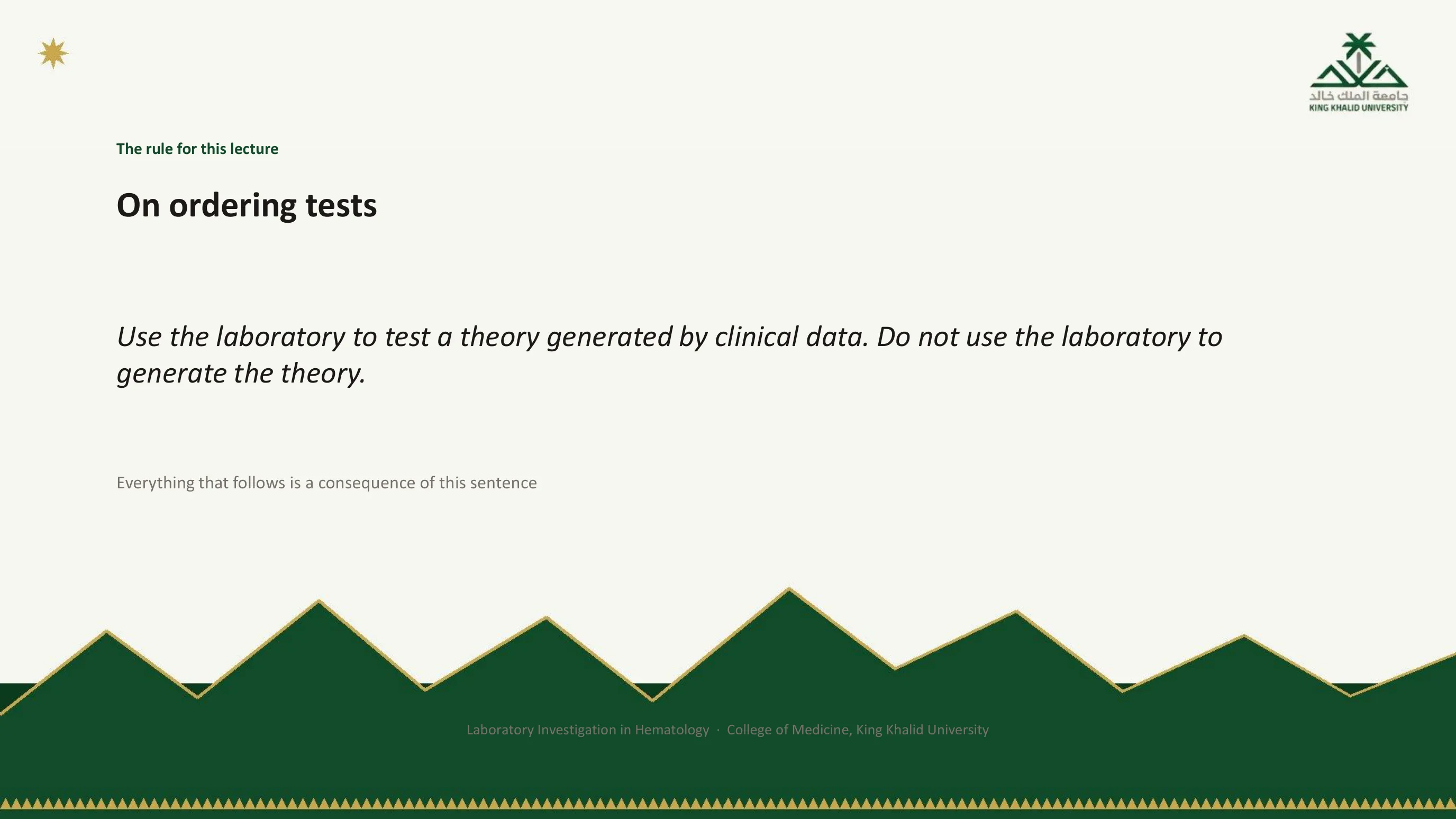
The rule the whole lecture follows from
If you remember one sentence from the two hours, make it this one. The laboratory is an instrument for testing theories, and the theories come from the history and the examination. A test can strengthen a suspicion or weaken it. It cannot produce one from nothing, because, as station 5 will show, a result only means something in relation to the probability you held before you saw it.
The claim that everything else follows from this sentence is meant literally. Station 1 is the sentence itself. Stations 2 to 4 are the reasons a number can be wrong even when the question was right. Station 5 is what the number is worth once you have it, and that value depends on the theory you brought to it.
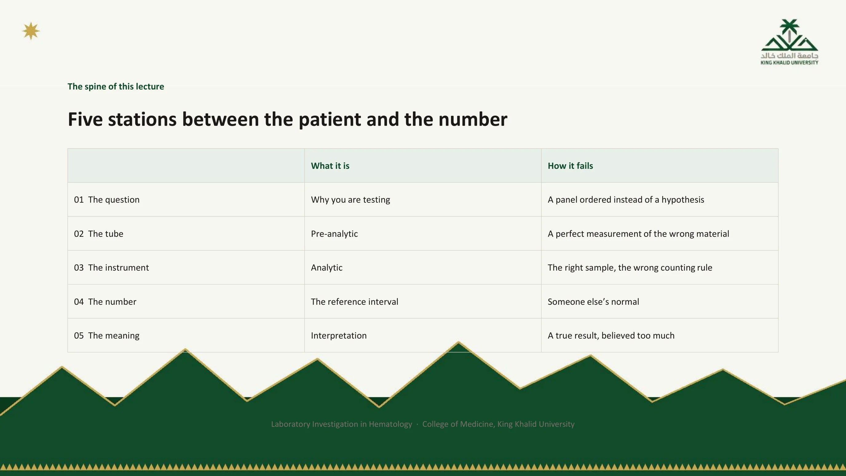
The spine: five places a result can fail
A laboratory result is not an observation of your patient. It is the output of a pipeline, and the table names the five stations on that pipeline and the characteristic way each one fails. Learn the right-hand column. It is the differential diagnosis of a wrong result.
At station 1 the failure is a panel ordered instead of a hypothesis. At station 2, the tube, the specimen is damaged before it reaches the machine, which then measures the damaged specimen perfectly. At station 3, the instrument, the specimen is fine but the counting rule the analyser applies does not fit what is in it. At station 4 the number is right but the reference interval it is compared with belongs to someone else. At station 5 everything upstream is correct and the error is yours: a true result, believed too much.
Everything in Part I teaches one of these five, and everything in Part II walks a real test through all of them. When a result surprises you, the useful question is never "is this true?" but "which station failed?"
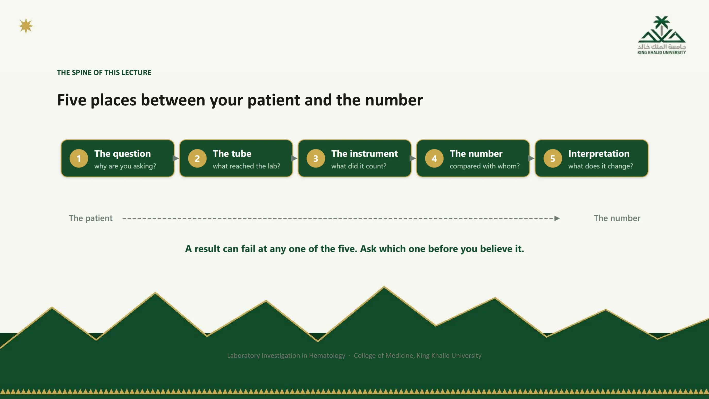
The same five stations as a line
The figure lays the table out in the order the specimen travels, from the patient on the left to the number on the right, and gives each station a question to ask. Why are you asking? What reached the laboratory? What did the machine count? Compared with whom? What does it change? Those five questions, asked in order, are the whole method of the lecture, and the caption is its instruction: ask which station before you believe the result.

Four costs, and only the first appears on an invoice
Money is the cost everyone thinks of, and it is the smallest. Cascade is the real expense: an unexplained abnormal result rarely stops. It recruits a repeat test, then an image, then a referral, each of which costs more than the assay that started it. Harm waits at the end of the cascade, because somewhere down that chain sits a biopsy, a marrow aspirate or a course of treatment for a disease the patient does not have. Attention is the cost that is hardest to see: a page of numbers you did not need is a page in which the one number that mattered is easier to miss.
The last bullet grounds this locally. When serum vitamin B12 requests in this institution were audited, the conclusion was that explicit ordering guidance was needed; the same question asked of serum folate reached the same place. The international expression of the idea is the Choosing Wisely programme, whose hematology list is worth reading because every item on it is a test ordered out of habit rather than question.

The four costs as cards
The figure groups the costs slightly differently from the bullet slide, adding time: a result you are waiting for is a decision you are delaying, and in a sick patient that delay is itself a harm. The fourth card, the next test, is the cascade of the previous slide in its simplest form. One odd result pulls in the next, and the next.
The footer anticipates slide 12. The defence against all four costs is a sentence spoken before the request is sent.

The test of a test
This is the practical form of the rule on slide 7, and it takes ten seconds. Before you order, say out loud what result you expect. Then say what you will do differently if the result is the opposite. The first sentence proves you have a theory. The second proves the test can change something.
If you cannot complete the second sentence, the test will not alter your management whatever it shows, and you are at station 1 without a question. No amount of laboratory quality downstream can rescue a test that had no reason to be ordered. Try the exercise on the next few requests you write; it is surprising how often the second sentence will not come.
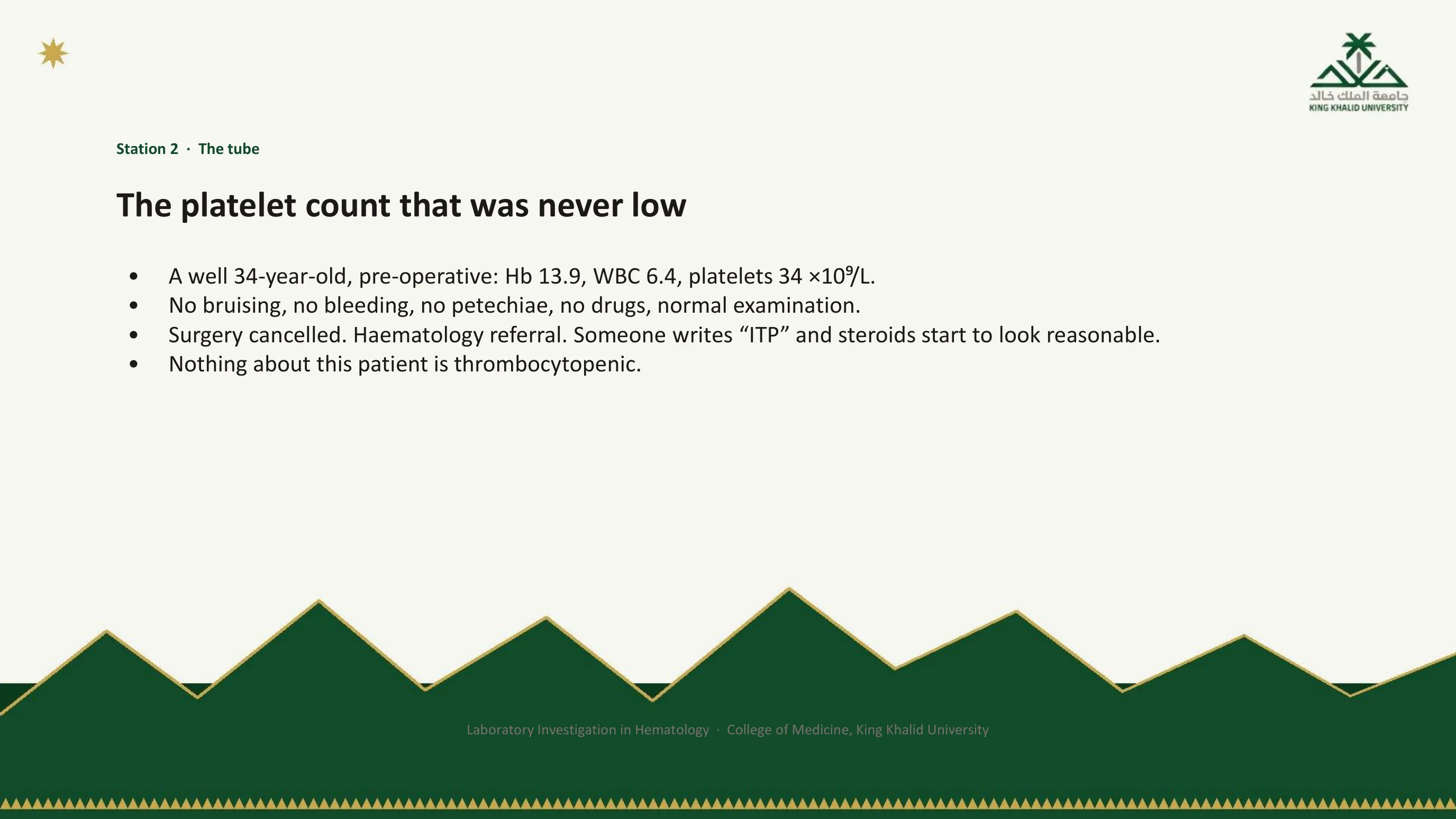
Station 2: a perfect measurement of the wrong material
Pre-analytic error happens between the patient and the instrument. The machine then measures the damaged specimen perfectly and reports a number that is precisely wrong. Here is the classic case.
A well 34-year-old comes for a pre-operative screen. Hemoglobin 13.9 g/dL, white cells 6.4, platelets 34 ×10⁹/L. There is no bruising, no bleeding, no petechiae, no drug history, and the examination is normal. Yet the number sets a cascade in motion: the operation is cancelled, a hematology referral is written, and somewhere in the differential someone writes ITP, at which point a course of steroids starts to look reasonable.
Read the slide's last line against the first three. A platelet count of 34 with not one clinical sign of thrombocytopenia is a mismatch, and a mismatch between the patient and the number is the cue to ask which station failed. Nothing about this patient is thrombocytopenic. The next slide says what happened in the tube.
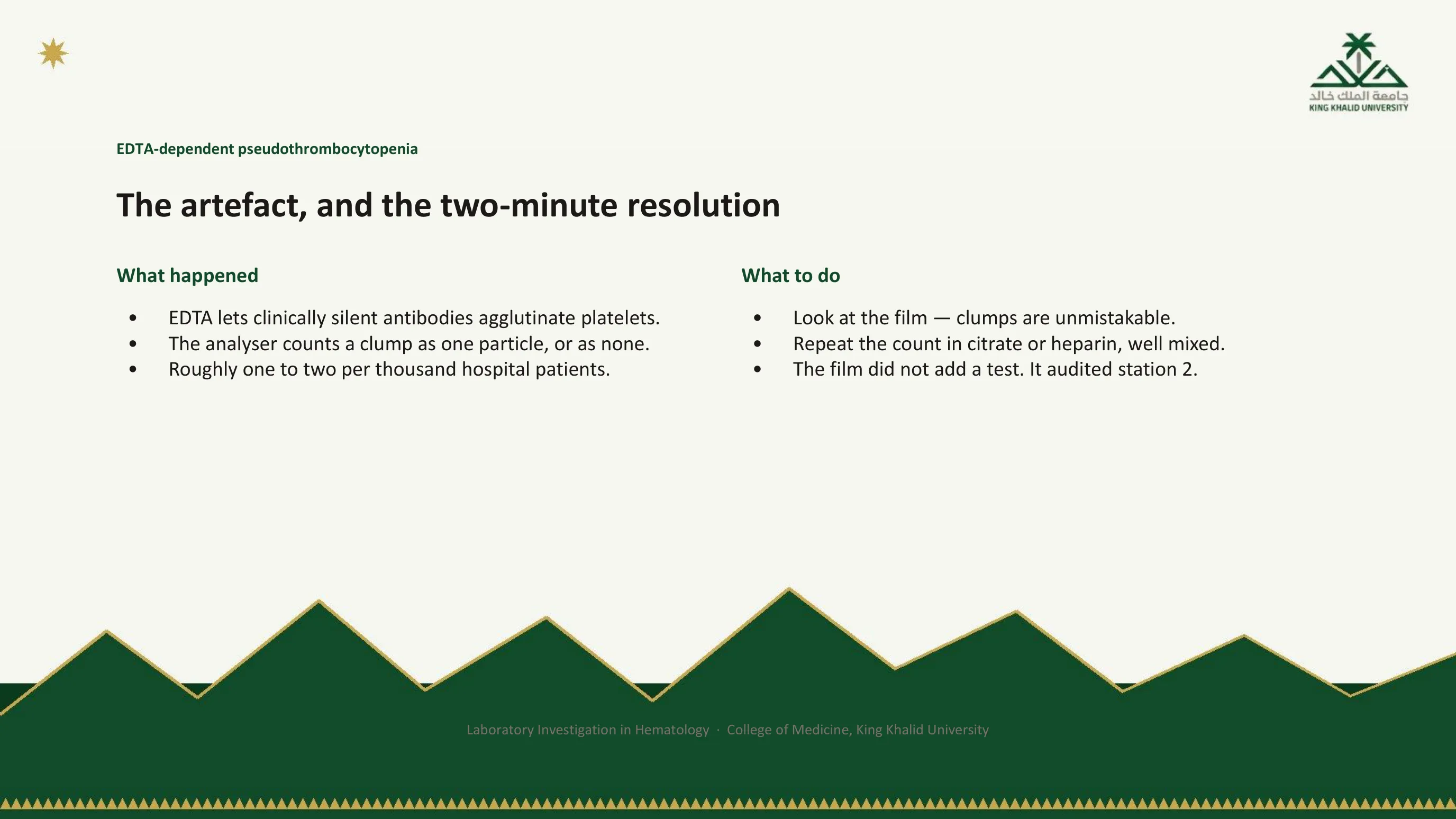
The artefact, and the two-minute resolution
The EDTA in the purple-top tube, the routine anticoagulant for a blood count, allows antibodies that a small minority of people carry, and that do nothing in the body, to agglutinate platelets in the tube. The analyser then counts a clump of forty platelets as one particle, or, if the clump is large, as nothing at all. The phenomenon is called EDTA-dependent pseudothrombocytopenia, and it is common enough to know by name: roughly one or two in every thousand hospital patients.
The resolution takes two minutes. Look at the film: platelet clumps are unmistakable, and the film costs nothing beyond the blood already drawn. Then repeat the count in a citrate or heparin tube, well mixed, and watch it return to normal.
Notice what the film did. It did not add a test. It audited station 2, telling you whether the specimen deserved to be counted at all. That is the most under-used skill in this lecture: when a count surprises you, look at the cells before you believe the number.
Read next. Case 53 · The Bleeding Patient in the casebook is the other side of this slide: a young woman whose low platelet count is real. Even there, the case makes the film the first investigation, before any treatment, because it rules out clumping in the tube and shows the blasts, fragments or dysplastic cells that would turn the problem into a different one.
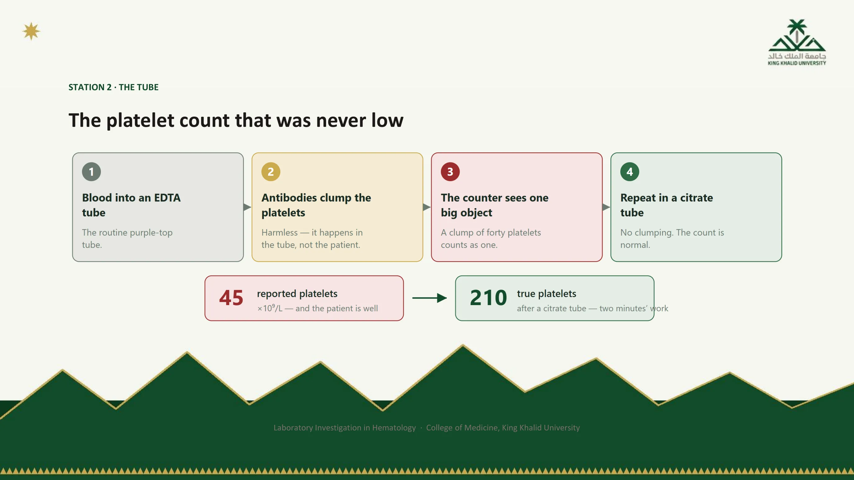
Four steps from a purple tube to a false number
The figure draws the mechanism as a chain, and the chain is worth being able to reproduce from memory. Blood goes into the EDTA tube. Antibodies clump the platelets, harmlessly, in the tube and not in the patient. The counter sees one big object where there were forty. A repeat in citrate removes the clumping and the count is normal.
The two numbers at the bottom make the stakes concrete. A reported count of 45 in a well patient became a true count of 210 after two minutes' work with a different tube. Every step of the cascade on slide 13, the cancelled surgery, the referral, the steroids, would have been built on a specimen artefact.
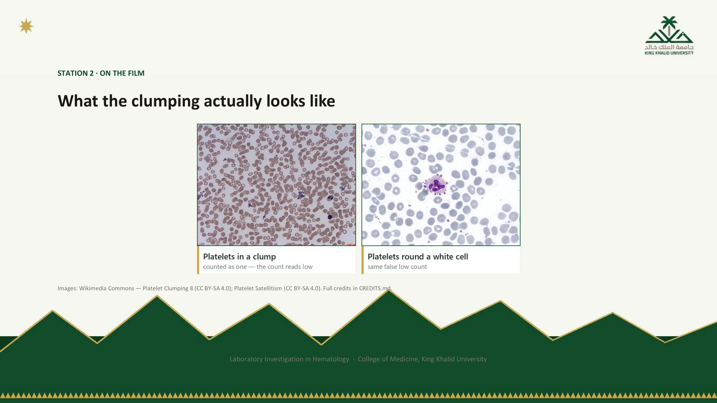
The artefact, seen
On the left, a heap of platelets stuck together at the edge of the film. The analyser saw this as a single large particle. On the right, a rarer version of the same phenomenon: platelets arranged in a rosette around a neutrophil, called platelet satellitism, also EDTA-dependent and also producing a falsely low count. Both are obvious at low power to anyone who looks, and invisible to anyone who reads only the number.
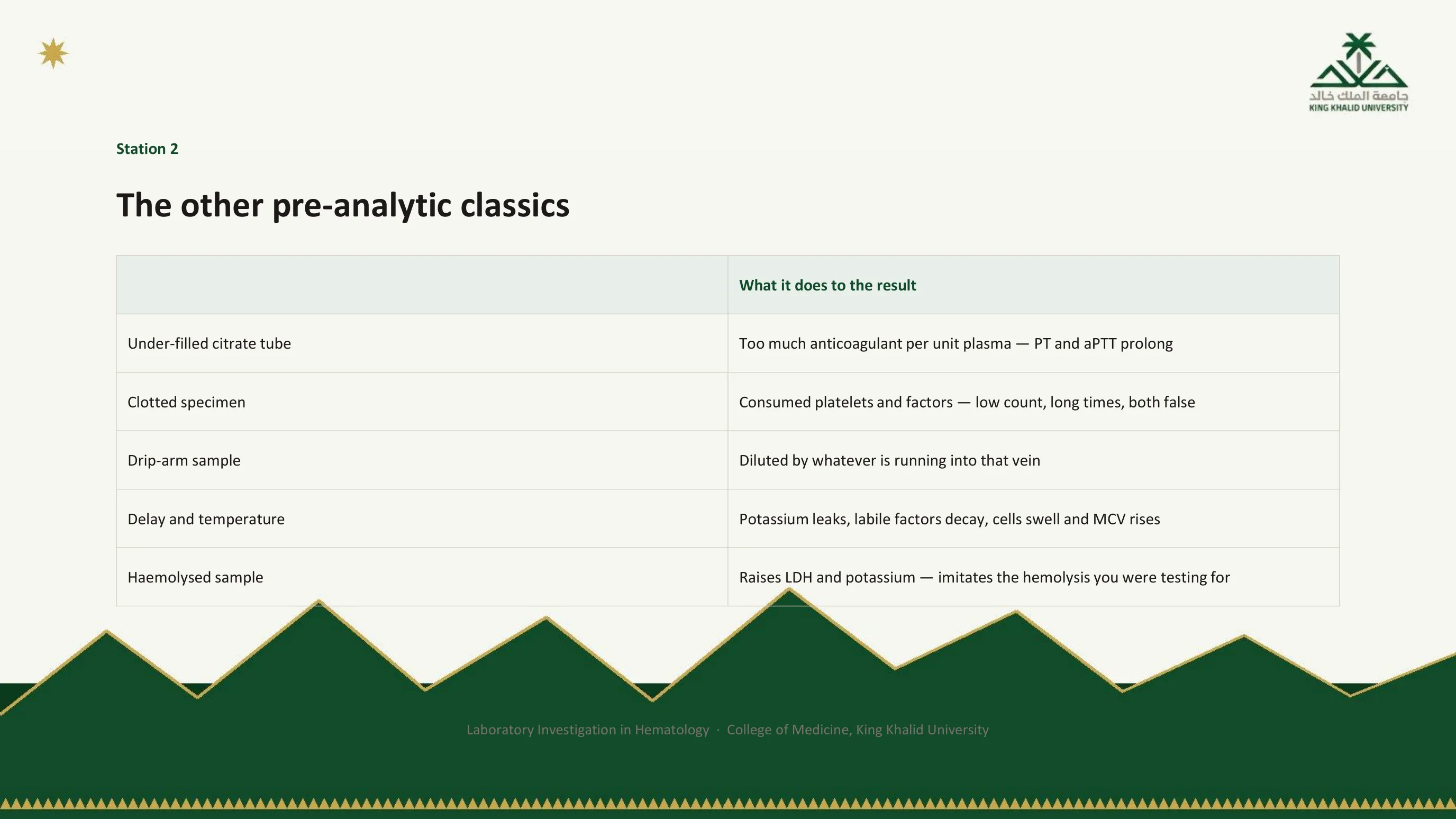
Five more ways the tube betrays the number
Pseudothrombocytopenia is the most instructive station 2 error, not the commonest. The table lists the everyday ones, and each is a specimen that the machine will measure faithfully. An under-filled citrate tube leaves too much anticoagulant for too little plasma, so the PT and aPTT prolong; slide 22 explains the same physics from the other direction. A clotted specimen has consumed its platelets and clotting factors before the analysis, giving a low count and long times, both false. A drip-arm sample is diluted by whatever is running into that vein. Delay and warmth let potassium leak out of cells, labile factors decay, and cells swell so that the MCV rises. A hemolysed sample releases free hemoglobin that raises the LDH and the potassium and imitates the very hemolysis you may have been testing for.
The common thread is that none of these looks wrong on the report. They are found by asking, whenever a result does not fit the patient, how the sample was taken and how long it waited.
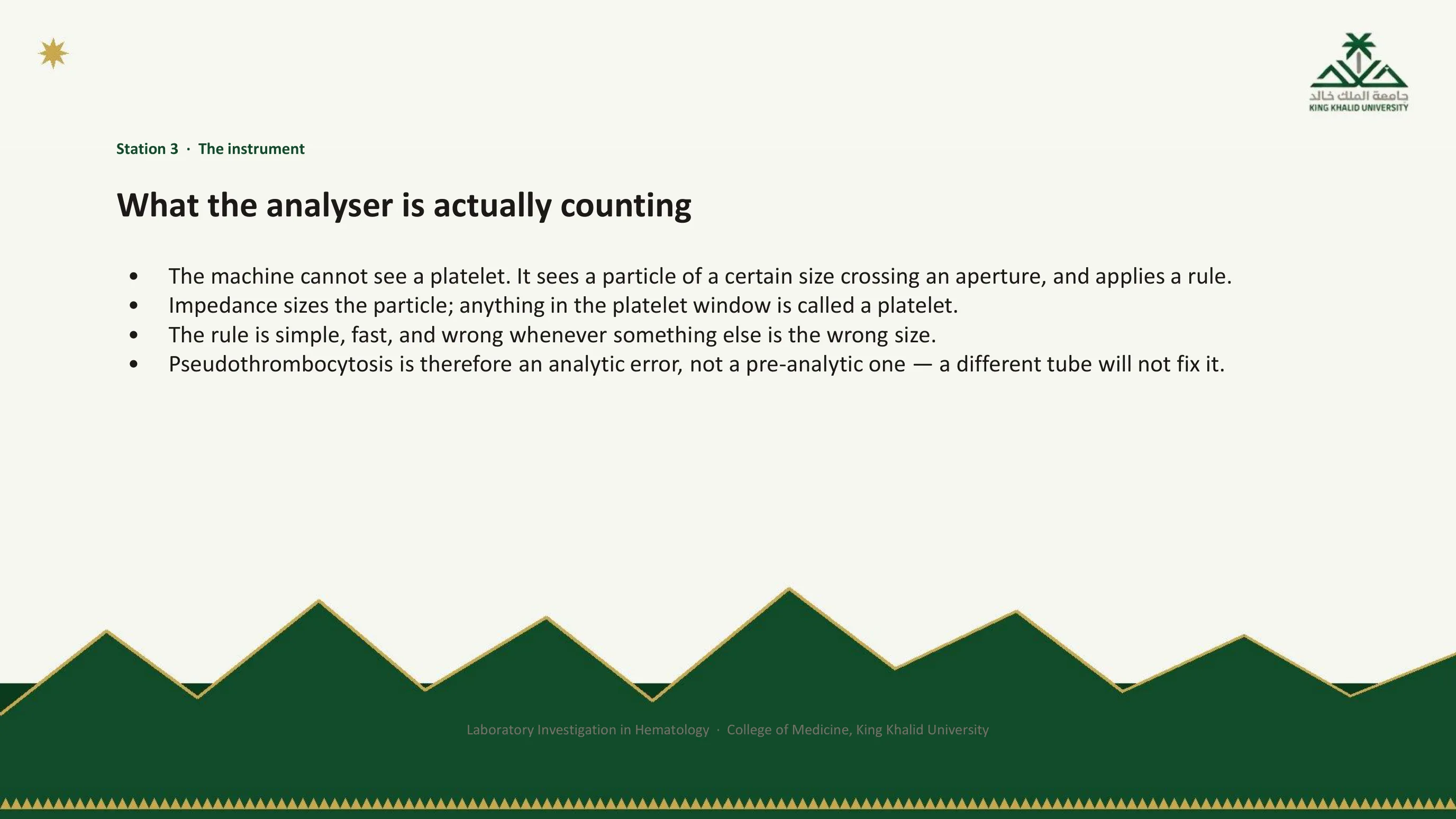
Station 3: the right sample, the wrong counting rule
A hematology analyser has never seen a platelet. What it sees is a particle of a certain size passing through a small aperture, and it applies a rule: anything whose size falls in the platelet window is called a platelet, anything in the red cell window a red cell. The sizing is done by impedance, a cell crossing the aperture briefly raising the electrical resistance, with the height of that pulse taken as the size of the cell.
The rule is simple, fast, and wrong whenever something else in the blood happens to be the wrong size. That is station 3, and it must be distinguished from station 2 because the fix is different. In pseudothrombocytopenia the tube was at fault, and a different tube corrected it. In pseudothrombocytosis, a falsely high count, the tube and the specimen were fine and the rule was wrong. Repeating the sample in another tube will not help. Only the film will tell you what those particles really were.
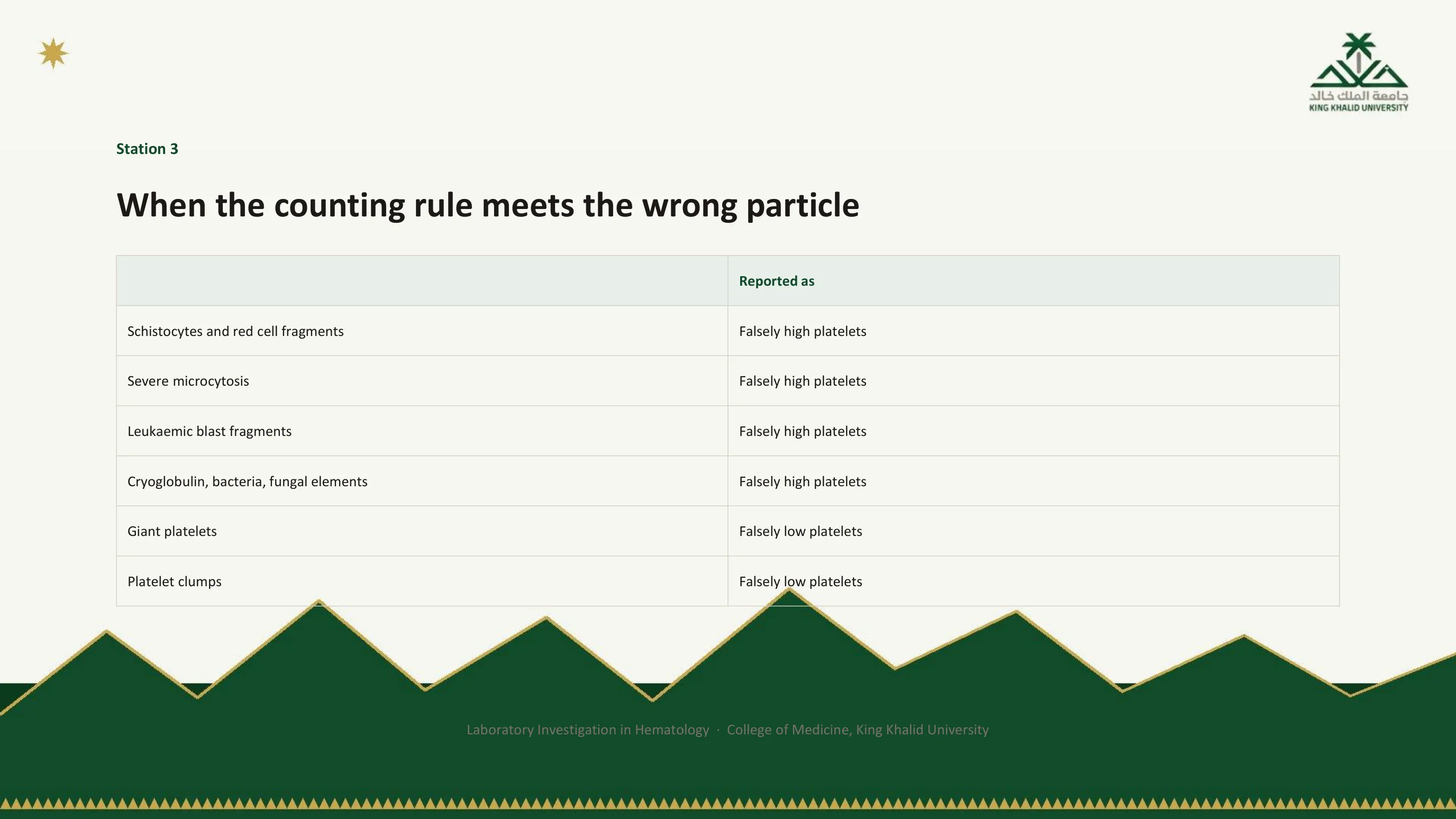
Six particles the rule was not written for
The table reads in two directions. Anything small enough to fall into the platelet window is counted as a platelet, so red cell fragments in a microangiopathy, the very small red cells of severe microcytosis as in marked thalassemia, debris from leukemic blasts, and particles that are not cells at all, cryoglobulin, bacteria or fungal elements, each inflate the count. Anything too large for the window is not counted as a platelet, so giant platelets are filed as red cells and the count falls; platelet clumps, already met at station 2, do the same.
The clinical danger is on the first four rows. A patient with thrombotic thrombocytopenic purpura, whose true platelet count is critically low, can have that count propped up by the schistocytes the disease itself produces. The analyser usually flags such samples. Treat the flag as a request for a film, not as a footnote.
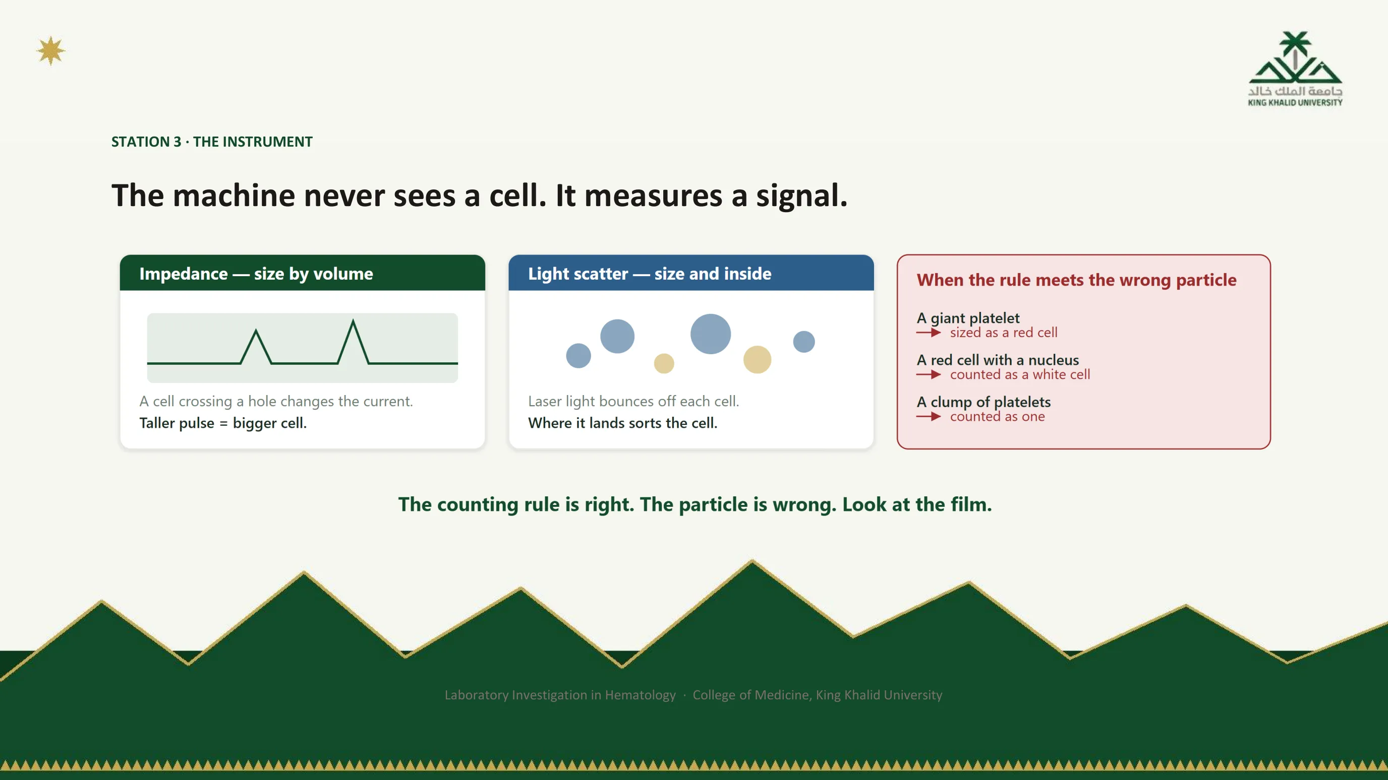
Two ways of measuring, and three particles that fool them
The left panel is impedance: the pulse drawn there is the signal the machine actually records, and its height is the only thing the machine knows about the cell's size. The middle panel is light scatter: a laser strikes each cell and the angles at which the light bounces sort the cell by size and by what is inside it. Neither method involves looking at a cell. Both measure a signal and apply a rule.
The red panel shows three ways the rule meets the wrong particle. A giant platelet is sized as a red cell. A red cell that still has its nucleus is counted as a white cell, because the machine identifies white cells by the presence of a nucleus. A clump of platelets is counted as one. In each case the rule did exactly what it was built to do; the particle was the problem. The footer gives the only remedy: look at the film.
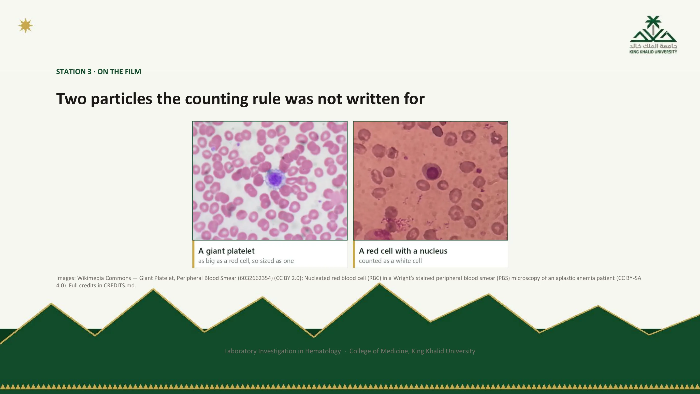
The wrong particles, seen
On the left, a platelet the size of the red cells around it. To an impedance counter it is a red cell, and every one like it is a platelet missing from the count. On the right, a red cell that has kept its nucleus, released early from a marrow under stress. To the analyser a nucleus means a white cell, so nucleated red cells inflate the white count until the laboratory corrects for them. Both are read in seconds down a microscope, which is why the film is the cheapest audit of the analyser you will ever order.

A question for you, and a mechanical answer
Why do patients with polycythemia, especially extreme polycythemia, have falsely prolonged PT and aPTT? Work it out before reading on; the answer is entirely mechanical once you see it.
A coagulation tube is filled to a line with a fixed volume of sodium citrate, nine parts blood to one part citrate. Citrate works by binding calcium, and the assay later adds back a fixed dose of calcium to start the clot. But the citrate dissolves in the plasma, not in the whole sample. Raise the hematocrit and the plasma fraction shrinks, so the same citrate is now concentrated in less plasma. When the laboratory adds its calcium, part of it is consumed neutralising the excess citrate, less is left to drive the reaction, and the clot forms late.
The patient's coagulation is normal. The tube was wrong. This is station 2 again, and it matters in Abha more than in most places, because polycythemia at altitude is a routine finding: an isolated prolonged PT and aPTT in a polycythemic patient with no bleeding history is a specimen problem until proved otherwise.
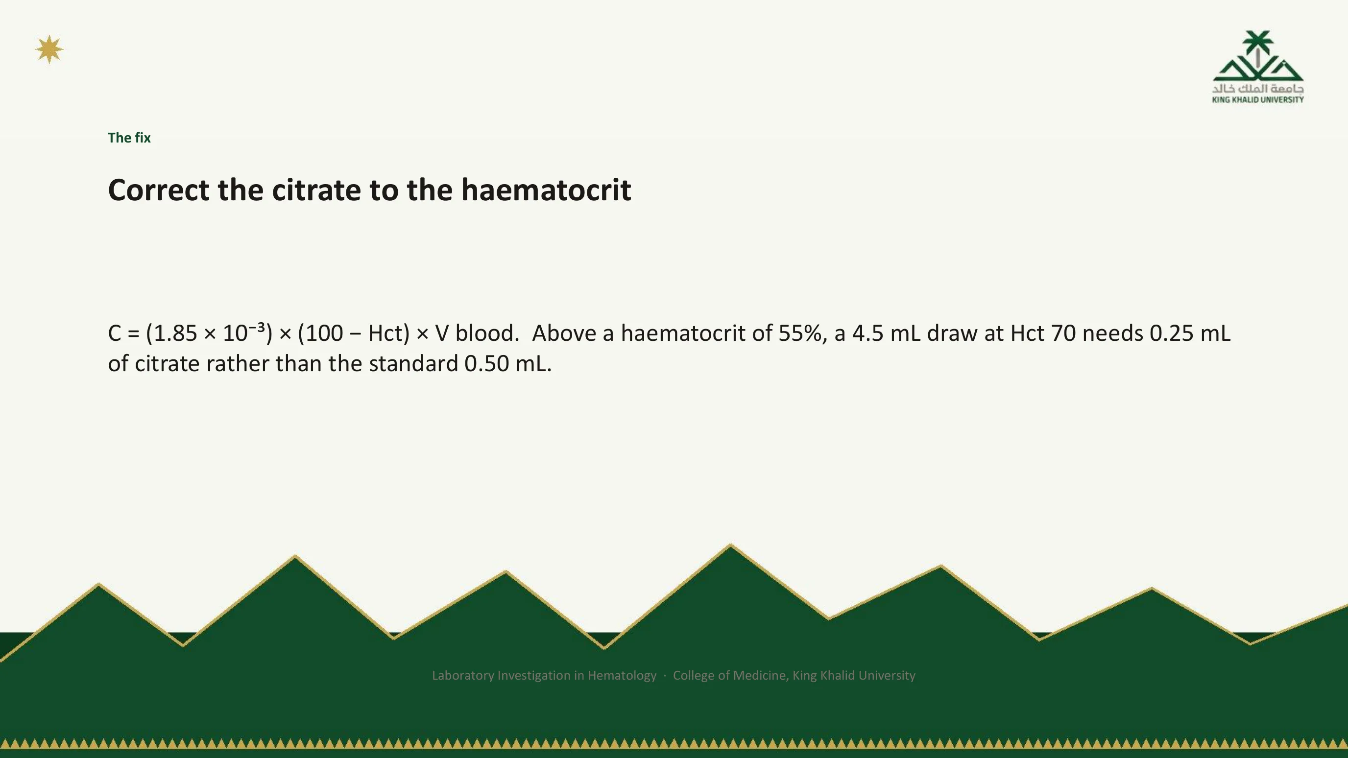
The fix: adjust the citrate, not the patient
The solution is to correct the volume of citrate to the patient's hematocrit, using the standard formula recommended for specimens above 55 percent. C is the volume of citrate in millilitres and V is the volume of blood drawn. Worked through for a hematocrit of 70 percent and a 4.5 mL draw, the tube needs 0.25 mL of citrate rather than the usual 0.50 mL. The correction is not a theoretical nicety; it demonstrably changes the results in high-hematocrit specimens.
In practice you do not calculate this at the bedside. You tell the laboratory the hematocrit and ask for a tube with the citrate adjusted, then redraw. What you must do at the bedside is recognise the situation: a prolonged coagulation screen in a polycythemic patient who does not bleed.

The two tubes
The figure is the argument of the last two slides in one picture. Both tubes hold the same volume of blood and the same fixed dose of citrate. In the normal tube 45 percent of the volume is cells and the citrate is spread through a generous plasma layer. In the polycythemic tube 70 percent is cells, the plasma layer is thin, and the same citrate is now too concentrated for it. The analyser receives an over-anticoagulated plasma and reports long clotting times that came from the tube, not the patient. The yellow box gives the fix and the threshold: correct the citrate above a hematocrit of about 55 percent.
Station 4: someone else's normal
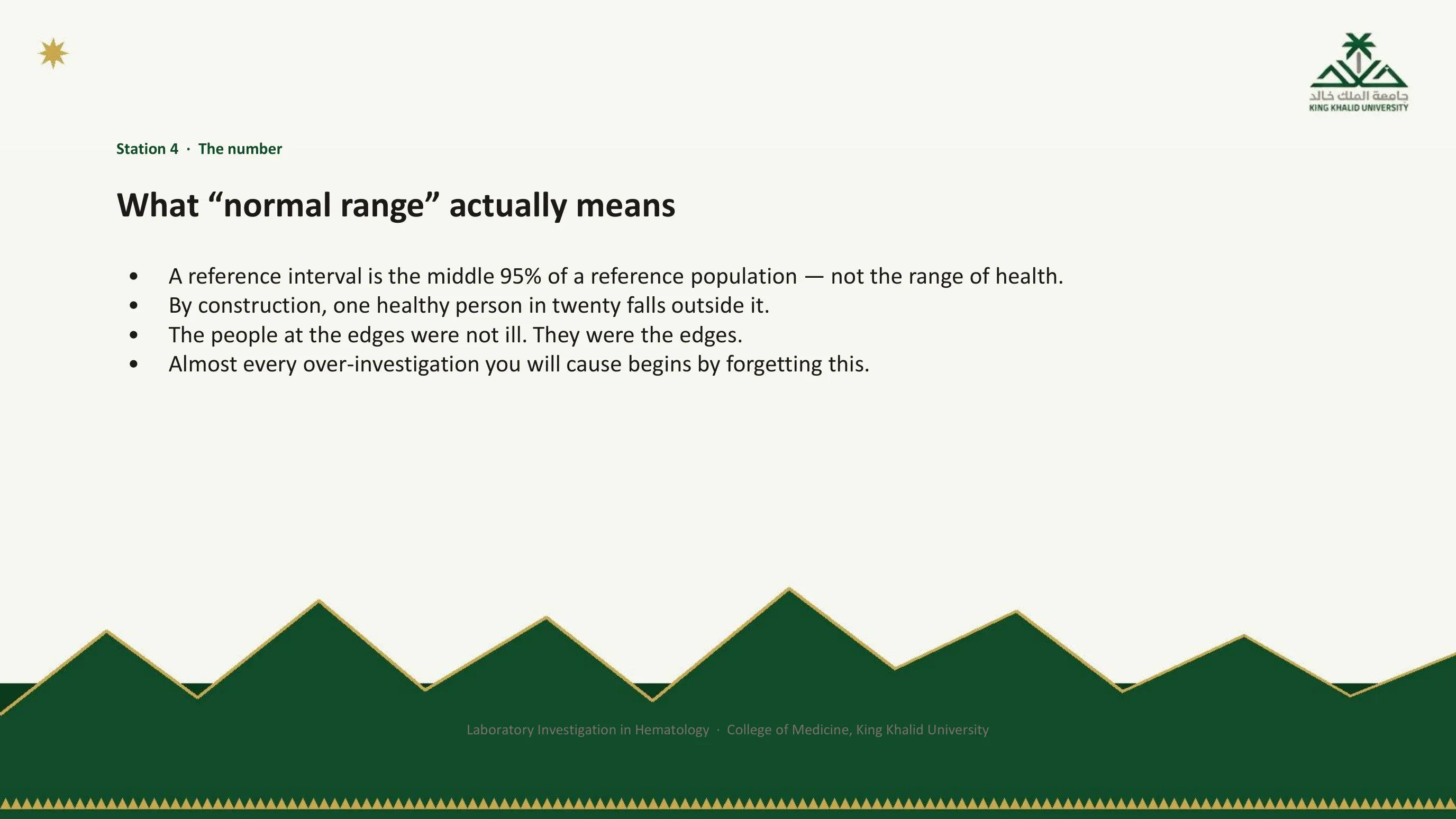
A reference interval is not the range of health. It is the middle 95 percent of a reference population. It was built by measuring a group of apparently healthy people, discarding the top 2.5 percent and the bottom 2.5 percent of their results, and printing what remained. It follows, by construction and not by accident, that one healthy person in twenty falls outside it. The people at the edges were not ill. They were the edges.
Read the last bullet twice. Almost every over-investigation you will ever cause begins by forgetting this: by treating a value just outside the printed range as an abnormality that must be explained, when it is the expected position of five percent of healthy people. The next slide shows what happens when you order twenty such values on one person.
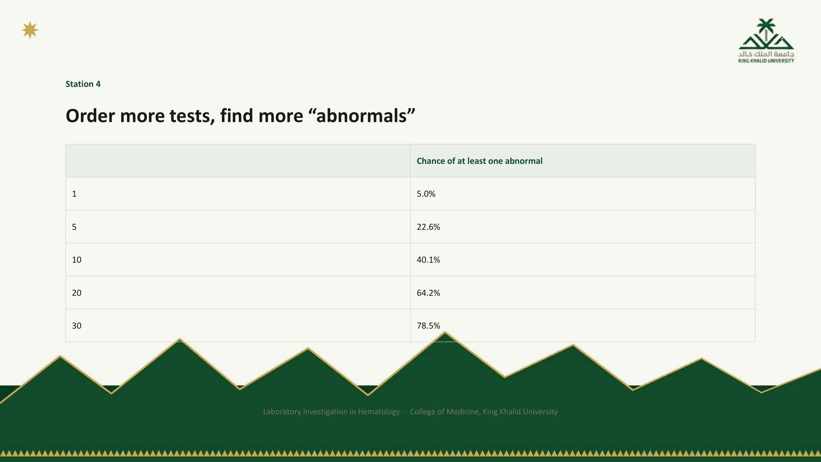
The arithmetic promised on slide 5
If each independent test has a five percent chance of flagging a healthy person, the chance that at least one flags rises quickly with the number of tests. One test, five percent. Five tests, nearly a quarter. Ten tests, forty percent. Twenty tests, and it is more likely than not that a perfectly well person will come back with something abnormal. Thirty tests, nearly four in five.
A comprehensive panel on a well person is therefore not a cautious act. It is a near-guarantee of at least one abnormal result that you will then be obliged to explain, and the cascade of slide 10 begins. This is what the second speaker on slide 5 was buying, and it is why the panel ordered without a question is called a loss.
The curve and the tails
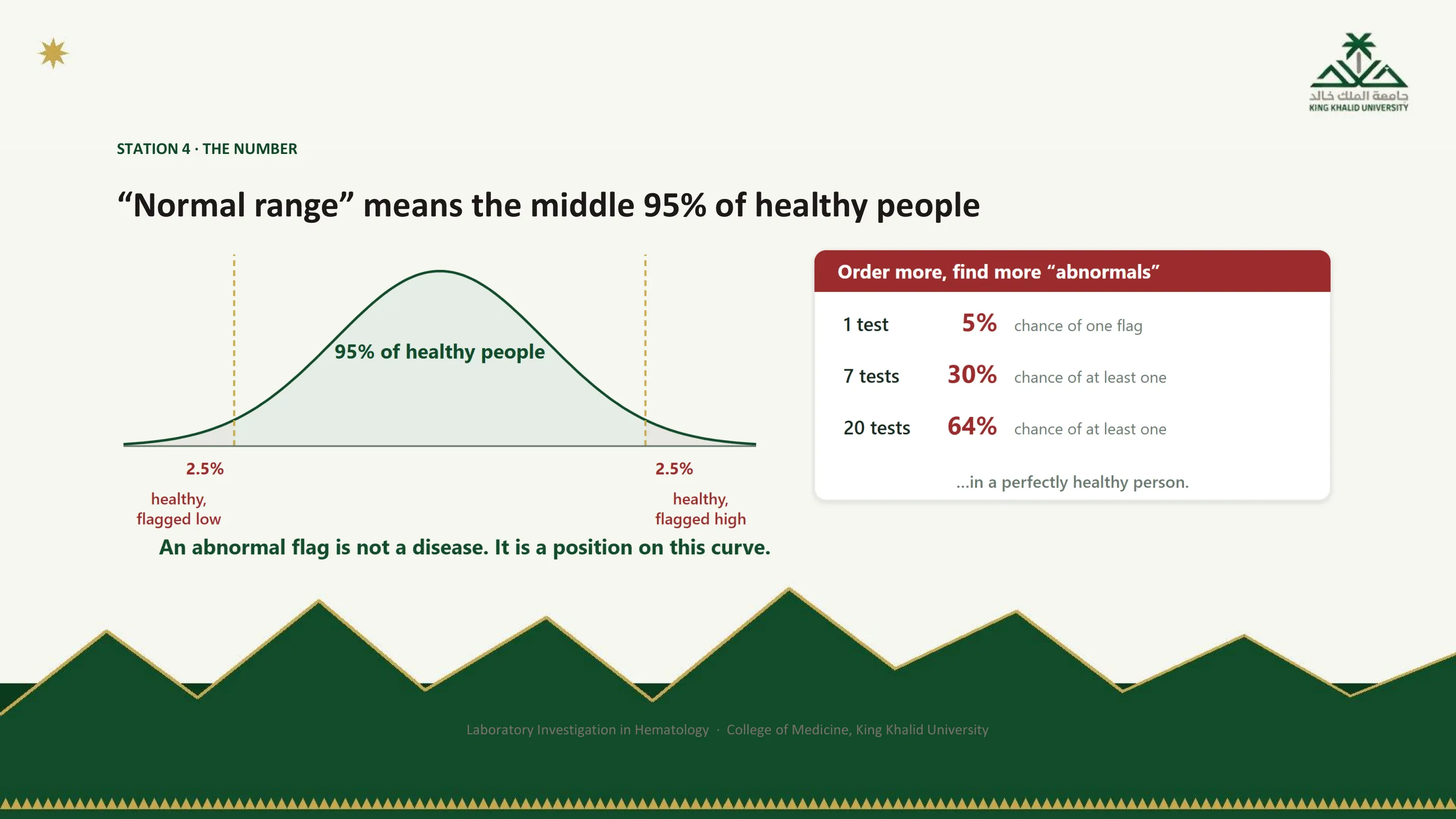
The bell curve is the reference population, and the shaded region is the interval: the middle 95 percent. The two tails, each 2.5 percent, are healthy people who will be flagged low and flagged high by any laboratory that applies this interval. They are not a rounding error; they are part of the definition. The box on the right repeats the multiplication of the previous slide for one, seven and twenty tests.
The caption is the sentence to keep. An abnormal flag is not a disease. It is a position on this curve, and before you chase it you should ask how many other positions you sampled at the same time.

Whose normal?
The 95 percent was measured in somebody, and every reference interval silently carries the conditions of the people it was measured in: their age, their sex, their ancestry, their physiological state, their environment. Change any of those and the interval may no longer describe the patient in front of you.
The clearest local example is the neutrophil count. Isolated neutropenia, judged by the interval printed on most reports, is common in this region, and in a large proportion of those people it reflects a benign constitutional pattern rather than any disease. The department's own study of its prevalence at altitude is among the sources at the end of the deck. Applying an interval derived elsewhere to these patients converts a normal person into a hematology referral, with a marrow examination waiting at the end of the cascade. The next slide takes the same argument to the number that matters most in Abha, the hemoglobin.
Where you are standing
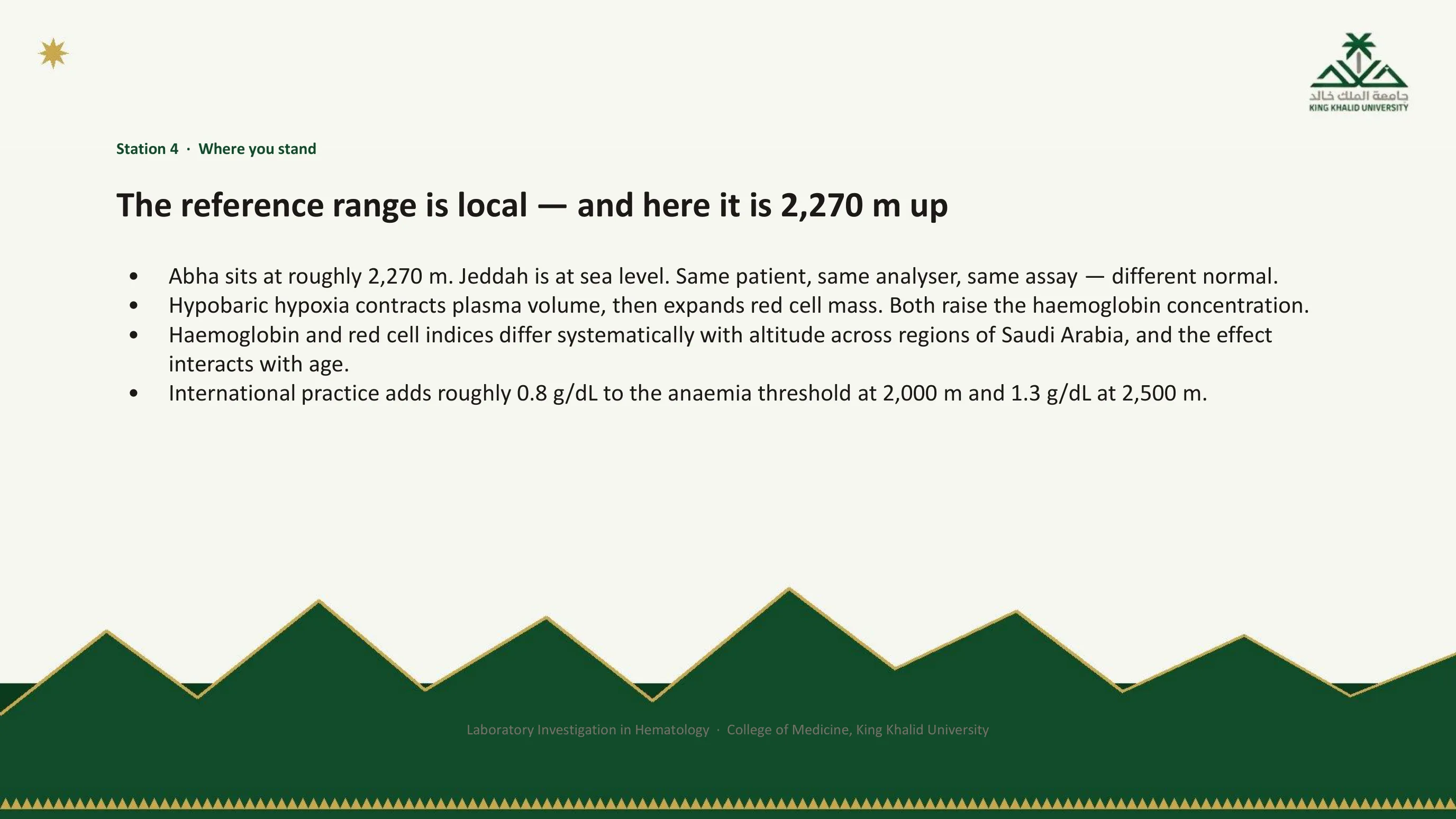
Abha sits at roughly 2,270 metres. Jeddah is at sea level. The same patient, the same analyser, the same assay, and a different normal, because the body at altitude is different. Hypobaric hypoxia first contracts the plasma volume, which raises the hemoglobin concentration within days, and then drives an erythropoietin-mediated expansion of the red cell mass, which raises it further over weeks and months.
The department's comparison of adults across regions of Saudi Arabia found that hemoglobin and red cell indices differ systematically with altitude, and that the effect interacts with age, so an older resident at altitude is described neither by a sea-level interval nor by a young-adult one. International practice acknowledges this with a correction, adding roughly 0.8 g/dL to the anemia threshold at 2,000 m and 1.3 g/dL at 2,500 m. A generic correction is better than none. Measuring your own population is better still, and the next slide shows what that measurement found.
The measurement, and the row that matters
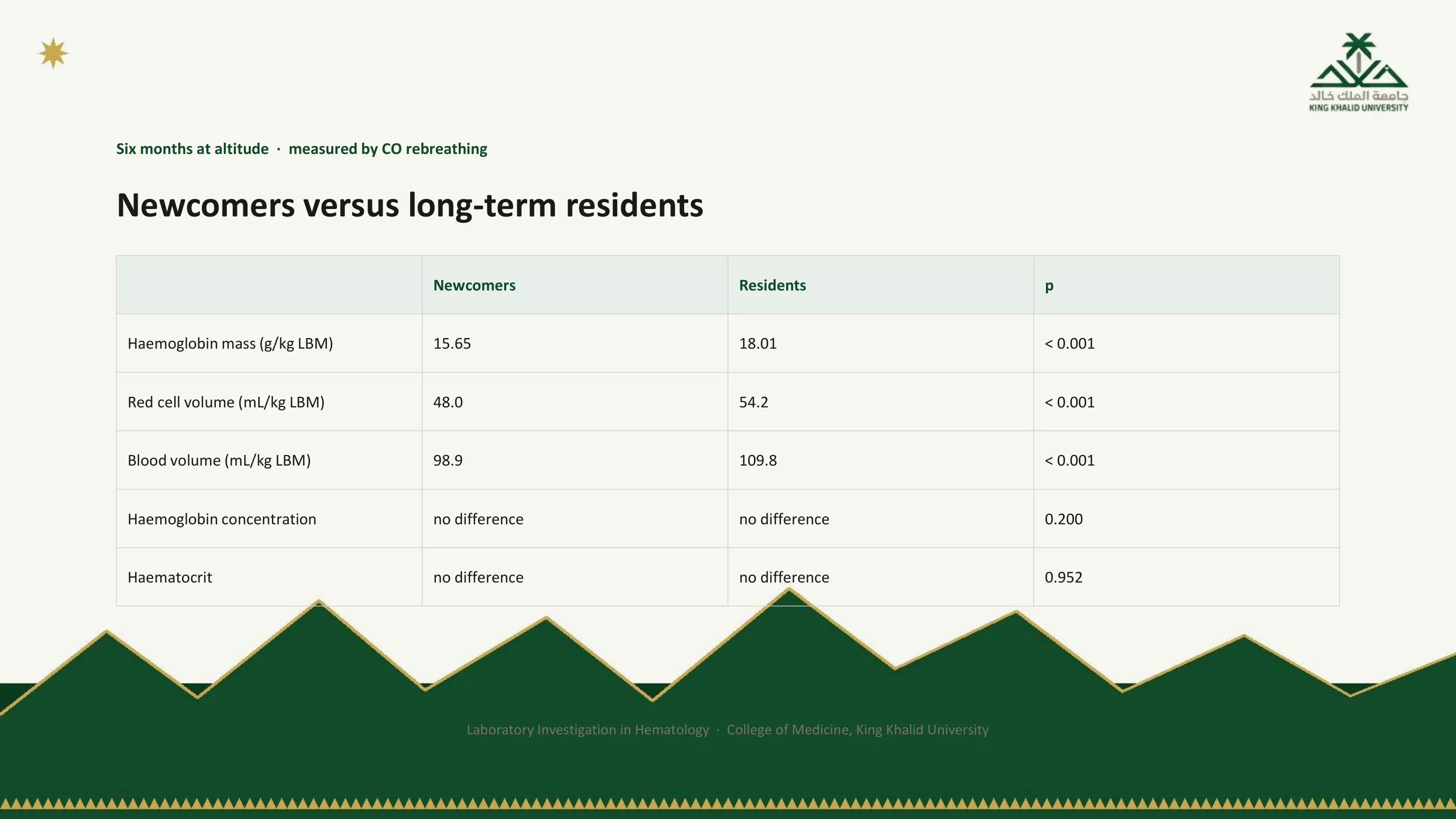
Carbon monoxide rebreathing measures hemoglobin mass and blood volume directly, rather than inferring them from a concentration. Using it, healthy men who had moved to Abha from sea level were followed for six months and compared with long-term residents. After six months the residents still had substantially more hemoglobin mass, more red cell volume and more blood volume per kilogram of lean body mass, and every one of those differences was highly significant.
Now read the last two rows. Hemoglobin concentration: no difference. Hematocrit: no difference. The two groups differed by about 13 percent in the quantity of hemoglobin they carried, and the routine blood count could not tell them apart. The next slide says why.
You are being shown a ratio and thinking about a mass
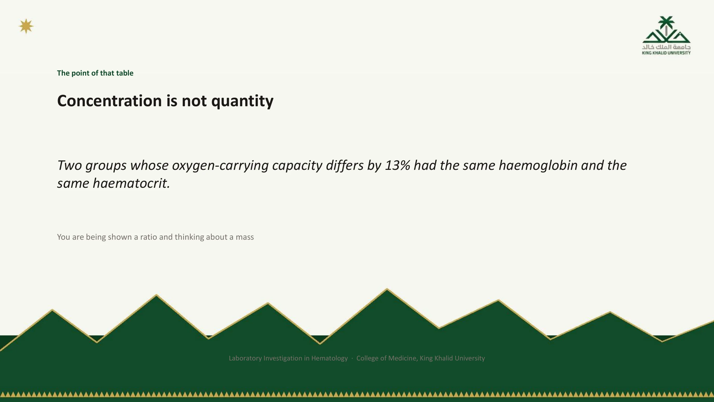
Hemoglobin concentration and hematocrit are ratios: red cells to plasma. A ratio moves when its numerator changes, and it moves just as readily when its denominator changes. Plasma contraction, from a diuretic, from dehydration, or from altitude itself, raises the concentration without adding a single red cell. Plasma expansion, in heart failure, renal disease or pregnancy, lowers it without destroying one. The residents in the table had more red cells and more plasma, and the ratio came out the same.
This is station 4 at its most consequential, and it has a practical consequence at this altitude: over-diagnosis. Physiological polycythemia in a resident of Abha overlaps the diagnostic thresholds written for sea level, and the published argument from this department for rethinking how polycythemia vera is screened for here rests exactly on that overlap. On a ward round the habit is simple. Before calling a hemoglobin high, ask what the plasma volume is doing. Before calling it low, ask the same. And before applying a threshold from a textbook, ask what altitude the textbook was written at.
The local range, and the study beside it
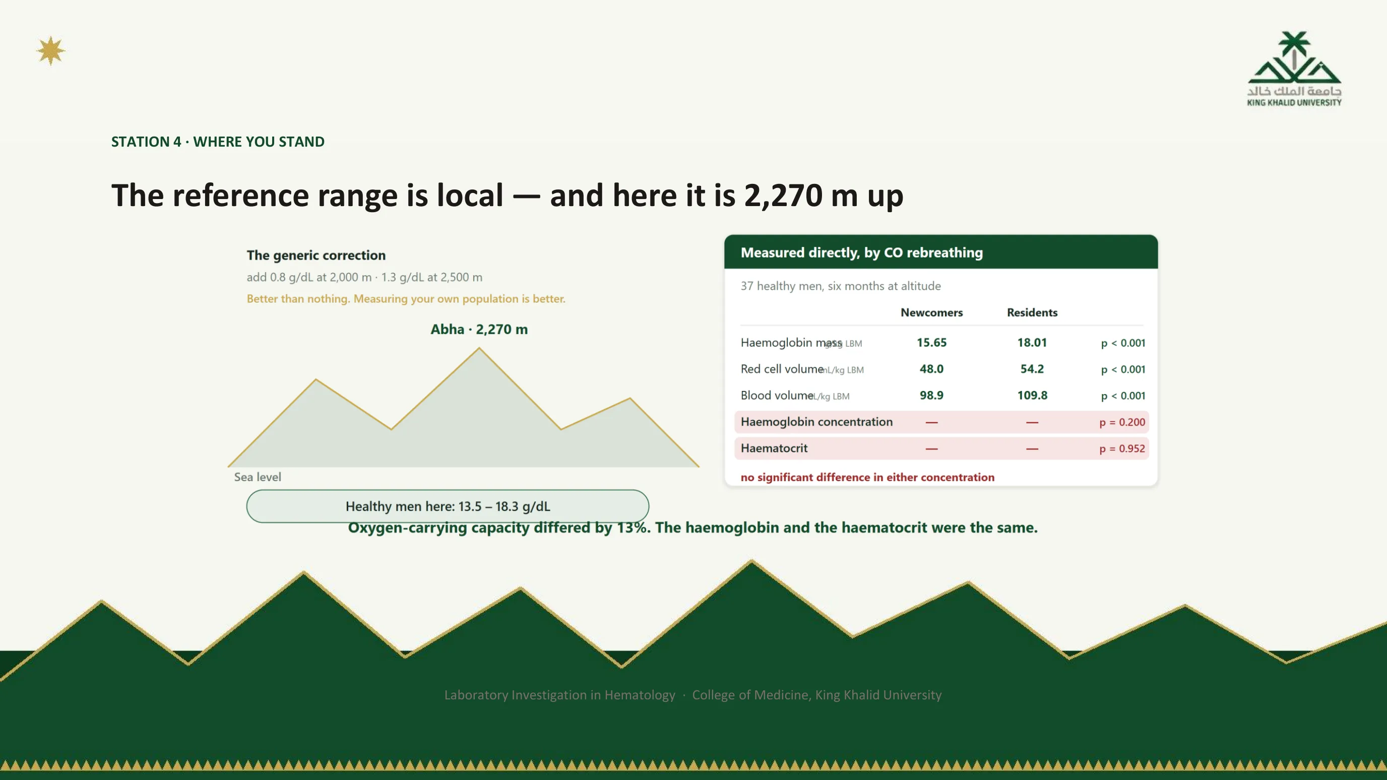
This figure carries the one number from the lecture you should actually memorise for practice here: the range for healthy men measured in Abha, 13.5 to 18.3 g/dL. Set it against the generic altitude corrections in the top left, which shift a sea-level threshold by less than a gram, and you see why a measured local interval is better than a borrowed one with an adjustment.
The right-hand panel is the rebreathing study of slide 30, now labelled with its cohort: 37 healthy men followed over six months. The three red-boxed rows are the concentrations that did not differ. The caption repeats the lesson because it is the lesson of the whole station: a 13 percent difference in oxygen-carrying capacity, invisible on a blood count.

Station 5: the four numbers
Station 5 is where the specimen, the instrument and the interval have all done their jobs and the error, if there is one, is in your head. Its vocabulary is four numbers, and the slide defines them with the direction each one reads.
Sensitivity is the proportion of people with the disease whom the test calls positive. A highly sensitive test misses few cases, so when it is negative it is good at ruling out. Specificity is the proportion of people without the disease whom the test calls negative. A highly specific test seldom flags the healthy, so when it is positive it is good at ruling in. Positive predictive value is the proportion of people who test positive who actually have the disease, and negative predictive value the proportion who test negative who are truly free of it. Both of the last two move with prevalence, and the next slide explains why that makes them a different kind of number altogether.
Two distinctions that prevent most interpretive errors
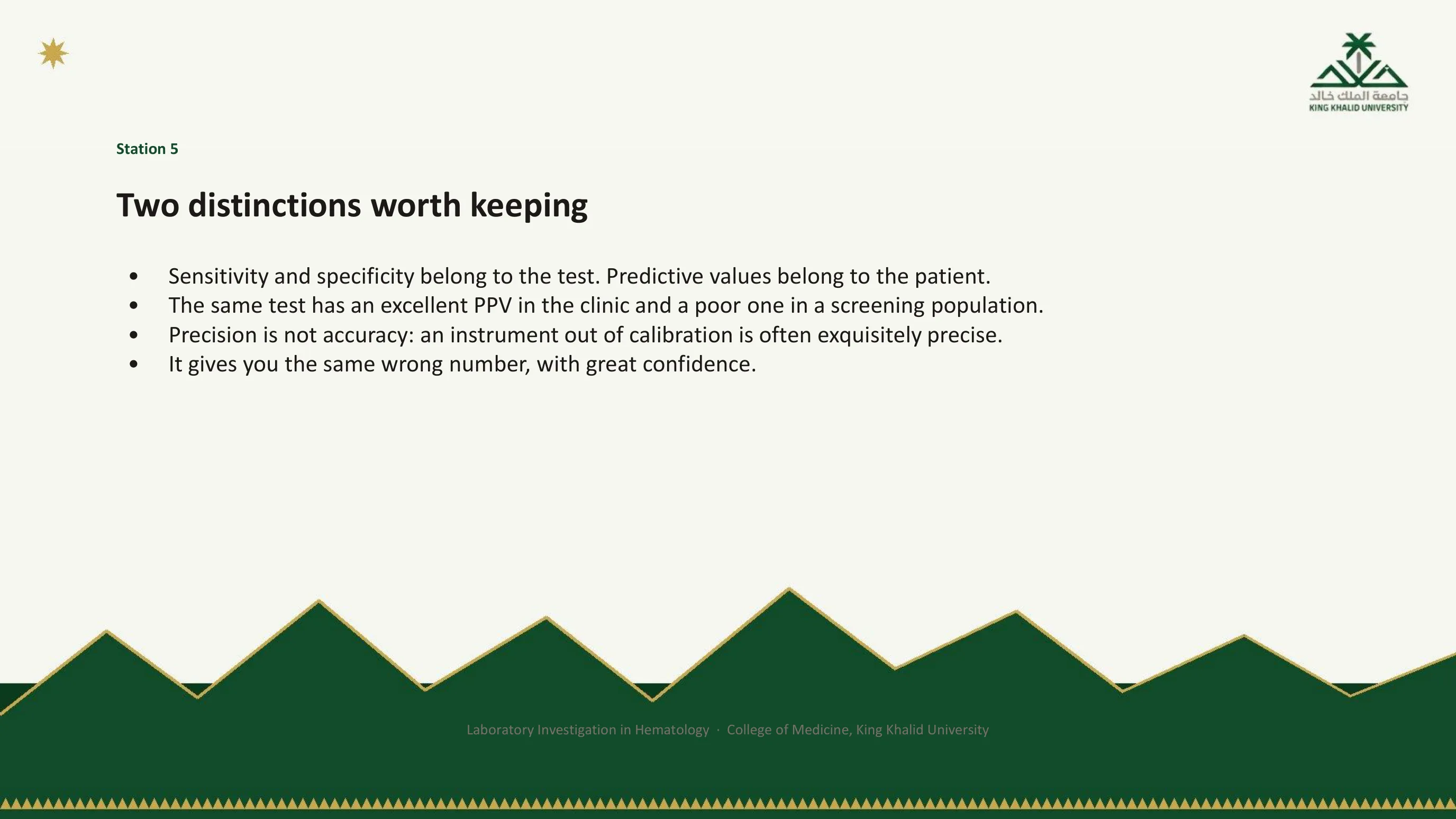
The first is the commonest error in laboratory reasoning. Sensitivity and specificity are properties of the assay. They were measured once, they are printed in the package insert, and they do not change when you carry the test to a different clinic. Predictive values are properties of the situation, because they depend on how common the disease is among the people being tested. The identical test, with identical sensitivity and specificity, has an excellent positive predictive value in the hematology clinic, where most patients referred with a suspicious count do have something, and a poor one in a well-person screen, where almost nobody does. A test that performs beautifully in one setting is actively misleading in the other.
The second distinction is about the instrument. A precise assay gives the same answer every time. An accurate assay gives the true answer. An analyser that has drifted out of calibration is often exquisitely precise: it gives you the same wrong number, with great confidence. Internal quality control exists to catch exactly this, and it is another reason a result that does not fit the patient deserves suspicion rather than deference.
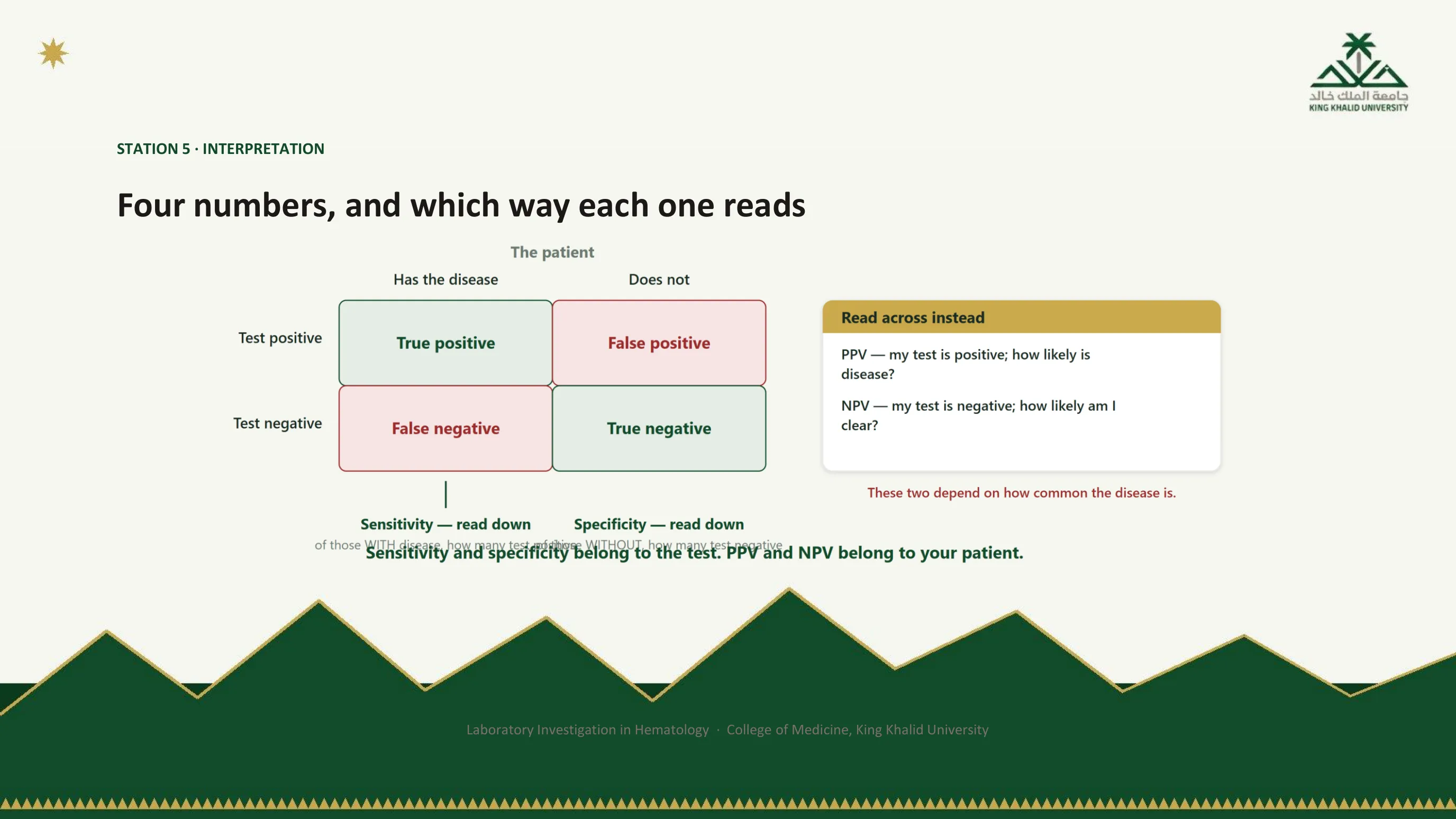
Down for the test, across for the patient
The two-by-two table is the tool for keeping the four numbers straight, and the figure marks the direction each is read. Sensitivity and specificity are read down the columns: start from the patient's true state, with the disease or without it, and ask how the test behaved. Those two proportions are fixed by the assay. Predictive values are read across the rows: start from the result in your hand, positive or negative, and ask how likely the disease is. Those two depend on how many people in the row came from the diseased column in the first place, which is the prevalence.
When you are handed a result, you are standing at the start of a row, not a column. That is why the numbers in the package insert are never quite the numbers you need, and why the next slide introduces the tool that converts one into the other.
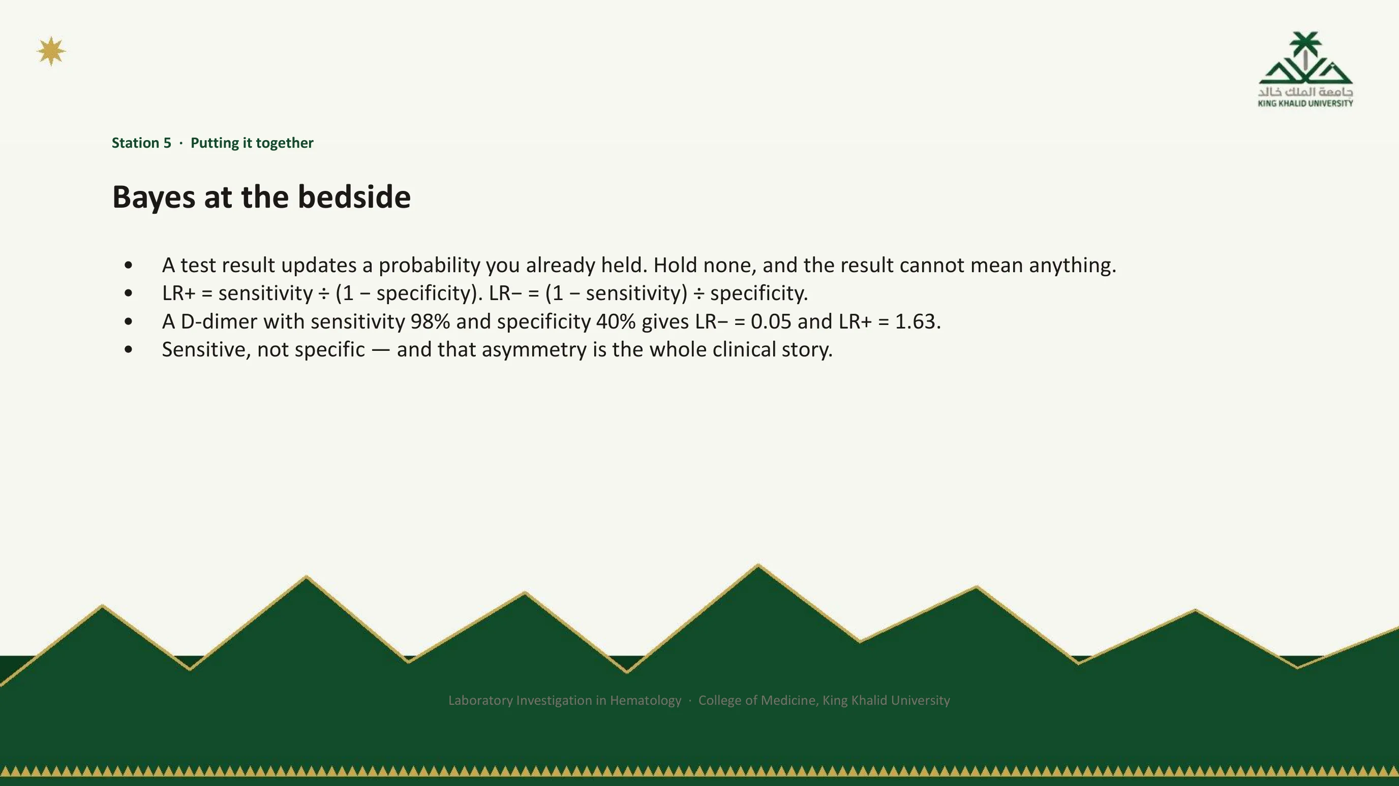
Bayes at the bedside
You do not need the algebra. You need one habit: a test result updates a probability you already held. If you held no probability before the test, the result cannot mean anything, which is slide 7 restated in the language of station 5. Thomas Bayes supplied the machinery and Fagan reduced it to a nomogram that fits in a pocket; its working form is the likelihood ratio.
The positive likelihood ratio, sensitivity divided by one minus specificity, is how much a positive result multiplies the odds of disease. The negative likelihood ratio, one minus sensitivity divided by specificity, is how much a negative result multiplies them. Take a D-dimer with a sensitivity of 98 percent and a specificity of 40 percent, realistic figures for a quantitative assay whose great sensitivity is bought at the price of specificity. The negative likelihood ratio is 0.05, a powerful divider. The positive likelihood ratio is 1.63, barely a multiplier at all. Sensitive, not specific, and that asymmetry, as the next two slides show, is the whole clinical story of the test.
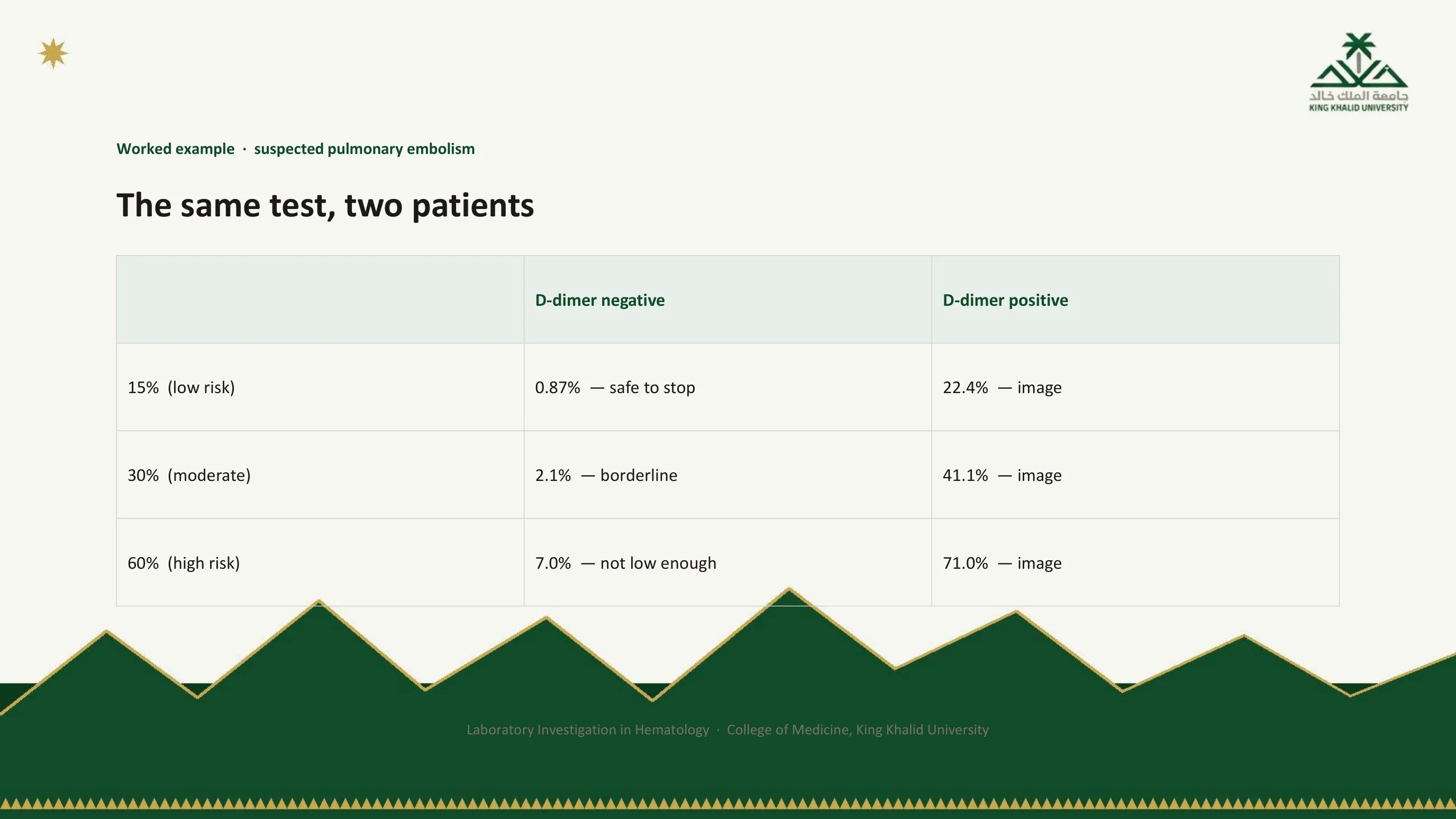
The same test, three patients
Put the D-dimer in front of three patients with suspected pulmonary embolism who differ only in the probability you assigned them before the test. In the low-risk patient, at 15 percent, a negative result drops the probability below one percent, and it is safe to stop. In the moderate-risk patient, at 30 percent, the same negative result leaves 2.1 percent, borderline. In the high-risk patient, at 60 percent, it leaves 7 percent, which is not low enough to discharge anyone with a possible embolus.
Read down the right-hand column too. A positive result at 15 percent gives 22 percent; at 60 percent, 71 percent. In every row the instruction is the same, image, because a positive D-dimer never settles anything by itself. The test did not change between the rows. The patient did. That is what it means to say that predictive values belong to the patient.

Why a positive D-dimer diagnoses nothing
The D-dimer detects fibrin degradation products, and fibrin is formed and broken down in far more situations than venous thrombosis: infection, malignancy, trauma, surgery, pregnancy, liver disease and simple old age all raise it. That is why its specificity is 40 percent and its positive likelihood ratio 1.63. A positive result means only "I could not rule this out". It is an instruction to image, never a diagnosis, and a patient should never be anticoagulated on the strength of it.
Two refinements follow directly from the same reasoning. Raising the threshold with age recovers specificity in older patients without losing safety, and tying the threshold to explicit clinical criteria formalises the pre-test probability instead of guessing it. Both are Bayes made practical: if you must use a test with poor specificity, spend more effort on the probability you bring to it.
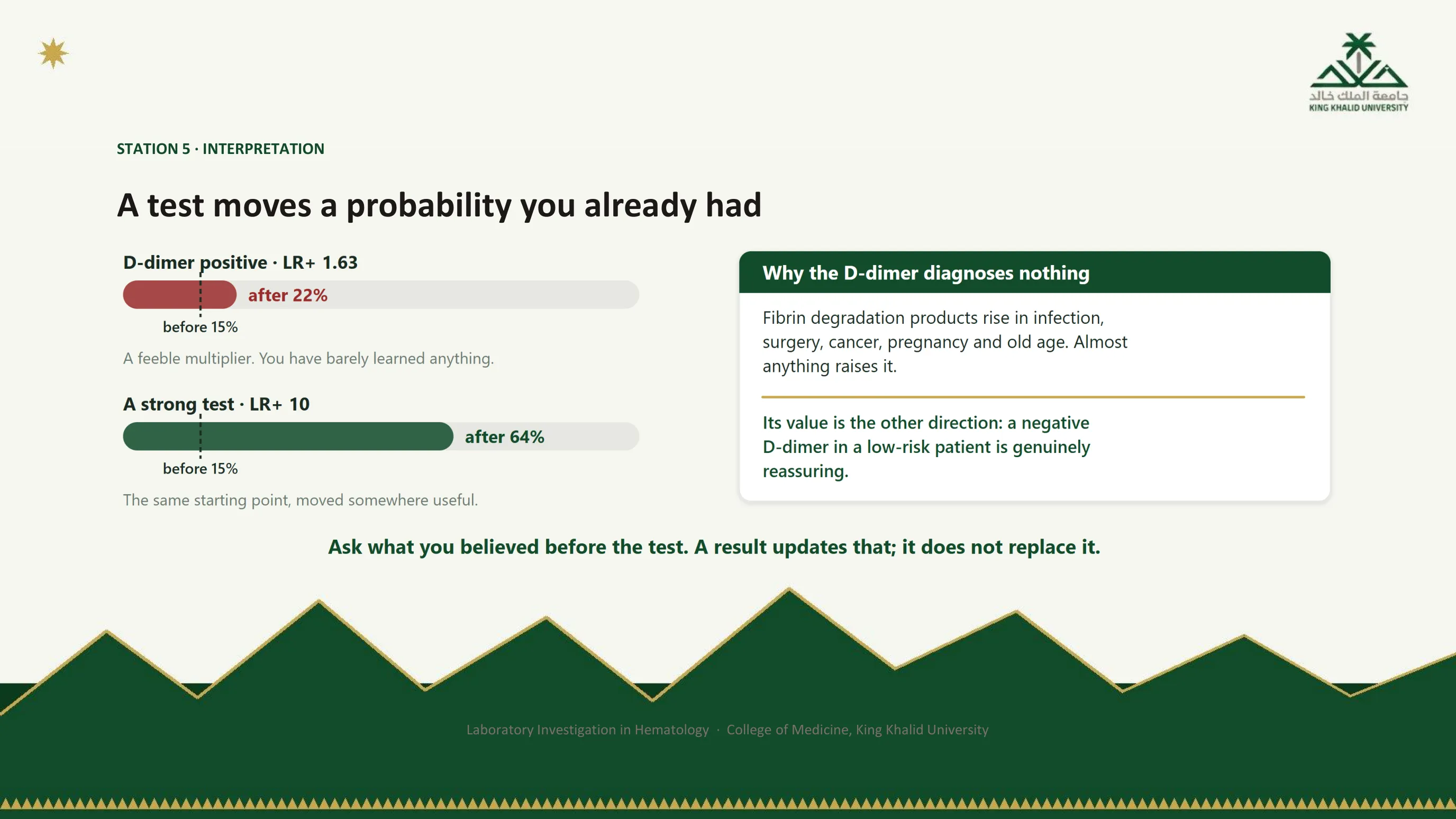
Two bars, one starting point
Both bars start at the same pre-test probability of 15 percent. The upper bar is the D-dimer: a positive result with a likelihood ratio of 1.63 moves the probability to 22 percent, and you have barely learned anything. The lower bar is a strong test with a likelihood ratio of 10: the same starting point moves to 64 percent, somewhere useful. The length of the move is the value of the test, and it is set by the likelihood ratio, not by whether the result reads positive.
The caption closes Part I where it began. Station 1 asked you to have a question before you ordered. Station 5 shows why: a result updates what you believed, and if you believed nothing there is nothing for it to update. Station 1 and station 5 are the same station, seen from opposite ends.

Part I in five lines
Each line is one station, and together they are the habit Part II will exercise. Order a test to answer a question you have already formed: station 1. When a result surprises you, ask which station failed rather than whether it is true: the framework. One healthy person in twenty falls outside any reference interval, by design: station 4. At 2,270 metres the normal range is genuinely different, and concentration is not quantity: station 4 where you stand. A result updates a probability and does not replace one: station 5.
Stations 2 and 3, the tube and the instrument, are folded into the second line, because the answer to "which station failed" is most often one of them, and the film is how you find out.
The tests themselves

Part II
Now the catalogue, but read through the same five stations. For every test that follows, ask what question it answers, what ruins the specimen, what rule the instrument applies, whose reference interval you are using, and what the result is worth once you have it. The tests are organised by the questions they answer, and the first slide of the part is the map.

The map: learn the question, not the panel
Hematology runs on a small number of panels, and each was built to answer exactly one question. Learn the question and interpretation stops being memorisation. The first group asks about the counts: is each cell line too high, too low or normal, are the cells the right size, and is the marrow responding? The blood count, the film and the reticulocytes answer it. The second asks about the causes of an abnormal count: is there enough iron, are red cells being destroyed, which hemoglobins are present? Iron studies, the hemolysis panel and electrophoresis answer it. The third is hemostasis: which arm of clotting is broken, and is a factor missing or blocked? The PT, aPTT, thrombin time and mixing studies. The fourth is transfusion and malignancy: can this unit be given safely, and what is this clone? Group and screen, the antiglobulin tests, immunophenotyping and genetics.
Part II follows this order. If you are ever unsure why a test is on a request form, find it on this map and read the question at the head of its column.

The map as four cards
The same four columns, drawn as cards so that the question sits above the tests rather than beside them. The colours recur in the figures that follow: green for the counts, gold for the causes, blue for hemostasis, red for transfusion and malignancy. The caption is the instruction for the rest of the lecture.
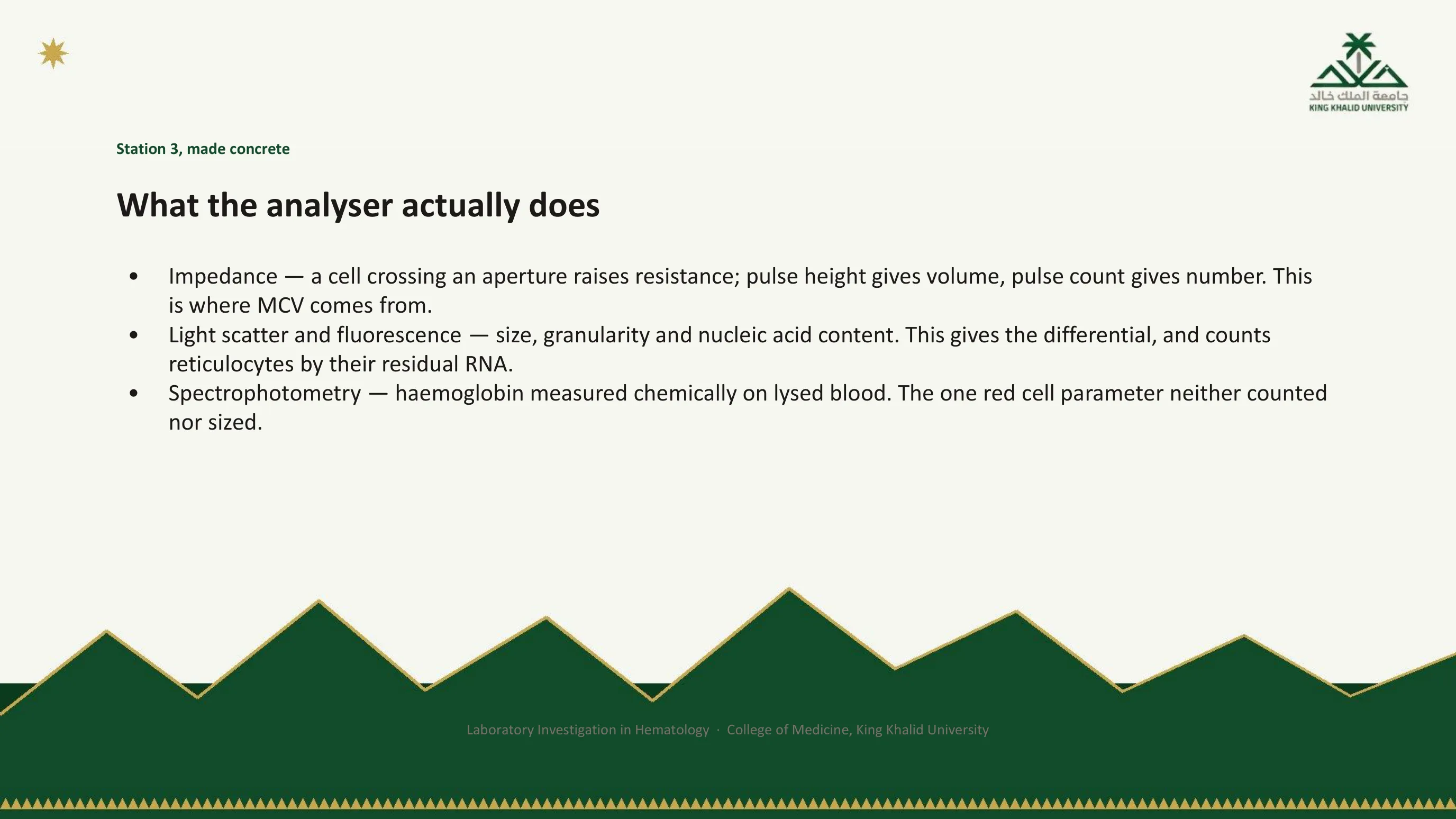
Station 3, made concrete
Part I said the instrument applies a rule. Here are the three rules. Impedance: cells suspended in a conductive fluid pass one at a time through a narrow aperture carrying a current, each briefly raising the resistance. The height of the pulse gives the cell's volume and the number of pulses gives the count. This is where the MCV comes from; it is measured directly, and the hematocrit is then calculated from it. Light scatter and fluorescence: a laser interrogates each cell. Forward scatter tracks size, side scatter tracks internal complexity and granularity, and fluorescent dyes bound to nucleic acid separate cells by how much RNA or DNA they carry. This is how the five-part differential is produced, and how reticulocytes are counted, since a reticulocyte is simply a red cell that still contains RNA. Spectrophotometry: hemoglobin is measured chemically, by light absorbance, on blood that has been lysed. It is the one red cell parameter that is neither counted nor sized.
Knowing which method produced a number tells you what can go wrong with it. Anything that interferes with light absorbance, lipaemia or free hemoglobin, corrupts the hemoglobin; anything of the wrong size corrupts the counts.
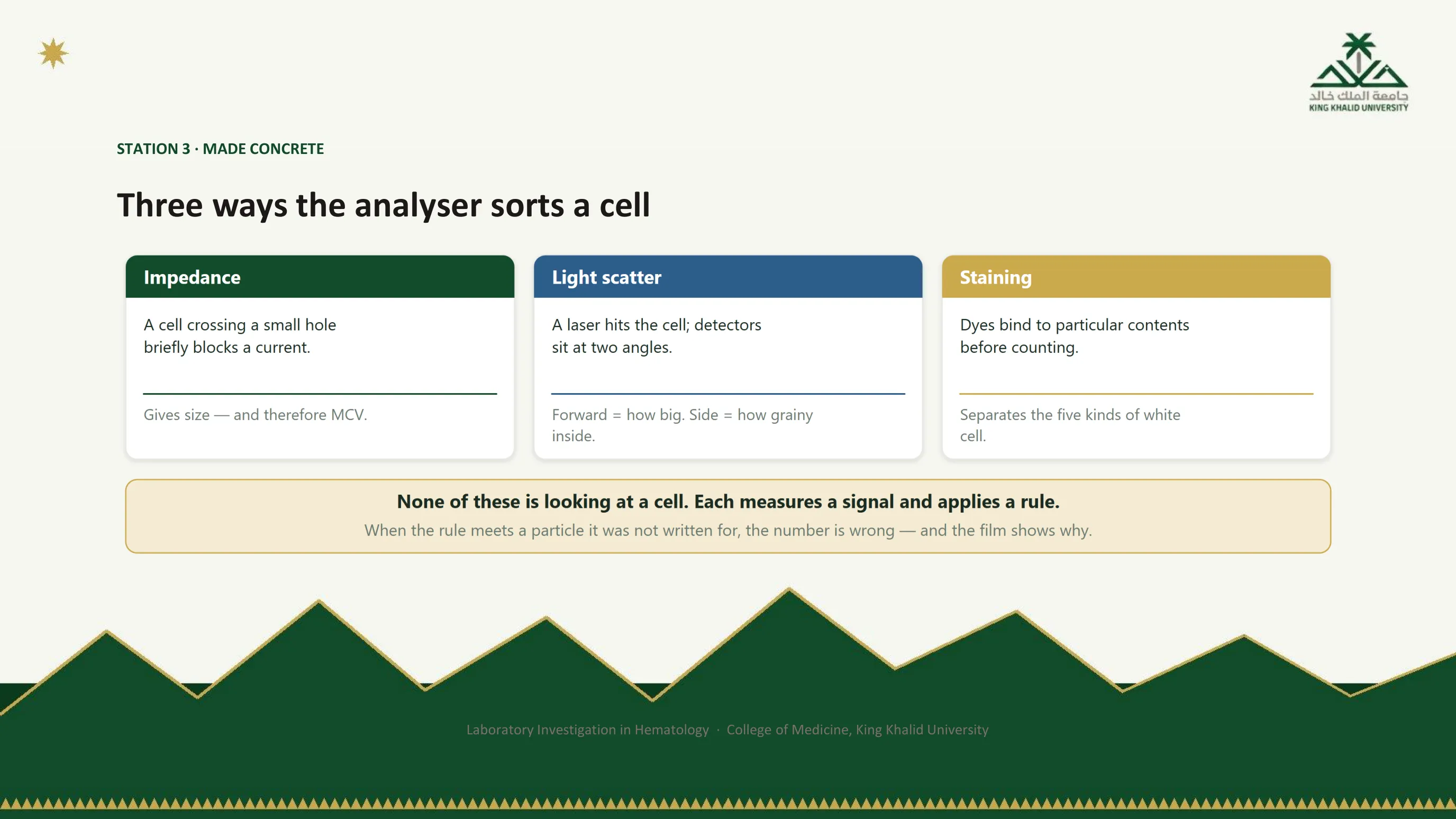
The three rules, side by side
Impedance for size, scatter for size and internal structure, staining for content. Between them they produce every number on a blood count, and the footer repeats the point of station 3 so that it is not forgotten in the catalogue: none of them is looking at a cell. Each measures a signal and applies a rule, and when the rule meets a particle it was not written for, the number is wrong and the film shows why.
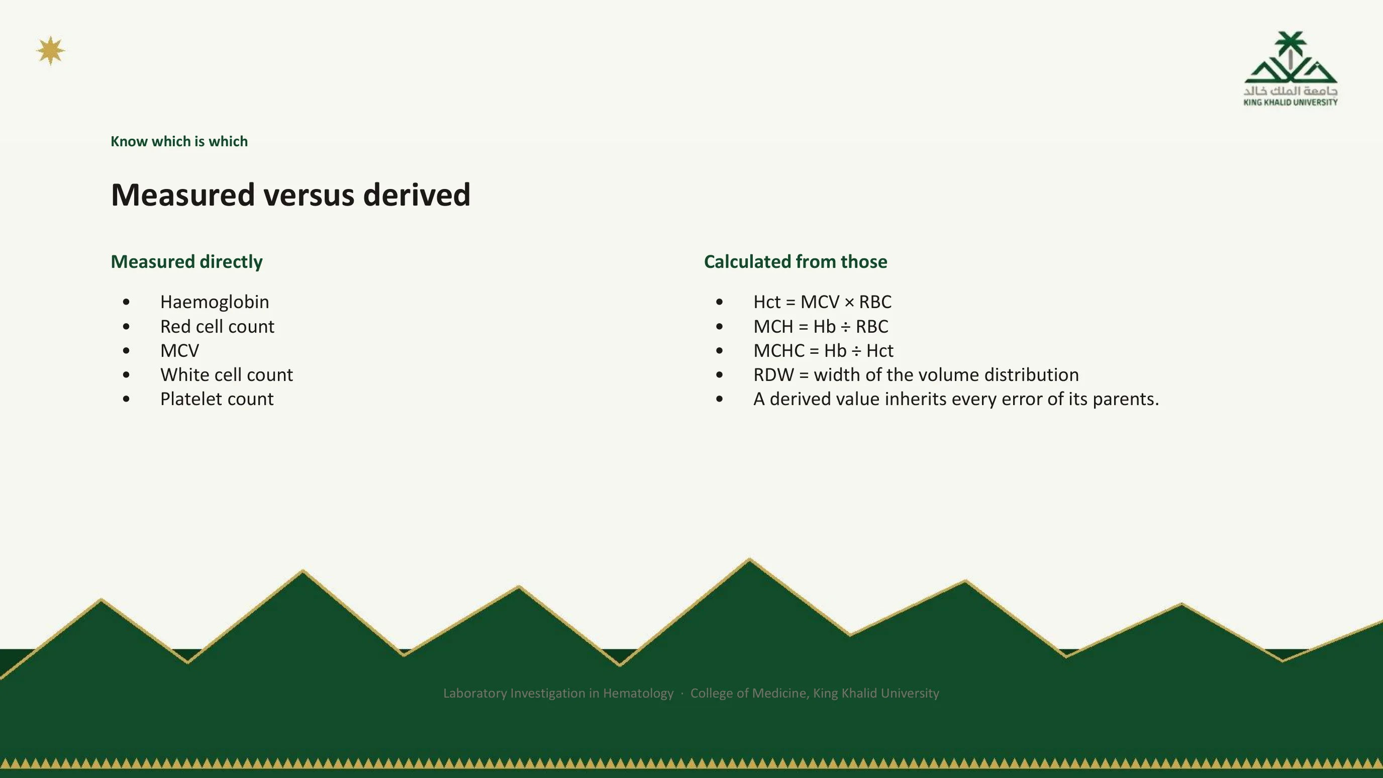
Know which numbers were measured and which were worked out
Five numbers on a blood count are measured: hemoglobin, red cell count, MCV, white cell count and platelet count. Everything else is arithmetic. The hematocrit is the MCV multiplied by the red cell count. The MCH is hemoglobin divided by red cell count. The MCHC is hemoglobin divided by hematocrit. The RDW is the width of the red cell volume distribution.
The last bullet is why this matters. A derived value inherits every error of its parents, so if the MCV is wrong the hematocrit is wrong too, and if the red cell count is wrong so are the MCH and the hematocrit. The useful consequence is the MCHC. Because it is a ratio of two measured quantities, an impossible MCHC, above about 36 g/dL, is one of the most reliable signals that something upstream has failed. It has three common causes: spherocytosis, where the cells genuinely are dense; cold agglutinins, where clumped red cells lower the count while the hemoglobin stays put; and lipaemia or free hemoglobin interfering with the optical measurement. Two of the three are specimen problems. An MCHC that cannot be true is a red flag, not a diagnosis, and the flag says station 2 or 3.

Measured on the left, worked out on the right
The figure reduces the previous slide to the two columns you should be able to reproduce. Notice that the hematocrit, which many clinicians treat as the primary measurement, is on the right. On a modern analyser it is a product of two other numbers, and the caption draws the consequence: if the MCV is wrong, the hematocrit is wrong too.
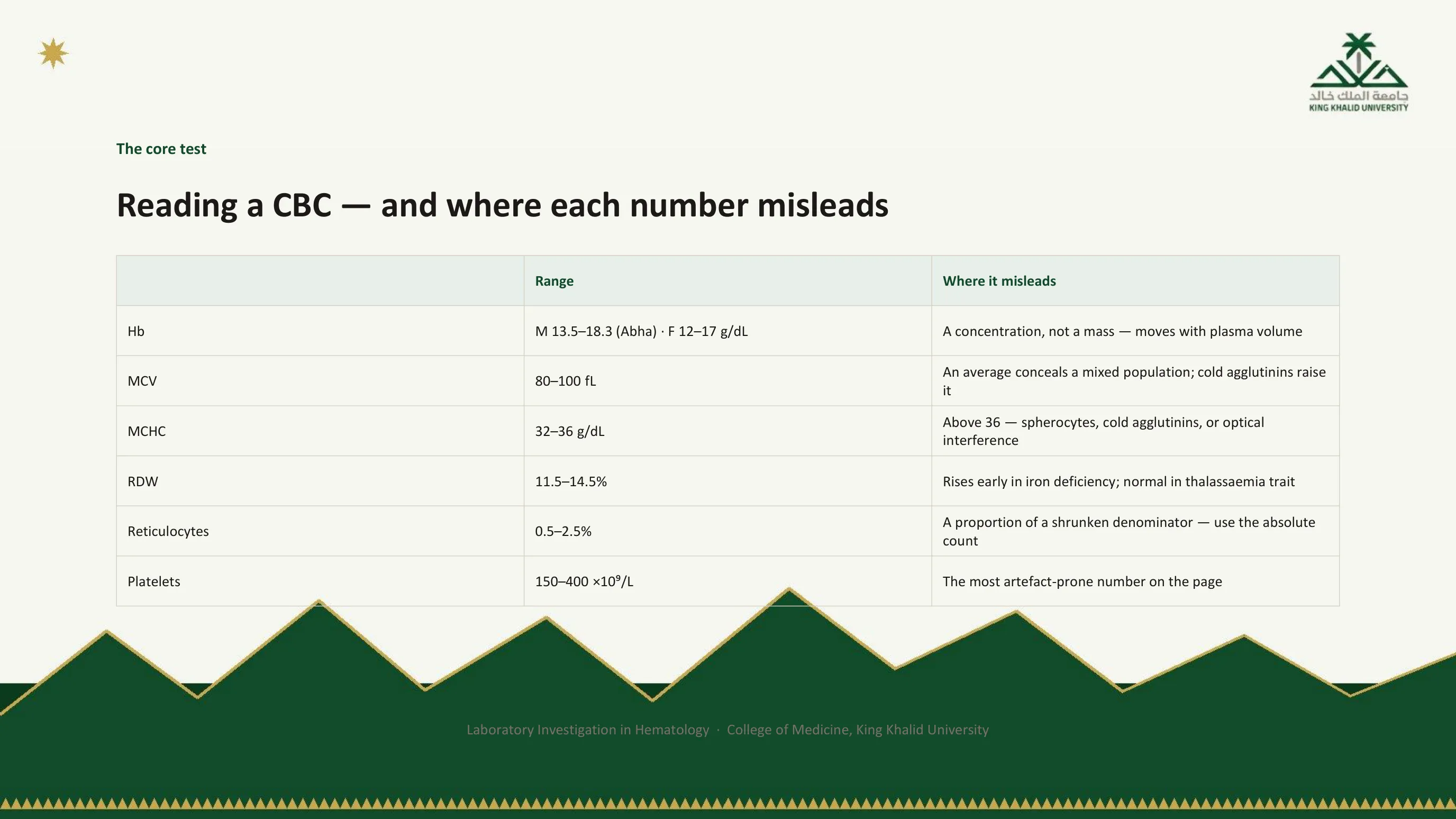
The core test, with the trap beside each number
This table is the blood count as the lecture wants you to read it: each parameter with its range and, more importantly, the way it misleads. The ranges are the ones printed in the department's handbook, and the upper limits for hemoglobin sit where they do because of the altitude; re-read slides 29 to 32 before calling a hemoglobin high in Abha.
Hemoglobin is a concentration, not a mass, and it moves with plasma volume. The MCV is an average, and an average conceals a mixed population: a patient with both iron deficiency and B12 deficiency can have a normal MCV made of small cells and large ones, which is what the RDW is for. Cold agglutinins make red cells clump and the doublets read as large cells. The MCHC above 36 is the red flag of slide 46. The RDW rises early in iron deficiency, before the MCV falls, and stays normal in thalassemia trait, which makes it useful for separating the two commonest causes of microcytosis. Reticulocytes reported as a percentage are a proportion of a shrunken denominator; use the absolute count, as slide 52 explains. Platelets are the most artefact-prone number on the page, for all the reasons Part I spent two stations on.
Read next. In the casebook, Reading the Blood Count in the Interpretation chapter adds the line this table leaves out, the white cells. Read the differential, not the total: a normal total can hide a neutropenia alongside a lymphocytosis. Its table gives the common causes of each abnormal count, and points to the case that works through several of them.

The handbook's walkthrough
This is the figure from the department's hematology handbook, chapter 3, laid over a real report. It labels each value with the question it answers and the way it misleads, and it is reproduced here so that you recognise it when you meet it in the book. The handbook's discipline is worth quoting: you do not need to memorise the table, you need to make use of all the data already in front of you before ordering anything further.

Two numbers turn a long differential into a short one
For anemia, two numbers do most of the work. The first is size, the MCV: microcytic below 80 fL, normocytic between 80 and 100, macrocytic above 100. That single split sorts the causes into three short lists, and the anemia lecture in this series is built on it. The second is response, the reticulocyte count. A high count means the marrow is working and replacing losses, which points at bleeding or hemolysis. A low count, or one that is normal when it should be raised, means the marrow itself is the problem.
Everything else on the blood count refines those two. The practical instruction is the last bullet. A blood count showing anemia without a reticulocyte count has answered half of a two-part question, and the patient will usually have to be bled a second time for want of one extra tick on the form. Order the reticulocytes with the CBC, not after it.
Read next. Case 50 · Macrocytic and Haemolytic Anaemia in the casebook opens with the same two numbers, asked the other way round: the reticulocyte count first, then the MCV. It then follows one patient down the low-reticulocyte, macrocytic branch to vitamin B12 deficiency.
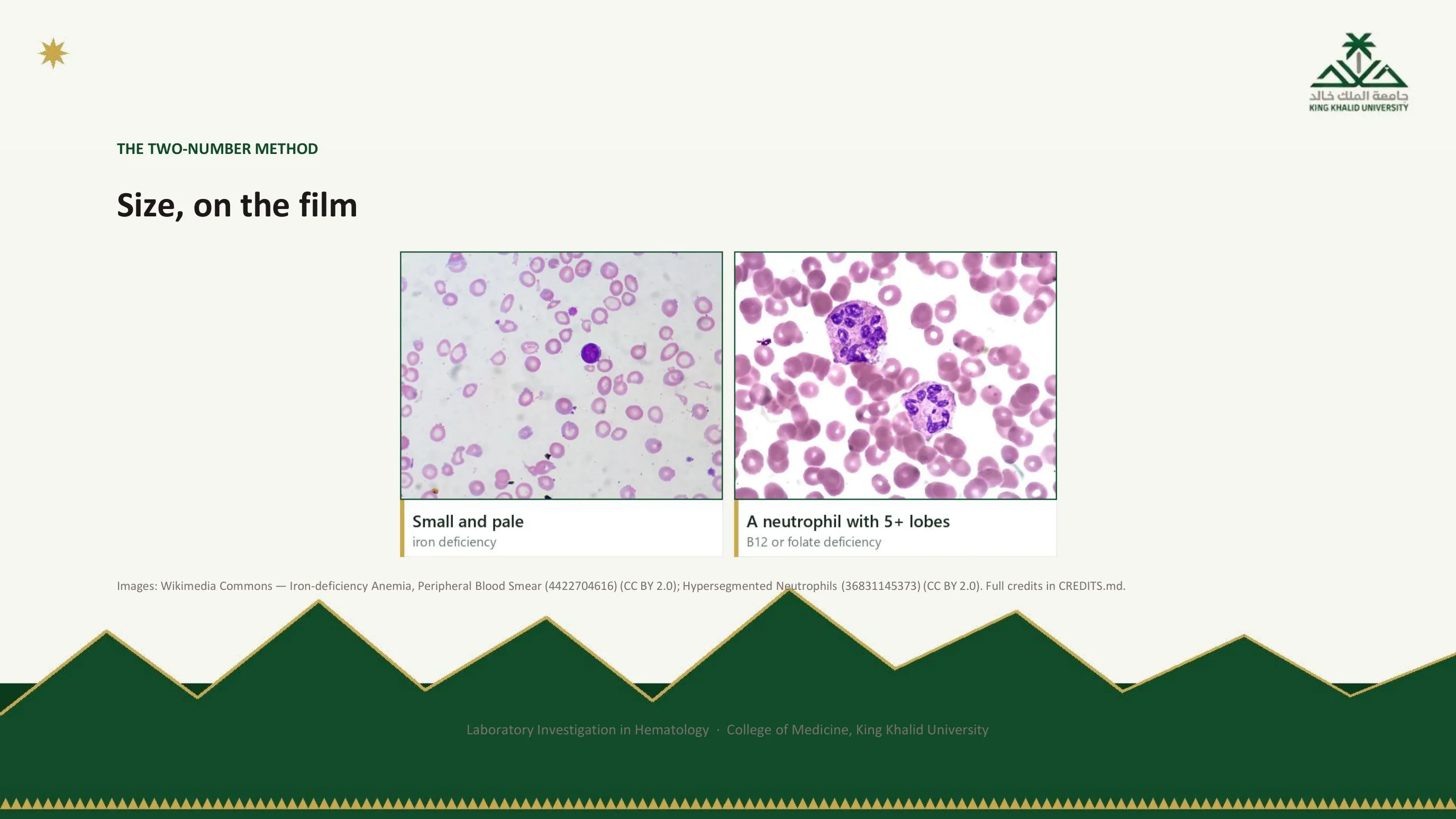
The two ends of the size axis, seen
On the left, iron deficiency: the cells are small, and the pale centre, which should occupy about a third of the cell, is wide. On the right, the tell-tale of the macrocytic end: a neutrophil with five or more lobes. Hypersegmentation appears in B12 and folate deficiency because nuclear maturation is delayed in every cell line, not only the red cells, and it is often visible before the MCV has risen far. The film gives you the two ends of the MCV axis in a single glance.
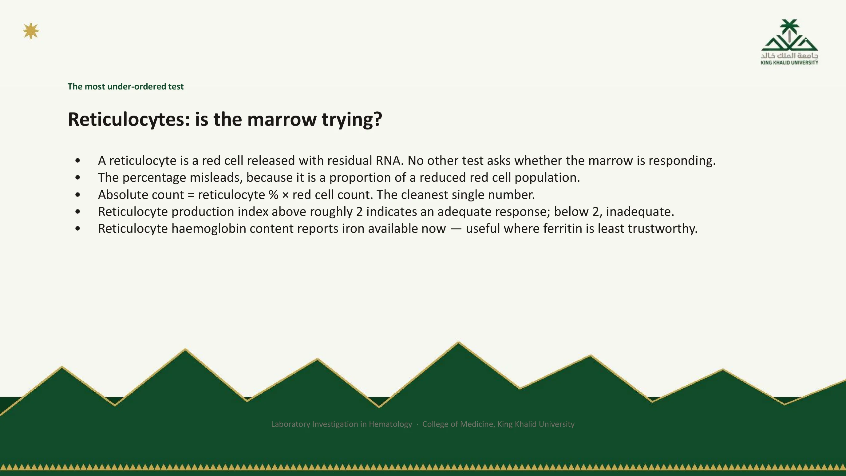
The most under-ordered test
A reticulocyte is a red cell released from the marrow with some of its RNA still inside. Counting them asks one question, and no other test asks it: is the marrow responding? The percentage alone misleads, because it is a proportion of a red cell population that is itself reduced. In severe anemia a normal-looking 2 percent can represent a marrow doing almost nothing. Two corrections fix this. The absolute count, percentage multiplied by red cell count, is the cleanest single number and is increasingly reported directly. The reticulocyte production index corrects both for the degree of anemia and for the premature release of reticulocytes under erythropoietin drive; a value above roughly 2 indicates an adequate response, below 2 an inadequate one.
Newer analysers add the reticulocyte hemoglobin content, which reports the iron actually available to the marrow over the last few days rather than the iron stored weeks ago. It is useful precisely where ferritin is least trustworthy, in inflammation and in renal disease. The clinical utility of these reticulocyte-derived indices is the subject of a review from this department.
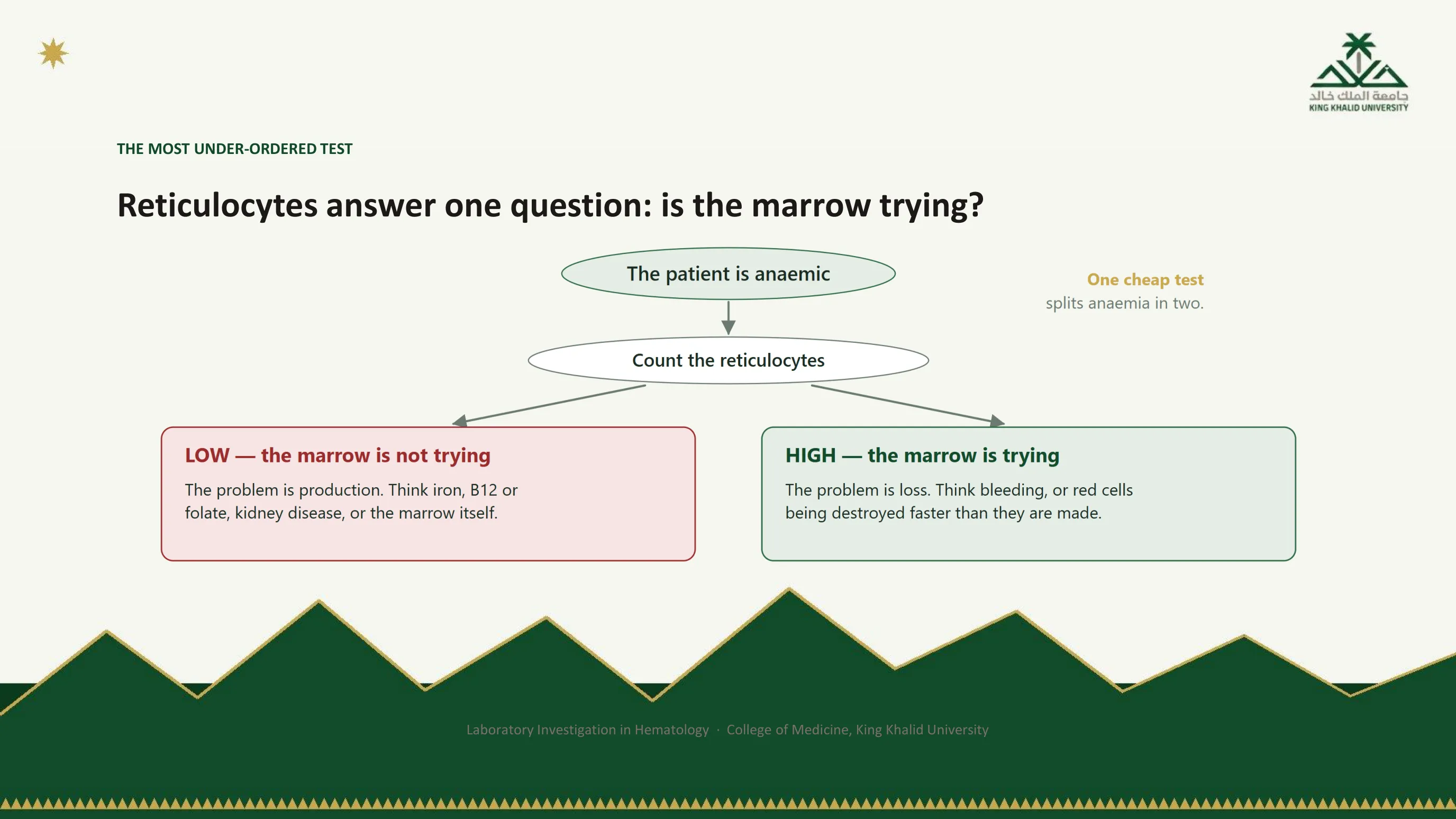
One cheap test splits anemia in two
The branch is the whole argument for ordering reticulocytes with every anemic blood count. Low, and the problem is production: iron, B12 or folate, the kidney's erythropoietin, or the marrow itself. High, and the problem is loss: bleeding, or red cells being destroyed faster than they are made, which sends you to the hemolysis panel on slide 64. Two long differentials become two short ones, for the price of a tick on a form.
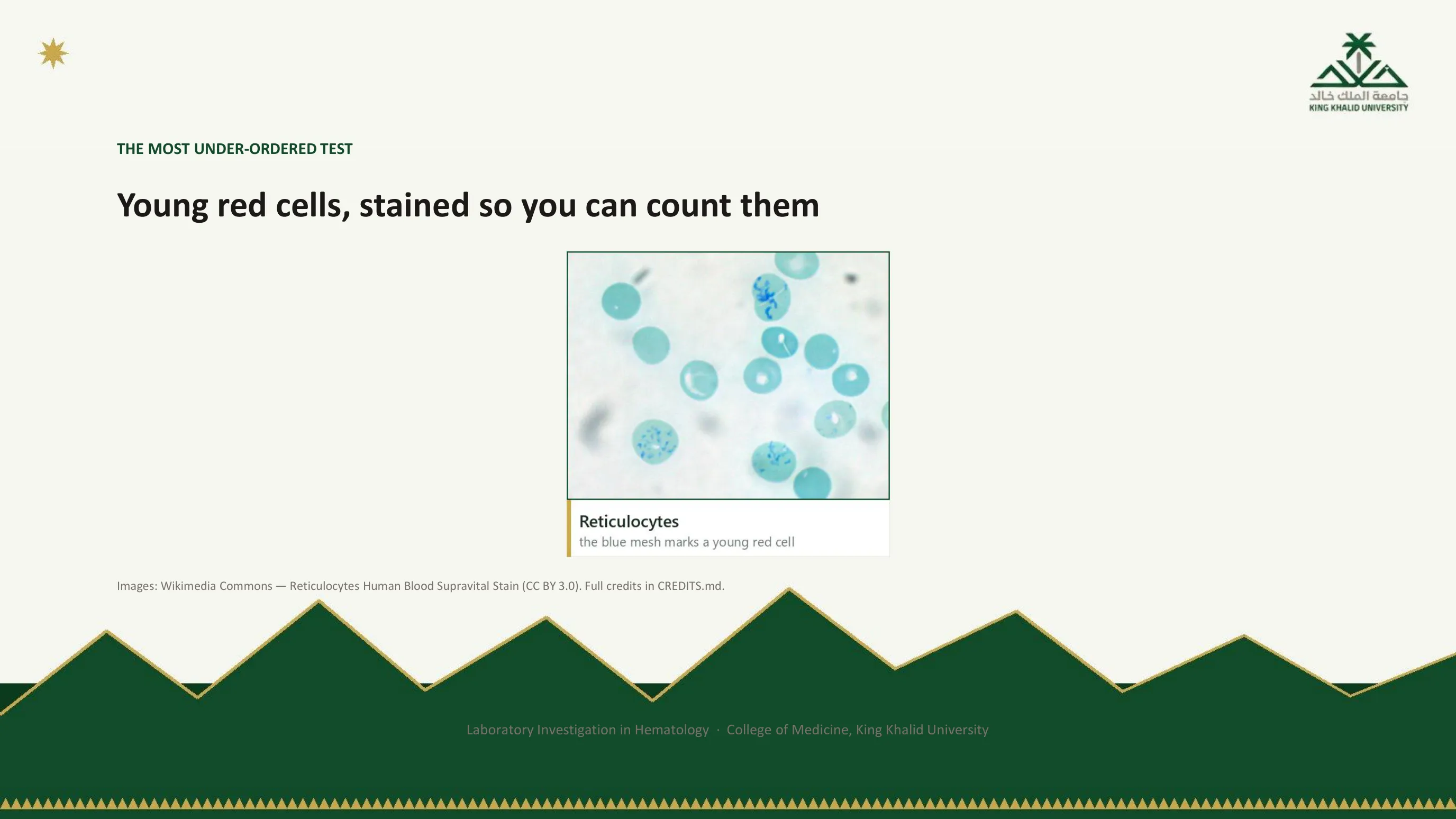
What the analyser is counting when it counts reticulocytes
A supravital stain, applied to living cells, precipitates the residual RNA into the blue mesh that gives the reticulocyte its name. On a routine Romanowsky-stained film the same cells appear only as slightly larger, slightly bluer red cells, the polychromasia that an experienced eye reads as a marrow response. The analyser does the same thing with a fluorescent dye and a laser, as slide 44 described: a red cell that fluoresces is a red cell that still contains RNA.
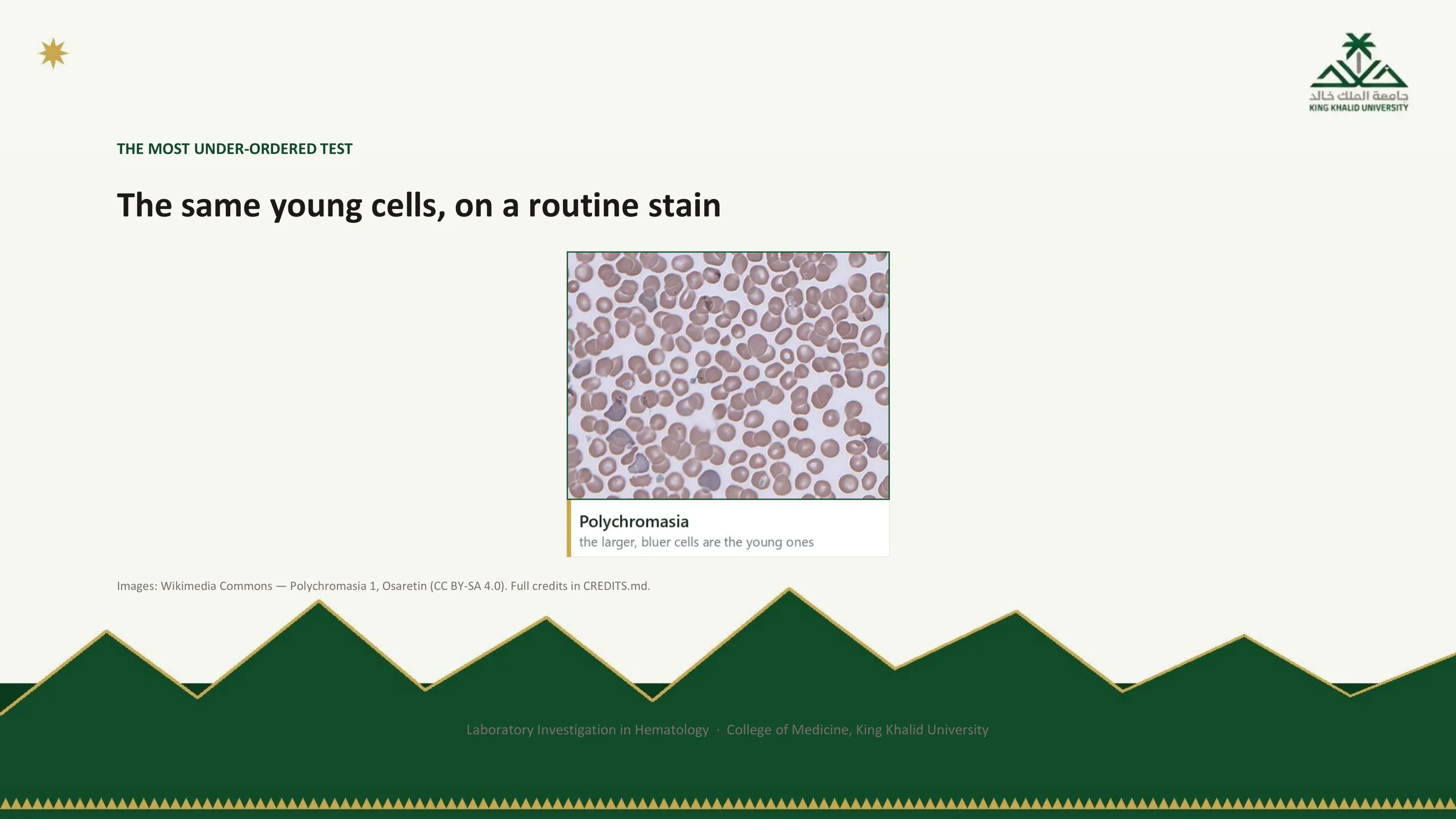
Polychromasia: the same cells without the special stain
This is the other half of the previous slide. There, a supravital stain showed the reticulocytes as cells with a blue mesh inside. Here the film has had only the routine stain, and the same young cells look different: a little larger than the cells around them, and blue-grey instead of pink. That is polychromasia. Look for the few cells that do not match the colour of the rest; several of them sit toward the left and the bottom of this field.
You will meet polychromasia on ordinary films far more often than you will meet a supravital stain. Slide 54 gave its meaning: an experienced eye reads it as a marrow response, the marrow sending out young cells early.

Looking, not counting
The blood count counts cells. The film lets you look at them. Numbers tell you something is wrong; the film often tells you what. Ask for one whenever a blood count is unexpectedly abnormal, and especially when you are about to act on the abnormality. In suspected hemolysis, unexplained cytopenia or leukocytosis, suspected leukemia and suspected microangiopathy it is essential rather than optional. And whenever the analyser raises a flag, treat the flag as a request for a film.
When you look, describe four things in a fixed order: size, which gives micro-, normo- or macrocytic, with mixed sizes called anisocytosis; shape; colour, meaning the degree of central pallor; and inclusions. Shape and inclusions are where the high-yield clues live, and the next slides list the handful of morphologies that are specific enough to make a diagnosis on their own. Recall Part I too: the film is also the cheapest audit of stations 2 and 3 that exists. Platelet clumps, fragments miscounted as platelets and cold agglutination are all visible on a slide and invisible in a number.

Where on the slide to look
A drop of blood is spread across the slide with a second slide, and the result is a wedge: thick where the drop was placed, thinning to a feathered edge. Only in the thin part do the cells lie in a single layer, separated from each other, where size, shape and central pallor can be judged. In the thick part they overlap and every cell looks small and dark; at the very edge they are distorted and spread. The reader works in the zone just behind the feathered edge, and it is worth knowing this so that a film reported as unreadable makes sense: the spread, not the blood, was at fault.

Seven findings that each carry a diagnosis
Most film findings are suggestive. These seven are close to specific, and each should trigger an immediate thought. Schistocytes, fragmented helmet-shaped cells, mean red cells are being sheared in small vessels: microangiopathic hemolysis, and the differential of TTP, HUS and DIC is an emergency. Spherocytes, small round dense cells without central pallor, mean membrane has been lost, either congenitally in hereditary spherocytosis or by antibody-coated cells passing through the spleen in autoimmune hemolysis. Target cells mean an excess of membrane relative to contents: thalassemia, liver disease, or the absent spleen. Tear-drop cells mean red cells squeezed out of a marrow that is fibrosed or infiltrated. Howell-Jolly bodies, single dark nuclear remnants, mean there is no spleen to remove them. Blasts, and above all Auer rods, mean acute leukemia, and an Auer rod specifically means myeloid. Hypersegmented neutrophils, six lobes or more, mean B12 or folate deficiency.
The morphology nomenclature these follow is standardised internationally, so a report from any laboratory should use the same words. Learn the seven, and learn that spotting one essentially makes the diagnosis.
Read next. In the casebook, The Film — What to Ask For and What It Shows in the Interpretation chapter lists the film findings that make a diagnosis on their own, each with the case that works it through. The same section lists the results that are not real, pseudothrombocytopenia among them.

The shapes as diagrams
The handbook's plate draws the shapes cleanly, without the noise of a real film, so that the defining feature of each is unmistakable: the missing central pallor of the spherocyte, the bullseye of the target cell, the pointed tail of the tear-drop, the crescent of the sickle cell, the coin-stack of rouleaux. Learn them here first, then find them on the photomicrographs of the next slide, where they are surrounded by normal cells and the exercise becomes the real one.
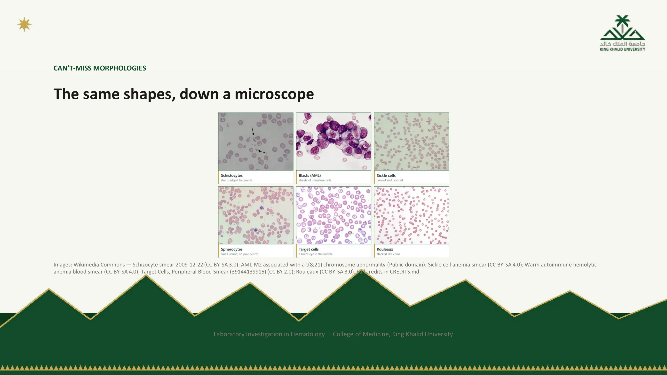
The same shapes, in real blood
Top row: fragments with sharp angles, the schistocytes of a microangiopathy; a sheet of large immature cells with open chromatin, the blasts of acute myeloid leukemia, one of them carrying the rod-shaped inclusion that settles the lineage; and the crescents of sickle cell disease. Bottom row: dense round spherocytes among normal cells in warm autoimmune hemolysis; the bullseyes of target cells; and red cells stacked like coins in rouleaux, the sign of a high plasma protein that you met in the myeloma lecture. Cover the labels and name each film; that is the level at which these should be known.
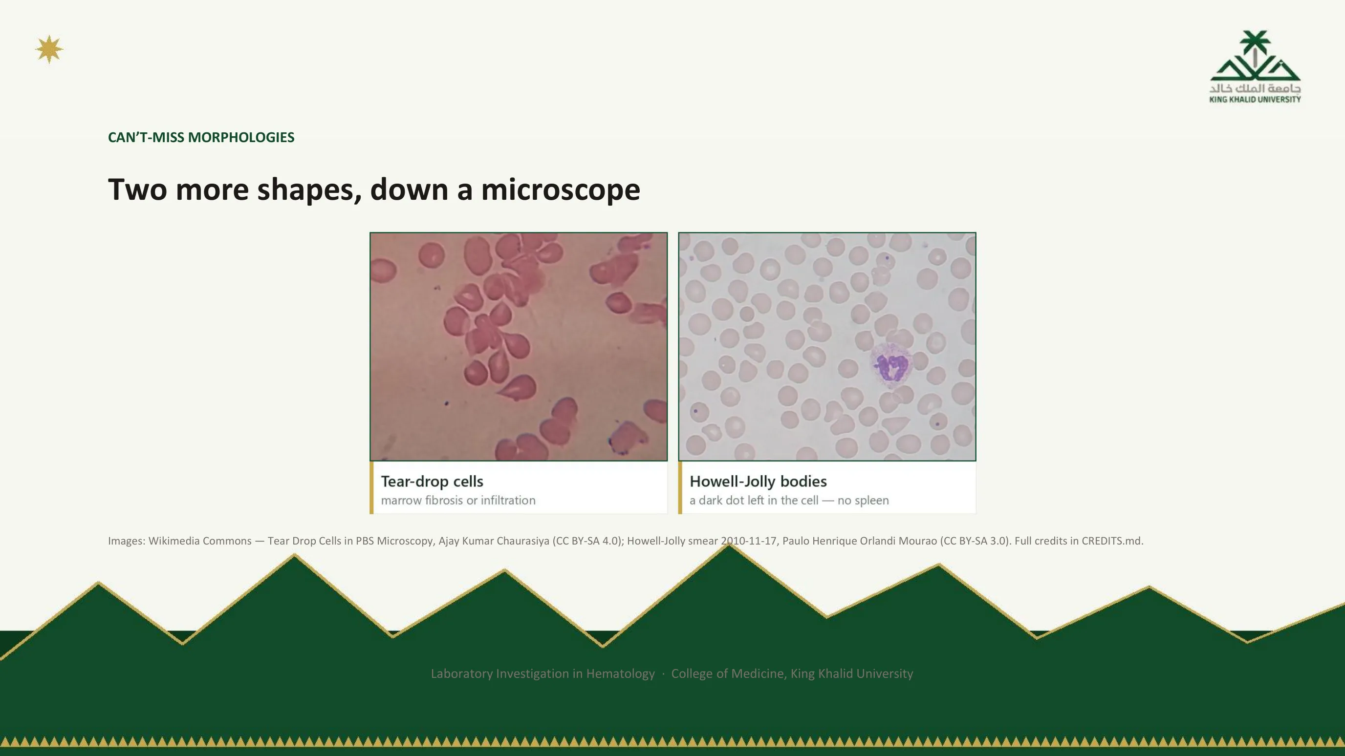
Tear-drop cells and Howell-Jolly bodies, in real blood
These are the two shapes from the table on slide 58 that the previous slide did not show. On the left, tear-drop cells: red cells drawn out to a point at one end, like a drop of water. Slide 58 gives the reason: they are cells squeezed out of a marrow that is fibrosed or infiltrated.
On the right, most red cells look normal, but three of them carry a single small, dark, round dot. That dot is a Howell-Jolly body, a remnant of the nucleus. The spleen normally removes it, so when you see it, think of a spleen that is absent or not working. The large cell in the middle is a neutrophil, there for scale.
Cover the labels and name both films, as you did on the previous slide.

Iron studies: one question, four numbers
Iron studies ask whether there is enough iron and where it is, and four results work together to answer. Ferritin reflects the stores and is the single most specific test for deficiency. Serum iron is the iron in transit at the moment of sampling. Transferrin, reported as the total iron-binding capacity, is the transport protein, and the body makes more of it when iron is short, trying to capture whatever is available. Transferrin saturation is how much of that transport capacity is in use.
The three rows are the three patterns. In iron deficiency the stores are empty, the transit iron is low, the transport protein is up and mostly empty. In the anemia of chronic disease the iron is present but locked away by inflammation: ferritin normal or high, serum iron low, and, the distinguishing feature, a low rather than high TIBC. In iron overload everything is full. The row you will use most is the middle one, because it is the one that is most often misread, and the next slide's trap explains why.
Read next. Case 49 · Microcytic Anaemia and the Iron Deficiency Workup in the casebook sets iron deficiency beside thalassemia trait in one table: ferritin, red cell count, RDW, the Mentzer index and the film. In this region those two causes account for nearly all microcytosis, and telling them apart matters, because one needs an endoscopy and the other needs genetic counselling.

The patterns, from the handbook
The handbook presents the same table as patterns to be recognised rather than values to be memorised, and adds the interpretation notes that go with each. It is reproduced so that you connect this slide with chapter 5 of the book, where the panels of this part of the lecture are worked through with cases.
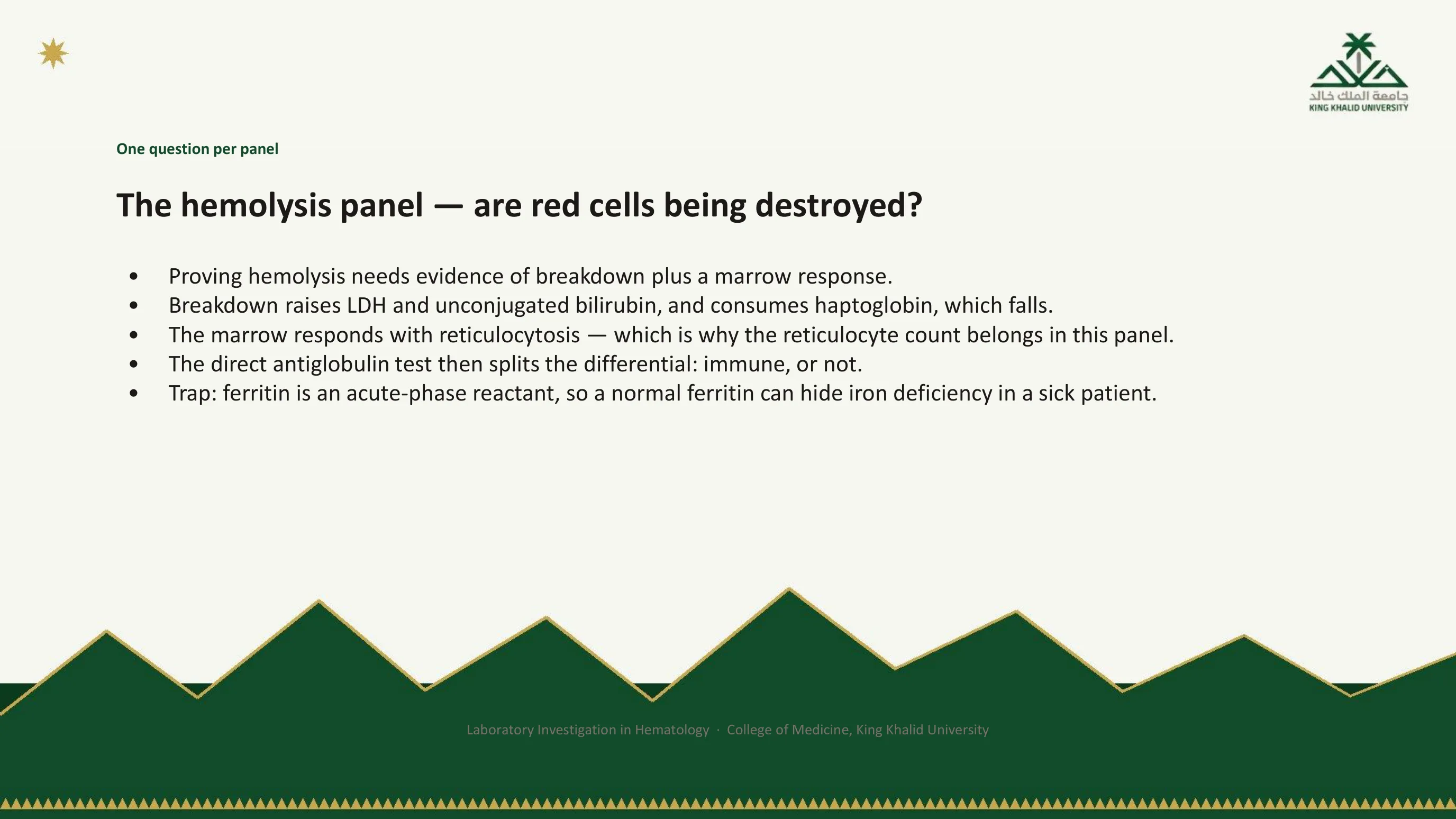
Proving hemolysis, and a trap left over from the iron studies
Proving that red cells are being destroyed means finding two things at once: evidence of breakdown, and evidence that the marrow is responding to it. Breakdown releases lactate dehydrogenase from the cells and produces unconjugated bilirubin from the released heme, and it consumes haptoglobin, the protein that mops up free hemoglobin, so haptoglobin falls. The marrow responds with reticulocytosis, which is why the reticulocyte count belongs inside this panel and not beside it. Once hemolysis is established, one further test splits the differential in half: the direct antiglobulin test, slide 77, asks whether the process is immune-mediated. Positive points to autoimmune hemolysis; negative points to a membrane, enzyme or mechanical cause, and the film of slide 60 usually says which.
The last bullet belongs to the iron studies but is placed here because it is a station 5 trap of exactly the kind Part I described. Ferritin is an acute-phase reactant. It rises with inflammation, infection, malignancy and liver disease, so a normal ferritin can conceal genuine iron deficiency in a sick patient. The test did not fail. The interpretation did, by reading one number without the clinical state that governs it.
Read next. Case 51 · Acquired Haemolytic Anaemia and the Direct Antiglobulin Test in the casebook sets out the same four results with the mechanism behind each. It then shows the trap in a jaundiced patient with a raised MCV, where the reflex is to send a B12 level: the high reticulocyte count, not B12 deficiency, explains the large cells.
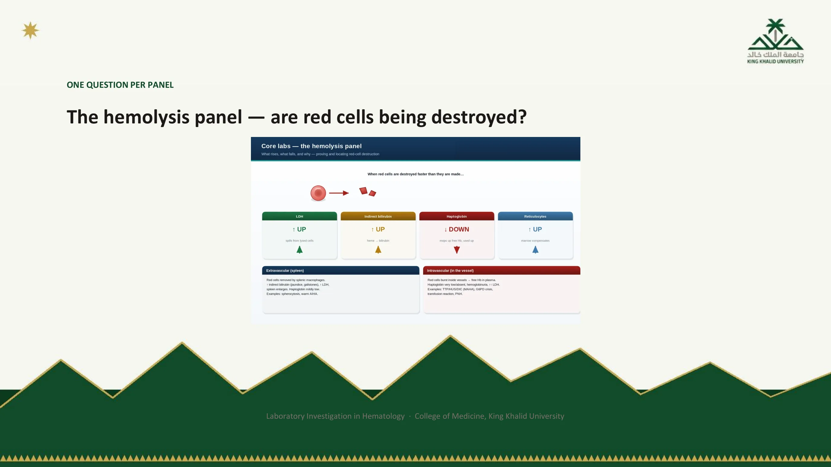
The panel as arrows
The handbook draws the panel as a row of arrows: LDH up, bilirubin up, haptoglobin down, reticulocytes up, with the antiglobulin test beneath as the fork between immune and non-immune causes. Four arrows pointing the right way, in a patient whose anemia has appeared quickly, is hemolysis until proved otherwise.
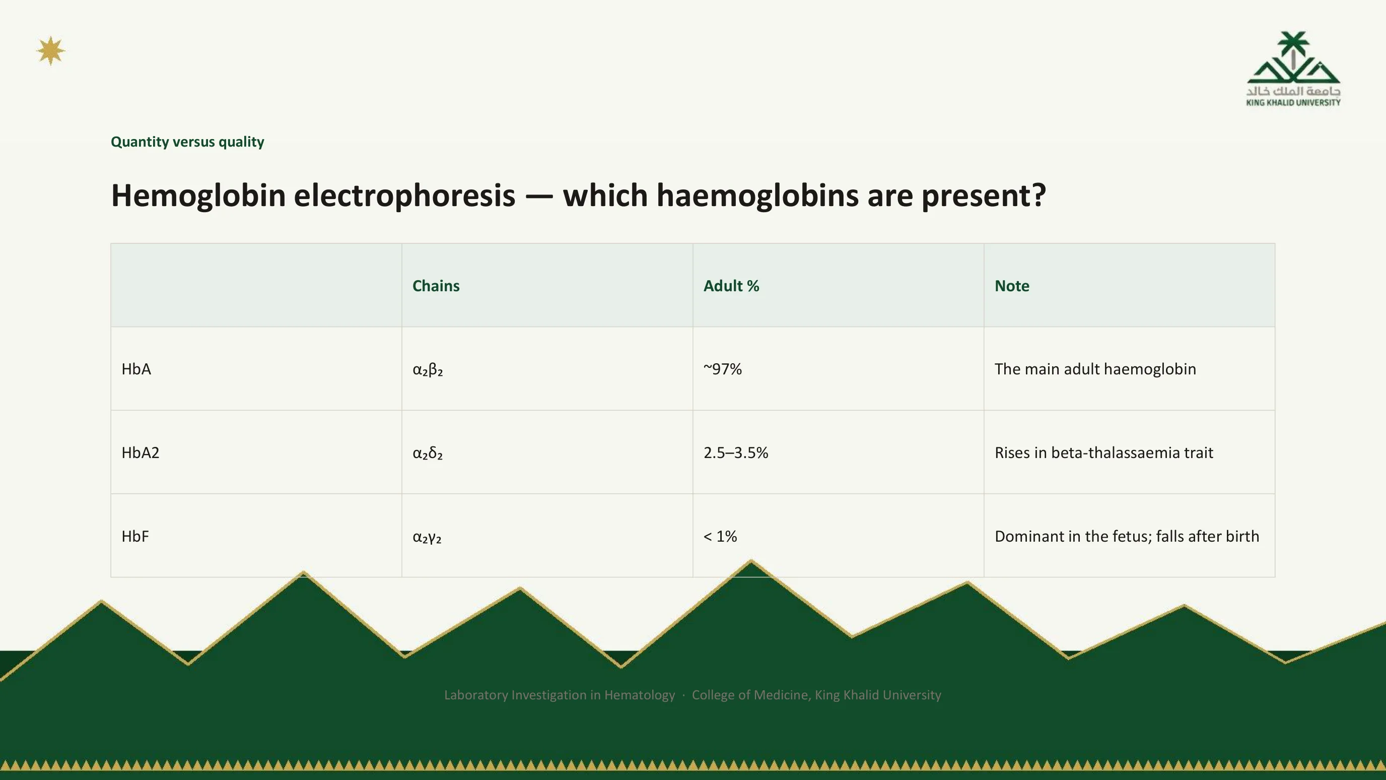
Quantity versus quality: which hemoglobins are present
Electrophoresis asks one question: which hemoglobins are present, and in what proportions. Read with the blood count, it separates making too little normal hemoglobin from making an abnormal one. The handbook's analogy is the one to keep: the CBC tells you how much milk is in the carton; electrophoresis tells you what kind of milk it is.
The table gives the normal adult pattern. Almost all of it is HbA, two alpha chains and two beta. A small fraction is HbA2, alpha with delta, and its rise is the marker of beta-thalassemia trait. Less than one percent is fetal hemoglobin, alpha with gamma. The developmental switch behind that last row has a consequence you will be asked about: beta-chain disorders are not apparent at birth, because gamma chains are still being made and decline only over the first months of life, whereas alpha-chain disorders affect every hemoglobin, since all of them use alpha chains, and can be detected from birth.
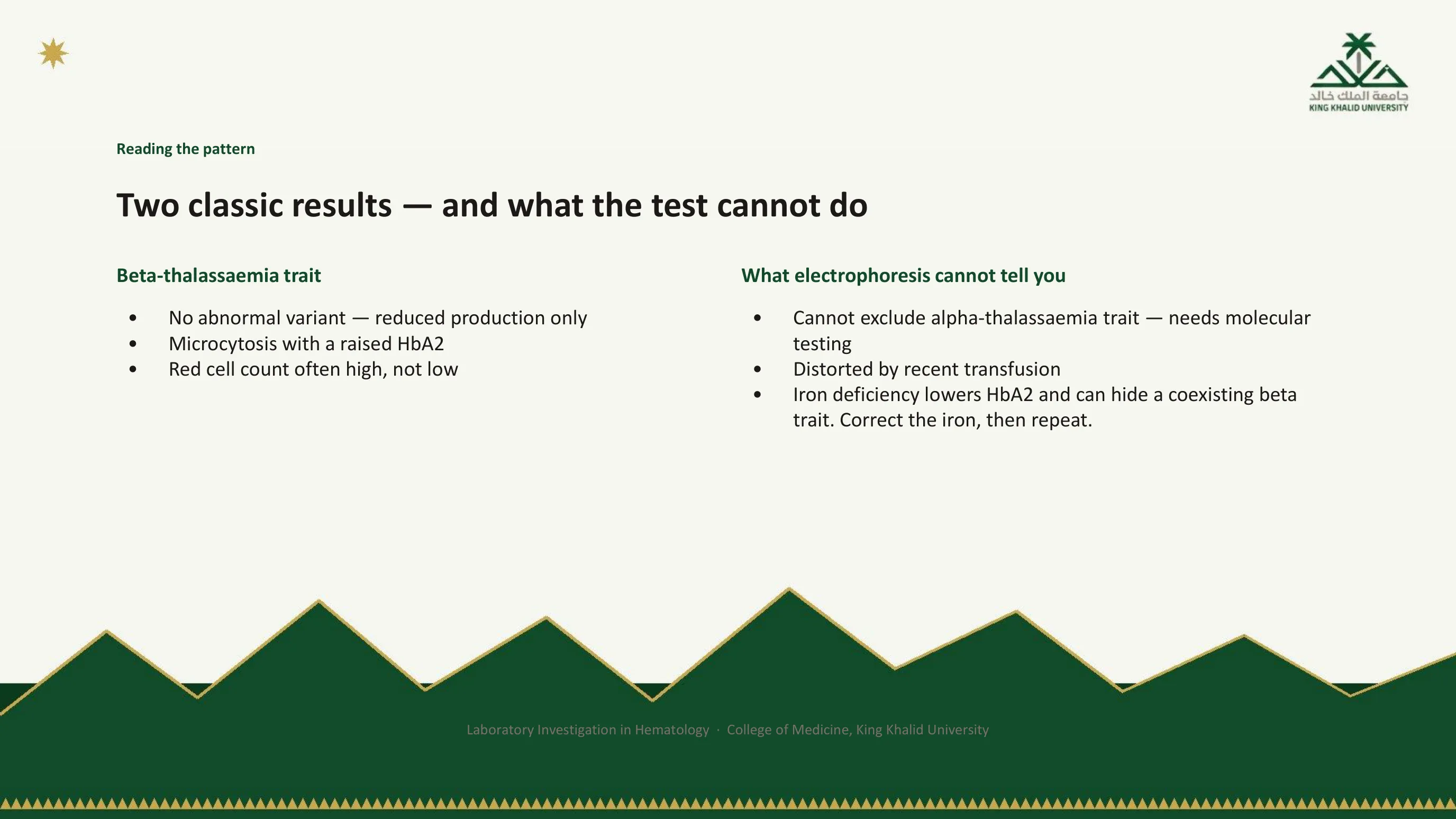
Reading the pattern, and knowing its limits
Beta-thalassemia trait is the classic quantity problem. No abnormal variant appears; production of beta chains is simply reduced. The blood count shows microcytosis, often with a red cell count that is high rather than low, because the marrow compensates with many small cells, and electrophoresis shows the raised HbA2 that makes the diagnosis. Sickle cell disorders are the classic quality problem: an abnormal variant appears, and the proportions of HbS, HbA and HbF distinguish trait from disease and from compound states.
The right-hand column is the station 5 material. Electrophoresis cannot exclude alpha-thalassemia trait, which commonly gives a normal pattern and needs molecular testing, and it is distorted by a recent transfusion, because the patient's blood is now partly someone else's. The most important limit is the last. Iron deficiency lowers HbA2 and can pull it back into the normal range, hiding a coexisting beta-thalassemia trait. In a microcytic patient with low ferritin, correct the iron first, then repeat the electrophoresis; done in the wrong order the test gives a false reassurance.
Read next. The thalassaemia section of Case 52 · Sickle Cell Disease and Thalassaemia in the casebook makes the same split: beta trait shows a raised HbA2, while alpha trait shows a normal one and needs genetic testing. It adds the local point. Premarital screening for the hemoglobinopathies is a national programme here, and much of your work with these results will be explaining them to carrier couples.
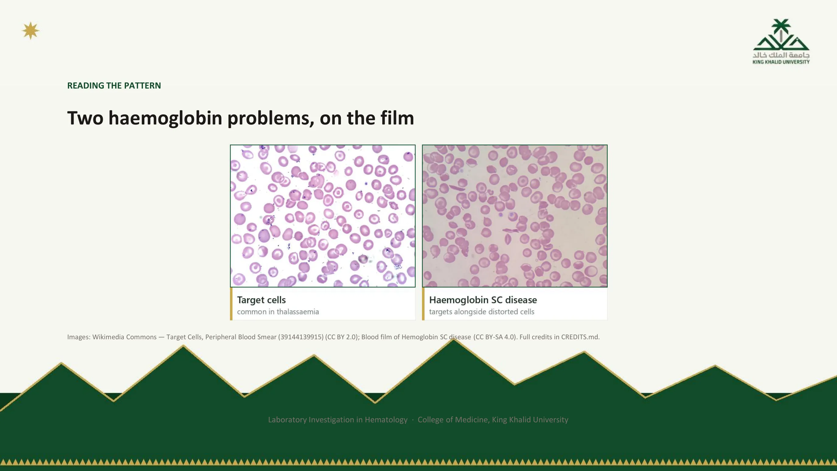
Quantity and quality, on the film
On the left, target cells: a quantity problem, the thin under-filled cells of thalassemia with their excess of membrane folding into a central bullseye. On the right, hemoglobin SC disease, a quality problem in which two abnormal variants are inherited together; target cells lie beside cells distorted by the abnormal hemoglobins they contain. The film raises the suspicion in both; electrophoresis names the hemoglobin.

The third category, and a patient from Abha
Thalassemia is a problem of quantity and sickle cell disease a problem of shape. There is a third group, easy to forget and almost impossible to guess at the bedside: variants that alter how tightly hemoglobin holds oxygen. They usually cause no symptoms and no anemia worth the name, until a machine reports something that looks alarming. A high-affinity variant holds oxygen too tightly and releases it poorly to the tissues; the kidney reads relative hypoxia, erythropoietin rises, and the patient presents with unexplained erythrocytosis, which at this altitude already has three commoner explanations. A low-affinity variant releases oxygen readily, and the arterial saturation reads low: the patient presents with unexplained, persistent, completely asymptomatic hypoxemia.
The department reported such a case: an 8-year-old girl in Abha with home saturations of 85 to 89 percent, asymptomatic, who carried a diagnosis of asthma to which every low reading was attributed. The oximeter was not faulty. Her hemoglobin genuinely was less saturated, because it releases oxygen more readily than normal hemoglobin does. The cause was Hemoglobin J-Auckland, a beta-globin variant, reported from this region as the first case associated with hypoxemia at altitude. Put that case on the pipeline and it lands at station 5: stations 2, 3 and 4 were fine, the saturation really was 85 percent, and what failed was the inference from a true number to a clinical conclusion. Suspect an affinity variant when erythrocytosis comes with a normal erythropoietin and no JAK2 mutation, or when hypoxemia will not fit the story it has been given; hemoglobin analysis is the first step and sequencing usually the last.
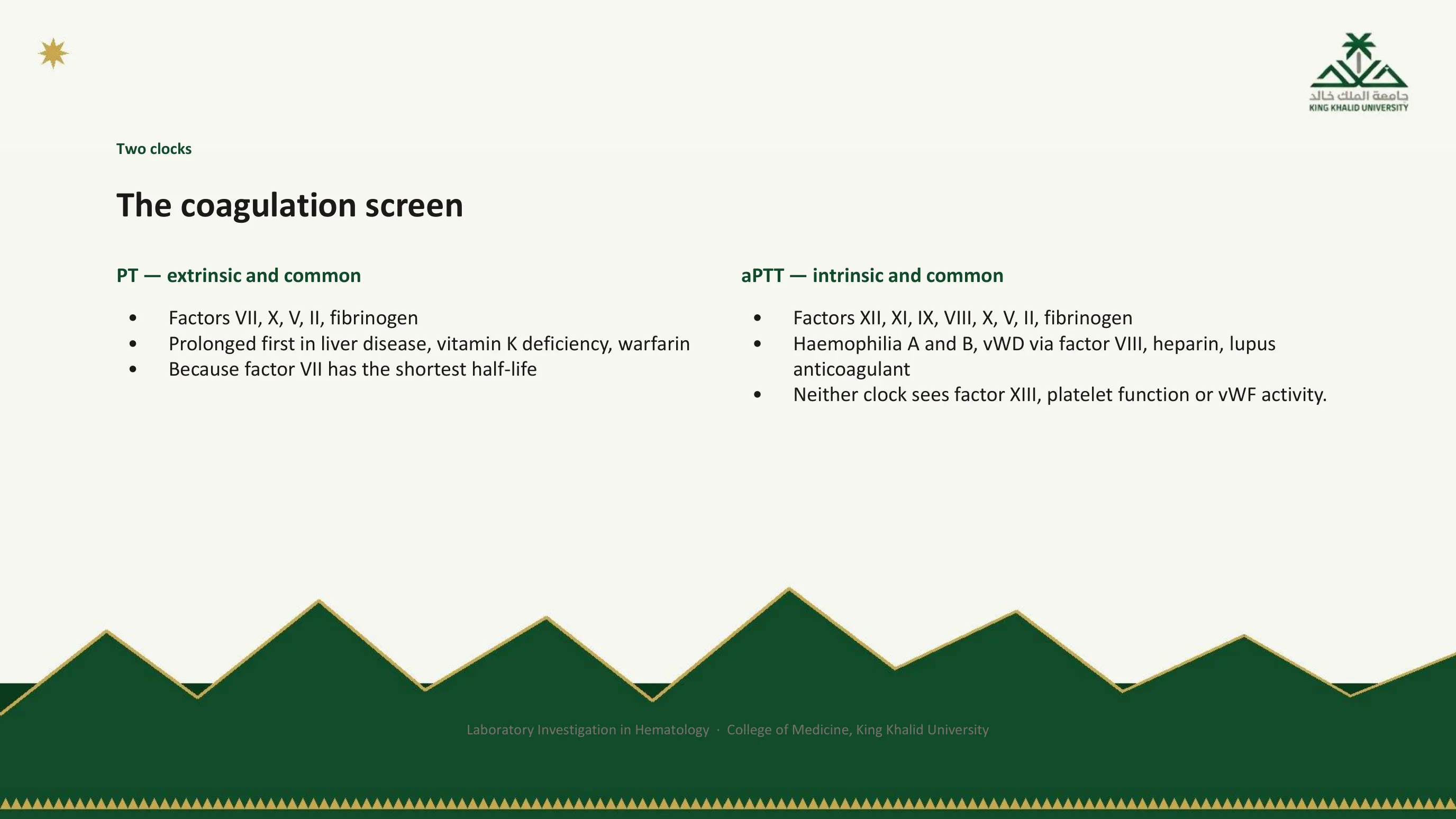
Two clocks
The PT and the aPTT are stopwatches started at different points in the same cascade. Neither measures bleeding; both measure how long plasma takes to clot in a tube. The PT starts from tissue factor and covers the extrinsic and common pathways, factor VII and then X, V, II and fibrinogen. It is the first to prolong in liver disease, vitamin K deficiency and warfarin, because factor VII has the shortest half-life of the vitamin K-dependent factors. The aPTT starts from contact activation and covers the intrinsic and common pathways, XII, XI, IX and VIII and then the same common factors. It is prolonged in hemophilia A and B, in von Willebrand disease through the low factor VIII that travels with it, by unfractionated heparin, and by a lupus anticoagulant. A third clock, the thrombin time, tests only the last step, fibrinogen to fibrin.
The final line is the one to remember. Neither clock sees factor XIII, platelet function, von Willebrand factor activity, or a mild factor deficiency. A normal coagulation screen never excludes a bleeding disorder. And station 2 comes first, always: before interpreting a single prolonged time, confirm the tube. Under-filled? Clotted? Drawn from a heparinised line? In a polycythemic patient, was the citrate corrected? The reasoning that follows a genuinely prolonged result is developed in full in the companion lecture on disorders of hemostasis.
Read next. Case 53 · The Bleeding Patient in the casebook reads the screen in a patient who is bleeding. Its table covers the four patterns, including the one this slide warns about: both times normal with clear bleeding, which points to the platelets, von Willebrand disease, factor XIII or the vessels.
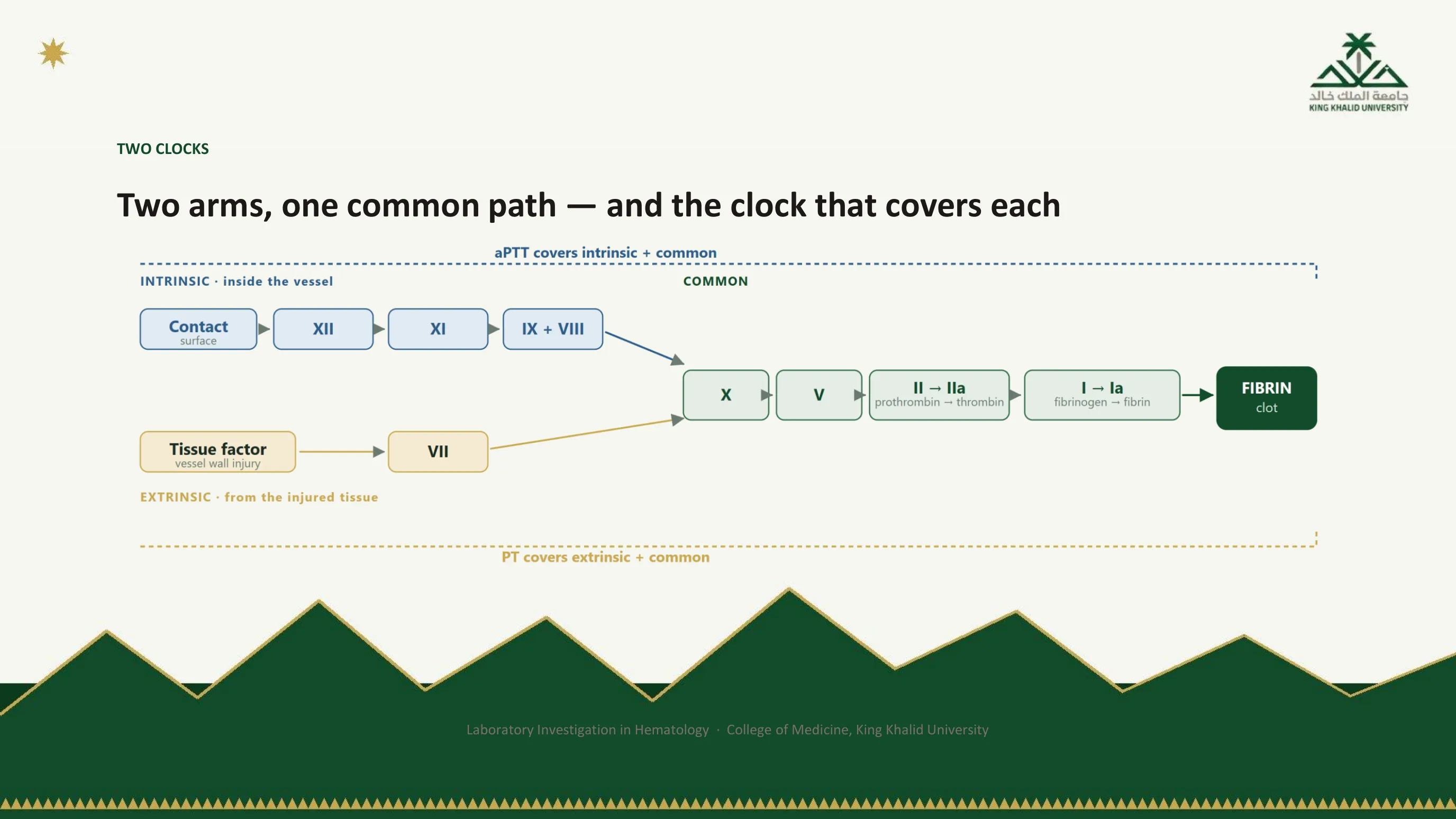
The cascade, drawn for the two tests
The figure is the cascade arranged for one purpose: to show which factors each clock covers. The dotted bracket above is the aPTT, spanning the intrinsic arm and the common path. The bracket below is the PT, spanning the short extrinsic arm and the same common path. Where the brackets overlap, the common path, a defect prolongs both tests. Where they do not, a defect prolongs one, and that is the logic by which a prolonged screen is read: PT alone points to VII, aPTT alone to the intrinsic arm, both to the common path or to several factors at once.
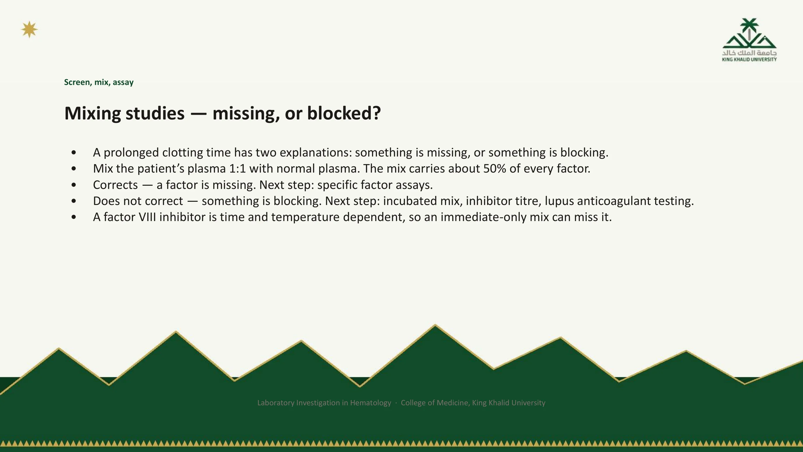
Screen, mix, assay
A prolonged clotting time has exactly two explanations: something is missing, or something is blocking. The mixing study is the single step that separates them. Patient plasma is mixed one to one with normal pooled plasma and the test repeated. Normal plasma supplies roughly 100 percent of every factor, so the mixture still carries about 50 percent, which is enough to clot in normal time if the only problem was a deficiency. If the time corrects, a factor is missing, and the next step is the specific factor assays that name it. If it does not correct, something in the patient's plasma is blocking the reaction and blocks the normal plasma too; the next steps are an incubated mix, an inhibitor titre and testing for a lupus anticoagulant.
Two cautions. A factor VIII inhibitor is time and temperature dependent, so the mix may correct immediately and then prolong again after incubation at 37 degrees for one to two hours; an immediate-only mix can miss it. And a lupus anticoagulant prolongs the aPTT in the tube while being associated with thrombosis, not bleeding, in the patient, the clearest example in this lecture of a true number pointing the wrong way if it is read naively.
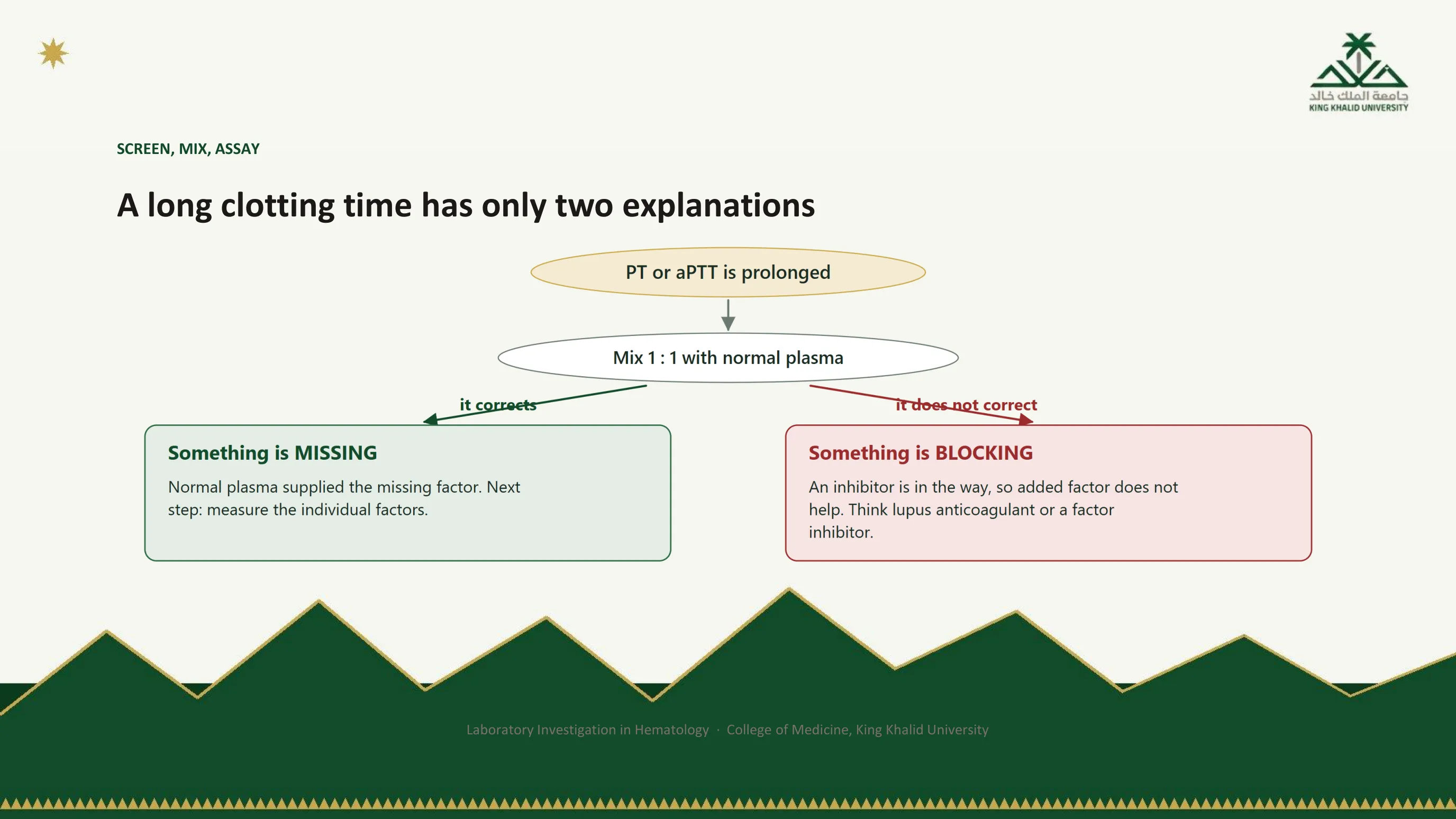
The fork
The whole logic of the mixing study is this one fork, and it is worth being able to draw. Left, green: the time corrects, a factor was missing, measure the factors. Right, red: it does not correct, something is blocking, look for the inhibitor. Everything in the investigation of a prolonged screen passes through this branch, and the companion lecture on hemostasis works through what lies on each side of it.
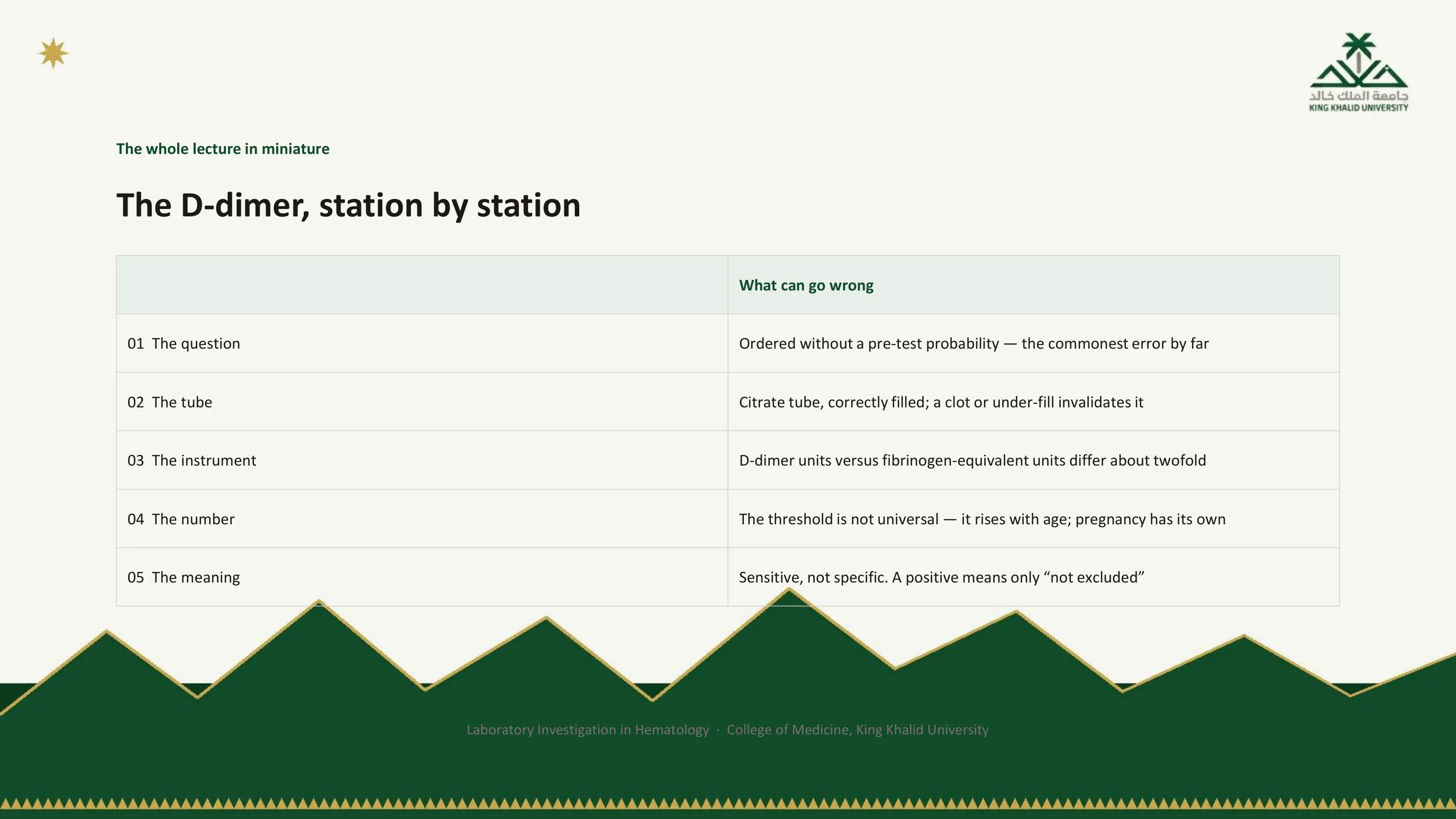
The whole lecture in miniature
Part I used the D-dimer to teach Bayes. Now look at the assay itself and notice that every one of its problems is a station. At station 1 it is ordered without a pre-test probability, so that no result can be acted on; this is the commonest error by a wide margin. At station 2 it needs a citrate tube, correctly filled, and a clotted or under-filled specimen invalidates it. At station 3 the assays differ, and the units are reported either as D-dimer units or as fibrinogen-equivalent units, which differ by roughly twofold; read the report, not your memory. At station 4 the threshold is not universal: it rises with age, and pregnancy has its own trajectory. At station 5 it is sensitive but not specific, so a negative excludes at low pre-test probability and a positive means only "not excluded".
That table is the entire lecture in miniature. Any test you meet for the rest of your career can be interrogated the same way, and the exercise takes a minute.

Five stations, one test
The figure phrases each station as the question you would actually ask about a D-dimer on a ward round. The first is the most useful: am I ruling out a clot in someone unlikely to have one? If yes, the test helps. If the patient is likely to have one, no result from this assay will settle it, and the imaging should be ordered directly. The caption says what the figure is for: this is the habit the lecture is trying to install.
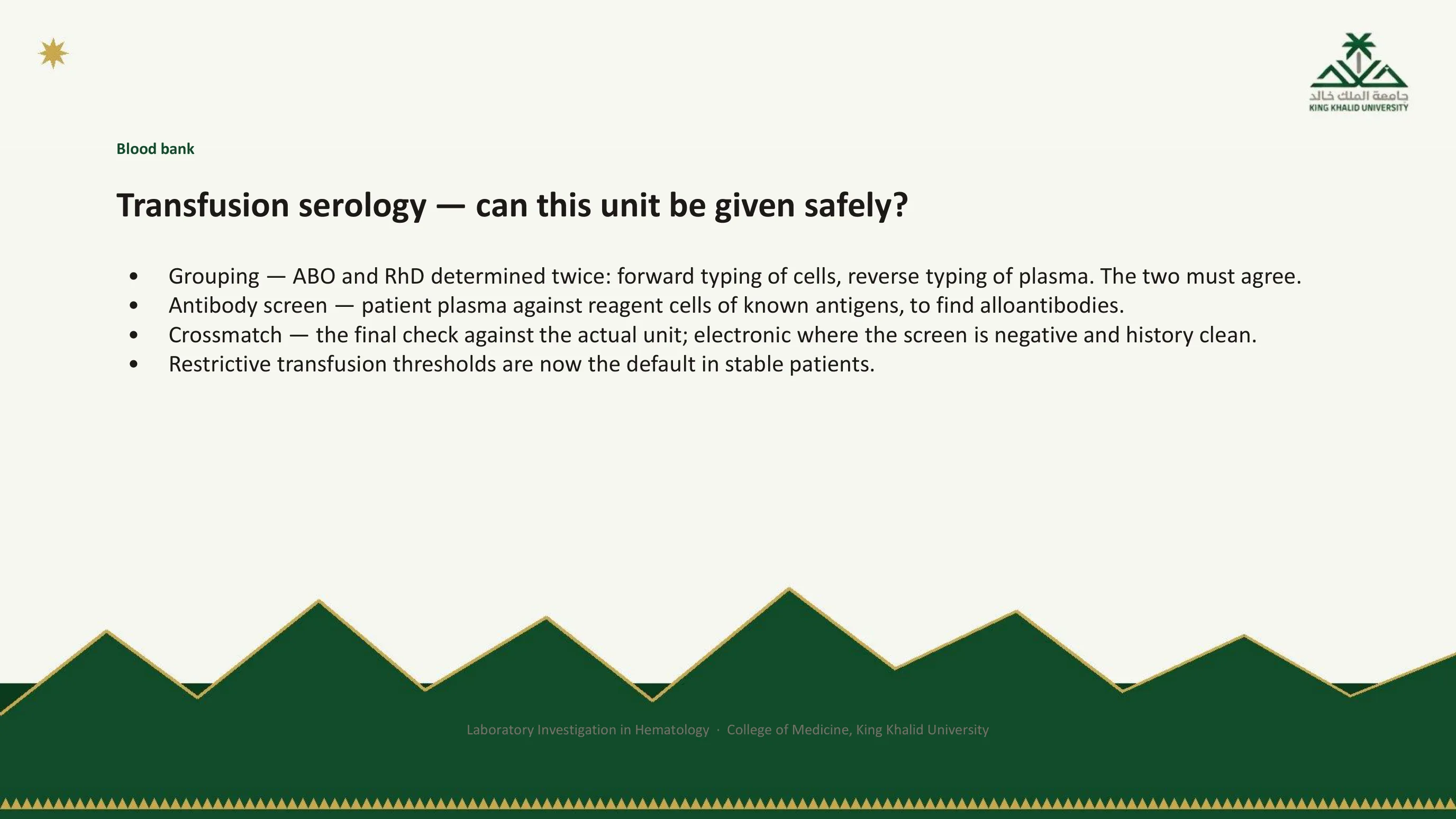
The blood bank's one question
The blood bank asks a single question with several tests: can this unit be given to this patient safely? Grouping determines ABO and RhD twice. Forward typing tests the patient's red cells against known antisera; reverse typing tests the patient's plasma against red cells of known group. The two must agree, and a discrepancy is investigated, never overridden. The antibody screen tests the patient's plasma against reagent red cells of known antigen composition, to detect clinically significant alloantibodies acquired through previous transfusion or pregnancy. The crossmatch is the final compatibility check of patient plasma against the actual unit; where the screen is negative and the patient has no history of antibodies, an electronic crossmatch may replace the serological one.
Compatibility is one question; whether to transfuse at all is another. Restrictive thresholds are now the default in stable patients, and the decision belongs to the clinician, not the laboratory.
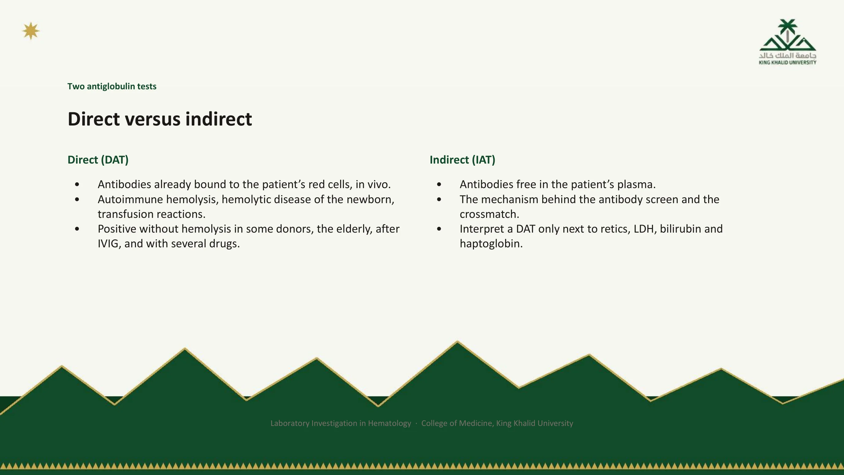
Direct versus indirect
Both tests use the same reagent, an antibody against human immunoglobulin, and ask two different questions. The direct antiglobulin test asks whether antibodies are already bound to the patient's red cells, in the body. It is the test for autoimmune hemolysis, hemolytic disease of the newborn and transfusion reactions, and it is the fork in the hemolysis panel of slide 64. The indirect antiglobulin test asks whether there are antibodies free in the patient's plasma that would bind red cells if they met them. It is the mechanism behind the antibody screen and the crossmatch of the previous slide.
A positive DAT is not a diagnosis. It can be positive without any hemolysis at all, in some healthy donors, in the elderly, after intravenous immunoglobulin, and with a range of drugs. Interpret it only next to the reticulocyte count, the LDH, the bilirubin and the haptoglobin. Station 5 again: a true positive, believed too much.
Read next. In Case 51 · Acquired Haemolytic Anaemia and the Direct Antiglobulin Test in the casebook, the direct test is read as a pattern, not as positive or negative. IgG, alone or with C3d, points to warm autoimmune hemolysis. C3d alone points to cold agglutinin disease. The case also names the antibiotics that cause immune hemolysis, and says to take the drug history before starting corticosteroids.
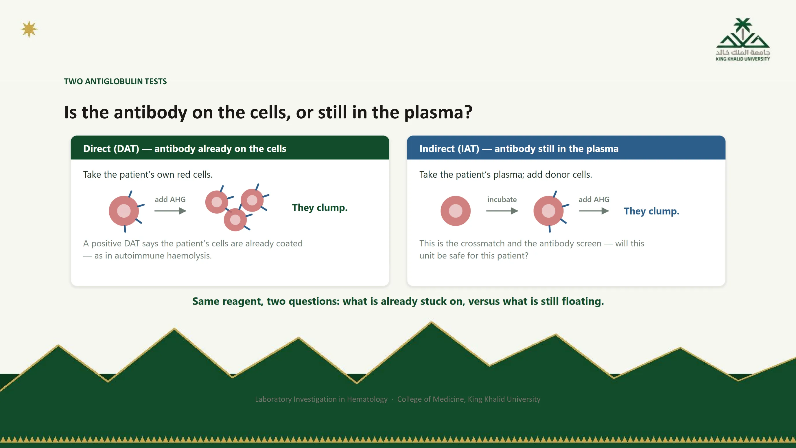
Stuck on, or still floating
The figure makes the difference procedural. In the direct test the patient's own cells go straight to the reagent: if they clump, they were already coated. In the indirect test the patient's plasma is first incubated with donor cells, giving any free antibody the chance to bind, and only then is the reagent added. One extra step, and a different question. The caption is the version to remember: what is already stuck on, versus what is still floating.
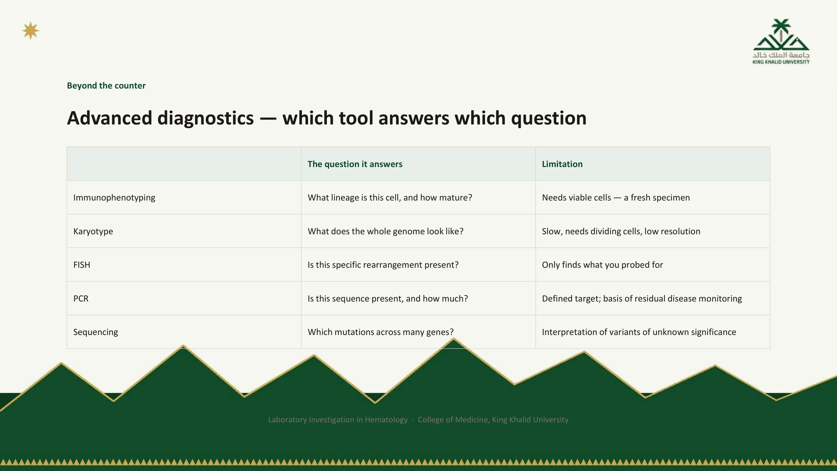
Beyond the counter: which tool answers which question
When the question stops being "how many?" and becomes "what is this clone, and what drives it?", five families of test take over, and each answers something the others cannot. Immunophenotyping by flow cytometry reads the surface and internal markers of each cell and answers what lineage it belongs to and how mature it is; it needs living cells, so the specimen must be fresh. The karyotype lays out every chromosome and answers what the whole genome looks like at low resolution; it is slow and needs cells that will divide in culture. FISH hybridises a fluorescent probe to one target and answers whether a specific rearrangement is present, quickly and without dividing cells, but it finds only what you probed for. PCR amplifies a defined sequence and answers whether it is present and in what amount, which is why it is the basis of residual disease monitoring. Sequencing reads many genes at once and answers which mutations are present, at the cost of having to interpret variants of unknown significance.
Modern classification is built on exactly this layering: morphology and immunophenotype establish the lineage, and genetics increasingly defines the entity and the prognosis. A local illustration: in a high-altitude cohort with thrombosis at unusual anatomical sites, JAK2 mutation testing was what separated a myeloproliferative driver from the physiological polycythemia that is ordinary at this elevation. The counts alone could not have made that distinction, which is where slide 31 and this slide finally meet.

The toolkit as layers
The handbook's figure stacks the tools in the order a diagnosis is actually built: morphology first, then immunophenotype, then cytogenetics and molecular panels, then clinical staging. Each layer narrows what the one above left open. This is the figure to have in mind when you read a modern leukemia or lymphoma report, and it is where the acute leukemia and myeloid neoplasm lectures in this series pick up.
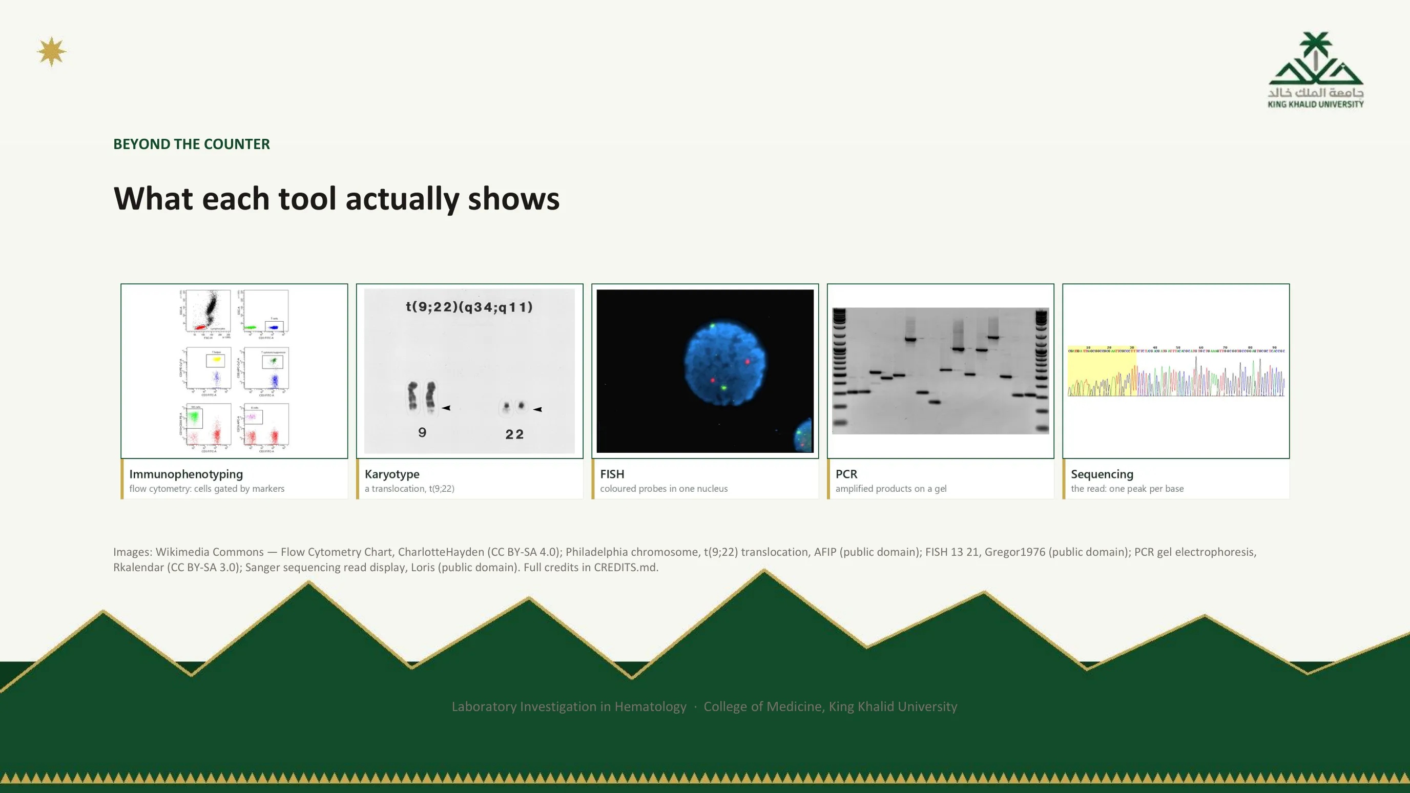
What the result of each tool looks like
The table on slide 79 names five tools. This slide shows what each one hands back, in the same order. Immunophenotyping gives a flow cytometry chart: each dot is one cell, and the boxes, called gates, pick out groups of cells by the markers they carry. The karyotype panel shows two pairs of chromosomes from a partial karyotype; the arrows mark the chromosomes changed by a translocation between chromosome 9 and chromosome 22. FISH shows one nucleus stained blue, with red and green spots where the fluorescent probes have bound. PCR gives a gel: each band is the copied target, and the ladders at the two edges are the size markers. Sequencing gives a trace with one coloured peak for each base, read from left to right.
The point is to know what sits behind each line of a report: a chart, a picture of chromosomes, a glowing spot, a band, or a trace. The videos on the next slide show how each one is made.

Five short films
Fifteen minutes of viewing in total, one film per tool, each showing the mechanism rather than the result: the reaction that turns a trace of DNA into enough to test, the probe landing on its gene so that a translocation becomes visible, the chromosomes laid out in order where t(9;22) is actually read, the laser and the CD markers that turn into a lineage, and what a sequencing panel is doing behind its report. The five links are below. They are live in the PDF deck too, downloadable from the top of this page.
- PCR — copying one piece of DNA many times BioMan Biology · 3 min
- FISH — a coloured probe lands on one gene CancerQuest, Emory University · 1 min
- Karyotype — laying the chromosomes out in order Pathology Tests Explained · 3 min
- Flow cytometry — sorting cells by what is on them Cell Signaling Technology · 3 min
- Sequencing — reading the letters themselves Illumina · 5 min

To end on
The sentence is the lecture. A laboratory result is a claim about your patient made by a machine that never met them. The machine did not take the history, did not see the patient's colour, does not know what altitude the patient lives at or whether the tube was filled to the line. It reports a number, and the number is a claim. Knowing how much of that claim to believe, which is the work of the five stations, is a clinical skill, not a laboratory one, and it is yours.
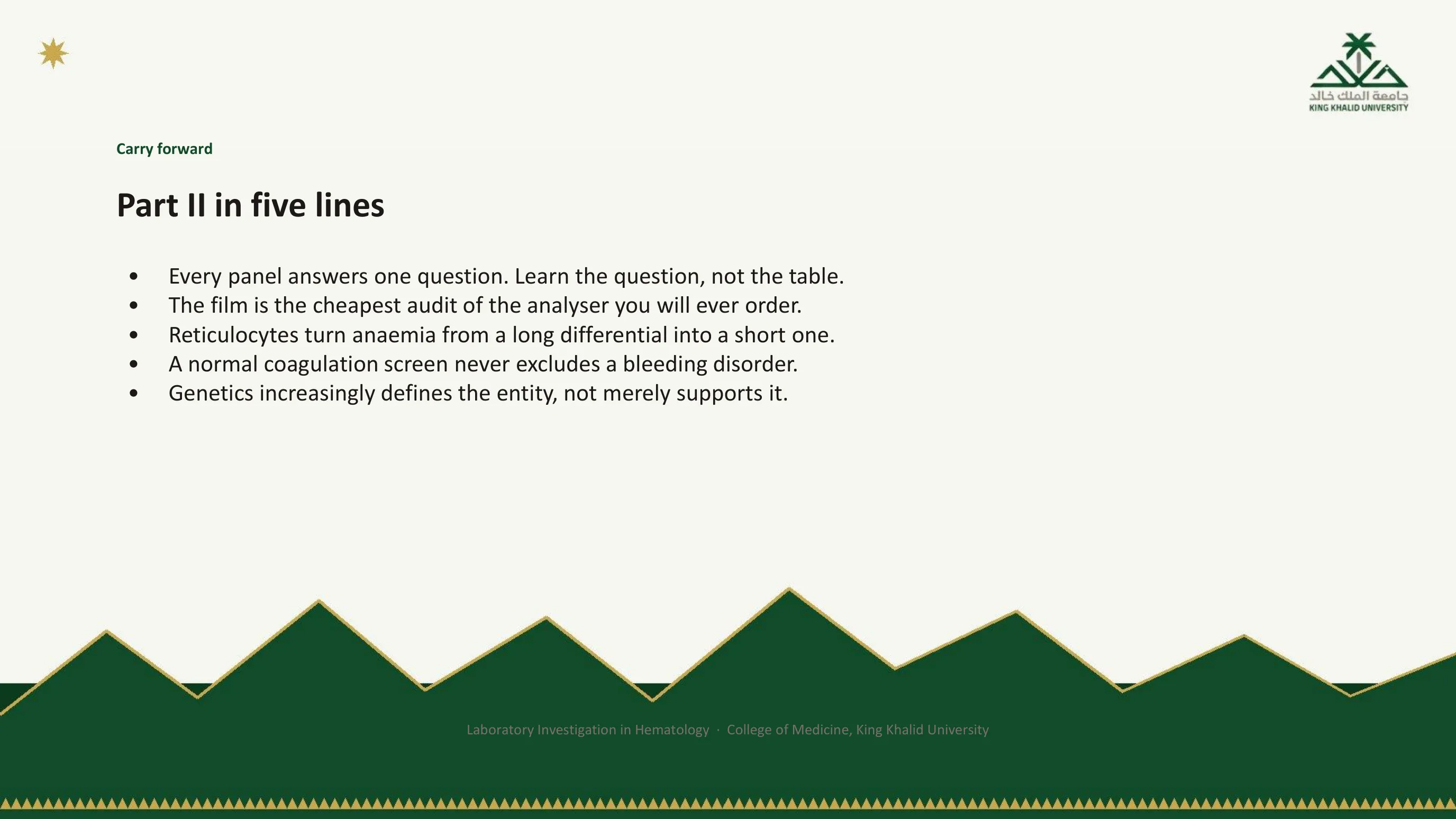
Part II in five lines
Every panel answers one question, and if you learn the question you will not need the table: that was the map. The film is the cheapest audit of the analyser you will ever order: that was station 3 made practical. Reticulocytes turn anemia from a long differential into a short one: the two-number method. A normal coagulation screen never excludes a bleeding disorder: the two clocks and what they cannot see. Genetics increasingly defines the entity rather than merely supporting it: beyond the counter. Put these five beside the five of Part I and you have the lecture on one page.

Where this comes from, part one
The first page of sources is mostly local, which is what slide 2 promised. The definition of a reference interval is the international standard from the Clinical and Laboratory Standards Institute. The rest are the studies behind station 4 as it was taught here: the regional comparison of hemoglobin and red cell indices across altitudes, the interaction with age, the carbon monoxide rebreathing measurements of hemoglobin mass, the argument about diagnosing polycythemia at altitude, the prevalence of isolated neutropenia in this region, and the test-ordering audit that station 1 quoted. Each can be found by a PubMed title search.
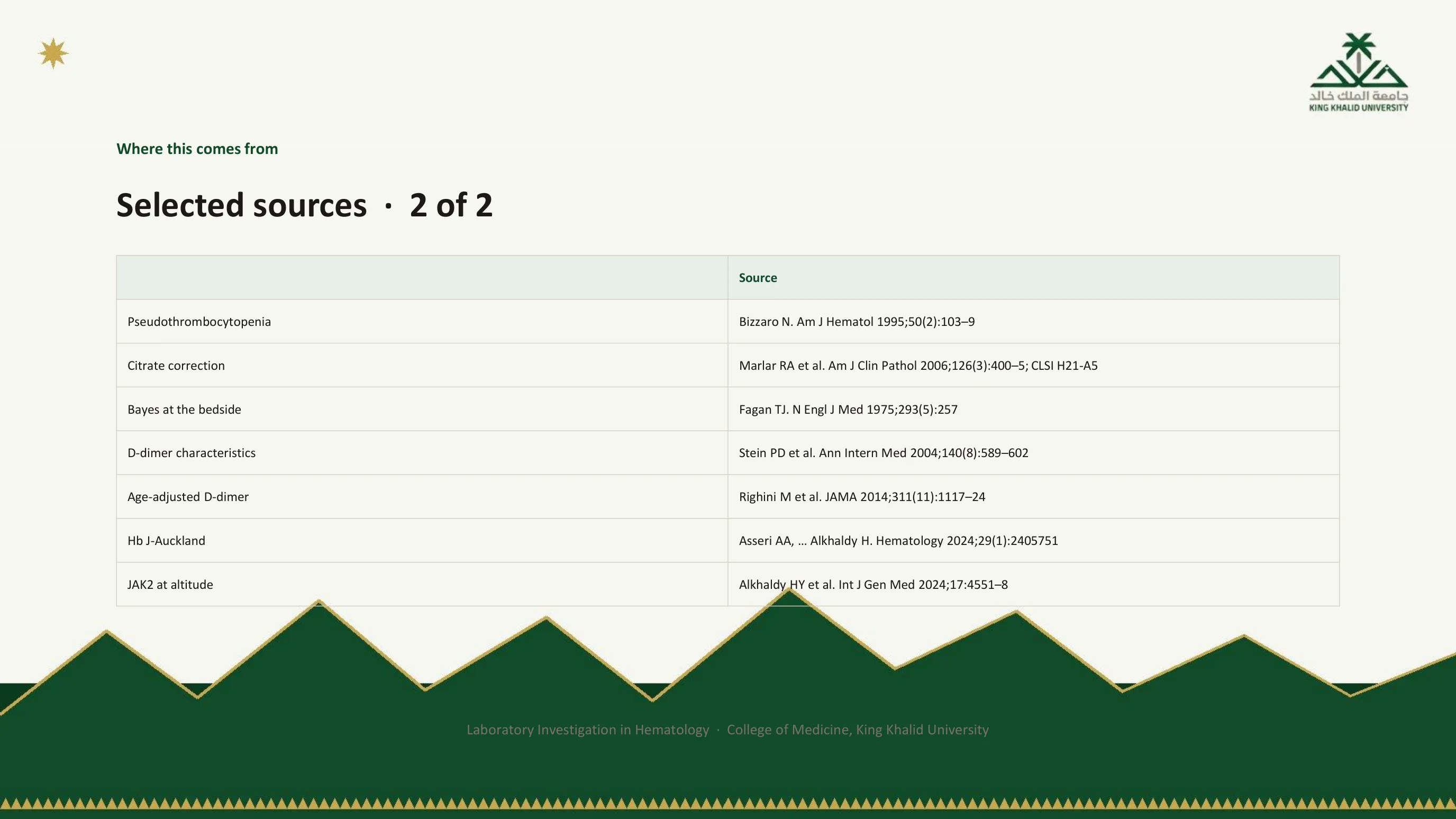
Where this comes from, part two
The second page supports the cases and the reasoning. Bizzaro's series is the source for the frequency of EDTA-dependent pseudothrombocytopenia. Marlar's study and the CLSI collection standard are the basis of the citrate correction. Fagan's one-page nomogram is the practical form of Bayes' theorem used at station 5, and Stein's systematic review supplied the D-dimer's operating characteristics; Righini's trial is the age-adjusted threshold mentioned on slide 38. The last two are local: the Hemoglobin J-Auckland case behind slide 69, and the JAK2 study behind slide 79.

Questions
The deck ends here, and the footer points back to this page. If you want to test whether the lecture has taken, pick any test you ordered this week and walk it through the five stations out loud, as slide 75 did for the D-dimer. If you can say what question it answered, what could have gone wrong in the tube and the instrument, whose reference interval it was compared with, and what the result changed, the lecture has done its work.